Explore data, Assignment 2: Share your findings

Submit your assignment for the Share your findings module in a reply to this topic

Remember to include these elements:

  1. A plot :bar_chart: that you’ve created during this module
  2. How do you interpret :bulb: the plot; what meaning do you draw?
  3. A brief reflection :thinking: next step, challenge you solved, or problem you still have
  4. Give specific and useful feedback :thumbsup: to a coursemate

Remember that each written step need only be a sentence or two

I managed to combine the text into one code

ggplot(data = LeafData,
mapping = aes(x = Width_mm,
y = Length_mm,
colour = Angio_Gymno)) +
geom_point() +
labs(x = “Leaf width (mm)”, y = “Leaf length (mm)”,
title = “Leaf dimensions by plant Clades”,
subtitle = “Leaf length is correlated with width”,
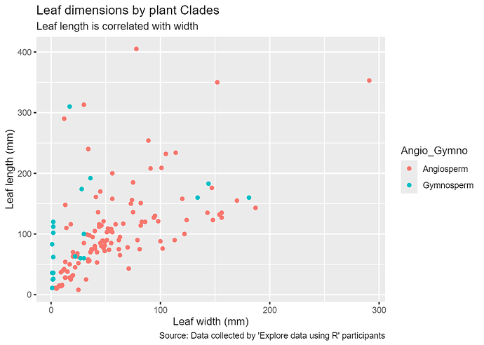
caption = “Source: Data collected by ‘Explore data using R’ participants”)

Giving this output

I have learnt how the comma can be used to join code.

Hi all,

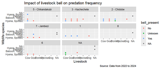
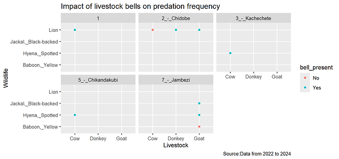
Tried the multiplot figures function

code
ggplot(hwc_incidents_,
aes(x=species_domestic_animal,y=species, colour = bell_present))+
geom_point() +
facet_wrap(vars(ward_number)) +
labs (x =‘Livestock’, y= ‘Wildlife species’,
title = “Impact of livestock bell on predation frequency”, caption = “Source: Data from 2022 to 2024”
)

output

Question:

I get the same output when i include data and mapping in the code, see below

ggplot(data=hwc_incidents_,
mapping = aes(x=species_domestic_animal,y=species, colour = bell_present))+
geom_point() +
facet_wrap(vars(ward_number)) +
labs (x =‘Livestock’, y= ‘Wildlife species’,
title = “Impact of livestock bell on predation frequency”, caption = “Source: Data from 2022 to 2024”
)

Please advise does data= and mapping = , have specific uses, or i can use them anyhow?

  1. A plot :bar_chart: that you’ve created during this module
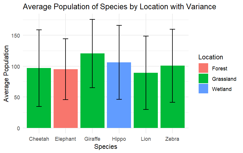
    (this is a fake dataset with 100 observations of different species)
    Uploading: image.png…

  1. Interpretation :bulb: - what meaning do you draw from this plot?
    There were 6 species recorded, each in a specific habitat, with average populations around 100 and large variance in those numbers ranging from around 50 to 150.

  2. A brief reflection :thinking:, for example why you chose this plot, something you’d like to improve about it, a challenge you overcame, or how you feel about completing this module
    I chose a simple dataset for this exercise. I’ll have to practice to do more complicated graphs. For example, I’d like to do a multiplot showing the same information but by year. I’ll do that next.

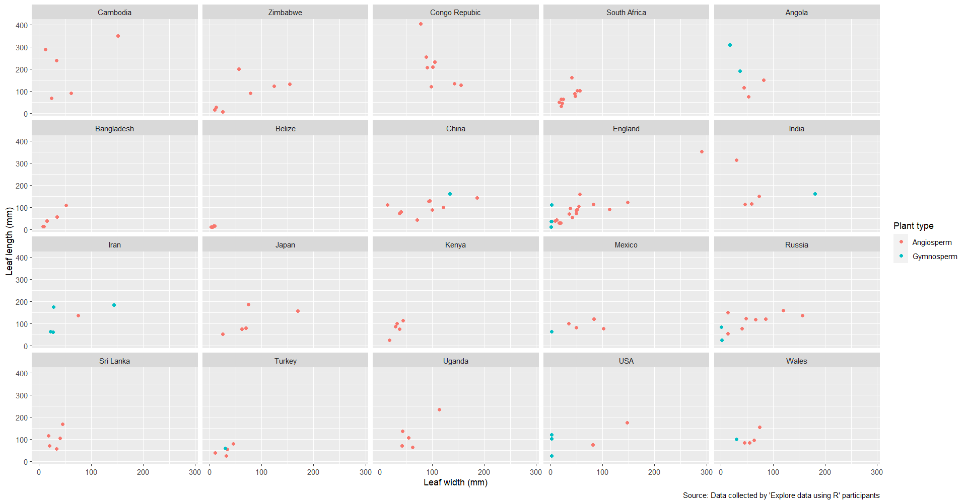
Please see multi plot using existing leaf dataset by country:
I modified axis, legend title added colours to easily visualise plant type records per country

Interpretation : Data availability varies per country, also differences/ variability evident within and across country for both in both plant length and width especially for Angiosperm, however in general both length and width were smaller for Gymnosperm, with some exceptions

Reflection : the ability to produce different plots including multiplot is very helpful. I
used the lab function for modification to axis etc and also for modifying legend titles.
While the image saved without any issues, I observed an overlap of numbers (on the x axis). The same problem was encountered when I used thee export function in the plots section console. To overcome this I used the zoom button and then saved the graphic from the zoomed version. Im not sure if there is a shortcut when you have multiplot

Questions: What is the difference between using labs () vs theme () and can these be intermixed? is there a reason that pipelines are not used in ggplots or does this overcomplicate matters?

Feedback :
Well done Nicroll for minimising the code and using commas, i have made a not in my script to do this next time

Hi all, here is my second assignment.

1) Plots:
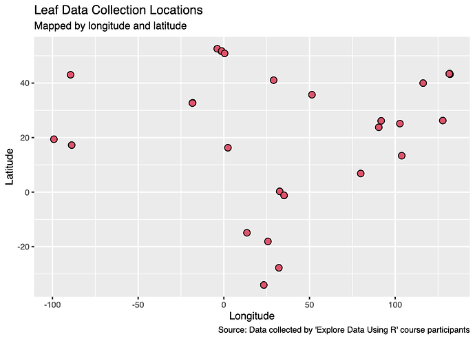
a) Using a scatterplot for more of an anticipatory applied use, I plotted Longitude and Latitude of the leaf data, to effectively create a map of collection locations. I customised the plot points and labels.

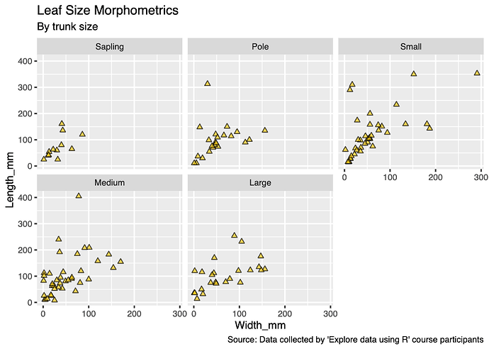
b) I also made a multi-plot figure of leaf morphometrics (width and length) by trunk
size, again customising the plot points and text.

2) Code:
a)

ggplot(LeafData,
  aes(x = Longitude, y = Latitude)) +
  geom_point(size = 3, shape = 21, colour = 367777, fill = 336666) +
  labs(title = "Leaf Data Collection Locations",
       subtitle = "Mapped by longitude and latitude",
       caption = "Source: Data collected by 'Explore data using R' course participants")

b)

ggplot(LeafData, 
  aes(x = Width_mm, y = Length_mm)) +
  geom_point(size = 1.7, shape = 24, colour = 367777, fill = 399183, alpha = 0.67) +
  facet_wrap(vars(TrunkSize)) +
  labs(title = "Leaf Size Morphometrics",
       subtitle = "By trunk size",
       caption = "Source: Data collected by 'Explore data using R' course participants")

3) Interpretation:
a) Though there cannot be assumptions made like with a traditional scatterplot, it does show that most leaf data was collected from locations in the global north.
b) It appears that a positive correlation between leaf length and width is maintained across trunk sizes.

4) Brief reflection:
I’m looking forward to tweaking the code to try this all out on different plot types and with my own data, as well as exploring additional plot customisations and colour scheme options.

5) Feedback:
@Rachel_Crouthers, beautiful & complex multi-plot figure! I also have similar questions to the ones you posed in your assignment.

And, regarding my general comment on the first assignment, it was great to find that scale_colour_viridis_d seems to be the best option for colourblindness!

Hi Alice
Great easy to read plot, would you mind sharing your code for this. As I like the added variance bars and would be nice to do for SE or SD in future plots either for histogram’s or bar charts.

Thanks so much
Rachel

1 Like

Hi Rachel, here is the code with the error bars included. Notice it is SD, just a mistake in the title of the figure
"

Calculate mean and standard deviation for each group

wildlife_summary ← wildlife_data %>%
group_by(Species, Location) %>%
summarise(
Mean_Population = mean(Population),
SD_Population = sd(Population)
)

Create the plot with error bars

ggplot(wildlife_summary, aes(x = Species, y = Mean_Population, fill = Location)) +
geom_bar(stat = “identity”, position = “dodge”) +
geom_errorbar(aes(ymin = Mean_Population - SD_Population, ymax = Mean_Population + SD_Population),
width = 0.2, position = position_dodge(0.9)) +
labs(title = “Average Population of Species by Location with Standard Deviation”,
x = “Species”,
y = “Average Population”,
fill = “Location”) +
theme_minimal()
"

1 Like

Thank you so much, that’s wonderful!

Hello,

Here is my second assignment

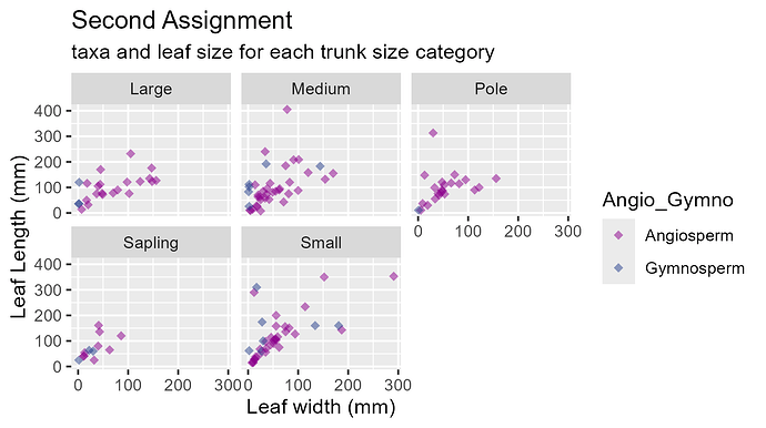
#assignment
Assignment2_plot <- 
  ggplot(na.omit(CombinedData),
       aes( x = Width_mm, y = Length_mm, color = Angio_Gymno)) +
  geom_point( size = 2, shape = 18, alpha = 0.5) +
  facet_wrap(vars(TrunkSize)) +
  scale_color_manual(values = c("Angiosperm" = "magenta4",
                                "Gymnosperm" = "Royalblue4"))+
  labs( y = "Leaf Length (mm)", 
        x = "Leaf width (mm)" ,
        title = "Second Assignment",
        subtitle = "taxa and leaf size for each trunk size category")

ggsave( Assignment2_plot,  
       filename = "Plots/Assignment2_plot3.png")

Interpretation
small trunk size seems to have the most diverse leafshapes, together with the medium size trunks.
Saplings appear to have the smallest leaves with less extreme proportions

Reflection

  • I set the alpha (transparency) to 0.5 to be able to see the overlapping points.
  • I had to manually choose the colours because R’s choice was awful, so I looked into it and tried different combination. I still neet to figure out if the shapes from 21 to 24 can be manually colored of different colors between the outline and the filling. Does anyone know if is possible?
  • I notice that th size and the ratio of the saved plot, is taken by R from the size of the Environment window at the moment of the saving! that can lead to mistake, especially if you work with R in half screen like me.

Feedback
@Nicorll I see your multiplot on the bell influence on livestock predation and now I am really curious to find out more on this project!
I see the text is a bit clumped and difficult to read, as I wrote above R take the size of the plot from the size of the environment window at the moment of saving, so if you stretch it until the text is clear and then save you should solve it!
Also I see online that you can decide size and resolution writing it in the ggsave() function:

ggsave( Assignment2_plot,  
       filename = "Plots/Assignment2_plot4.png", 
       width = 10, 
       height = 8, 
       dpi = 150, # resolution, dpi = dots per inch
       units = "in")  

let me know if it works also for you

Thanks

Thank you @Chiara, there is real need to make the texts on the plots readable.

I have rerun the code

Interpretation:
Most livestock predated upon seem to have bells on across all the predator species. Lion predation is highest in ward 2, with Hyena ,more spread out across the wards.

Reflection:
I wonder is it possible to put data labels on the bar plots?

1 Like