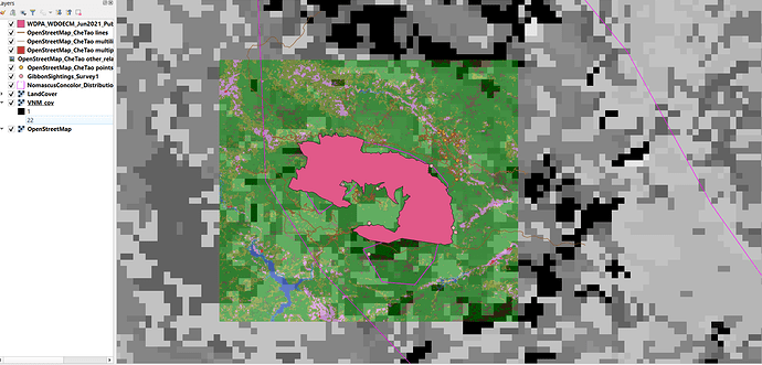
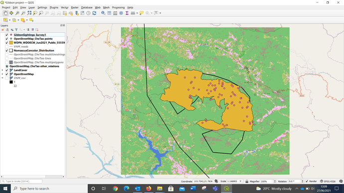
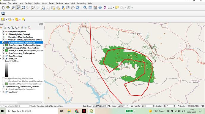
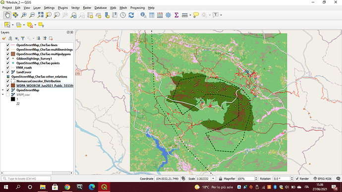
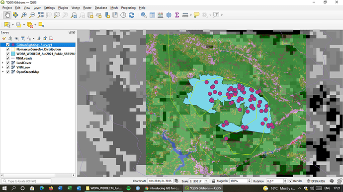
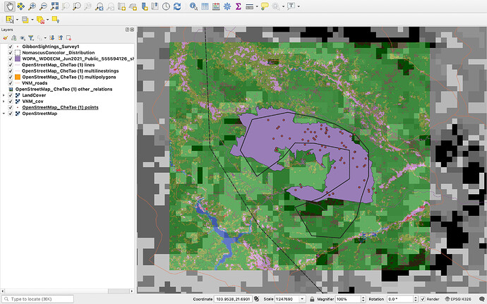
I also turned off the coarser data layers. It really helps to bring out the gibbon sightings and Roads. With the coarse vegetation data this became quite blurry. I suppose its a good example to work with to show differences of potential data examples. But to zoom in on such a small area, it is best to remove i think. Looks good.
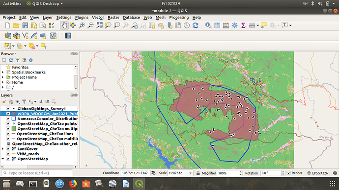
Hi there, I’m not sure about city names! Maybe it’s just because I was quite zoomed out?
I was a little surprised at first at how messy it looked as some of the points were blocked out. I fixed this by rearranging the layers
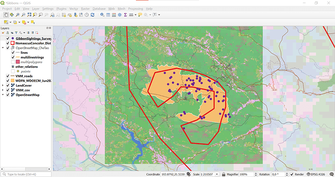
Here’s mine. I rearranged and turned off some layers so that it looked a bit better visually. This module really helped to solidify the differences between raster and vector data for me and how different types of data that I may collect might be represented. I had to attempt the quiz about the different types of raster data a couple of times before I got that in my head, but got there in the end! Also had to reread the bit about downloading all the different new layers before I could work out which ones I needed, but I’m getting more confident with how to use QGIS each week.
Yes, I agree with the others, this looks great. Playing around with which layers are active, and changing the colours and symbols has been really effective here!
At this moment I don’t have my own data to work on so I am learning from the examples provided. The concepts of raster and vector data seems confusing and I need to wrap my head around it. Still interesting to learn though.
Reflection: As I am not using my own data is it slightly more difficult to grasp these concepts and ideas. But I still think that by finding my way onto how to use the GIS tool is helpful for me to use in the future.
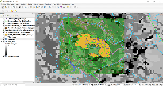
From a GIS newbie perspective, your map looks great! I can clearly see the comparison in resolution and extent in your map.
All the best.
The asignment was not particularly difficult, but I too had some confusion while downloading all the files. I checked other assignments to make sure I uploaded all the files. Overall, the explanation part was very clear and helpful and it has been fun to customize the layers to make a better-looking project.
Hy Nahdaniel
Thank you so much for your help. Let me correct that. Thank you.
Vuyisile
Same as the previous model, I found this module very informative and educational. I was a little confused about how to add the files at a certain point but I figured out when to add which files as vector and raster. The order of the layers is still a little confusing to manage but I’m getting there.
This module cleared a lot of my doubts regarding raster and vectors, comparing various resolutions was a fun way to learn what changes occur in proportion to the resolution and extent of our data collecting techniques. I have still not properly understood the differece between a thematic and continuous Ratser, it would be great if someone could help me with that.
Your map looks great! Well done!!
As someone who is completely new to GIS, I learned about the difference between raster and vector layers and the types of data they could represent. I am also starting to see how important it is to consider the order of layers and how to modify them to help with visibility, as well as whether it is necessary to include certain layers at all. I would appreciate any feedback!
I like how you colored the different layers to improve visibility. I also like how you turned off the coarse land cover data in order to better visualize the sightings data vs. the actual map.
This module effectively highlighted the differences between vector and raster data - which I had been struggling to understand before. It also nicely outlined how data can vary in its extent and resolution. To show that I have grasped these concepts, I chose to include both higher and lower resolution raster data (the coarse grain and fine grain cover data), as well as both raster (cover) and vector data (roads). I organized the layers in a way which I felt best represented the data I wanted to portray. At first I felt a little overwhelmed adding all of the layers but soon got the hang of it.
Hi there friend! Your map looks great  . I’m glad we’re getting the hang of this together (and catching up late together too haha).
I like the order of your layers - I think I may have added too many to mine - so thanks for helping me identify my own mistakes.
Great work there, really like how that map has been presented, would like to give a suggestion from my end. I personally feel like adding a gradient to polygons gives an impression of changing density or intensity and may cause confusion. Let me know what you think about the same and if there is any specific reason for using gradients, would love to know how to play around with more colors in a map
Thank you for your input. I will use your tip to try and try showing VNM_cov again.
I had some difficulty following the instructions as I found them vague at times (could be because I am a complete beginner). I had to research how to add the different file types. I did not know how to order my layers.
I feel like I have a better understanding of the difference between raster and vector after this module.
Looking good, mine looks similar to yours 
