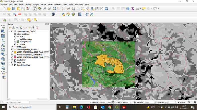
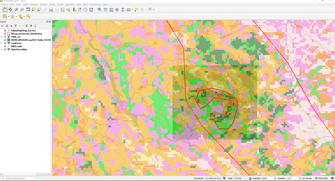
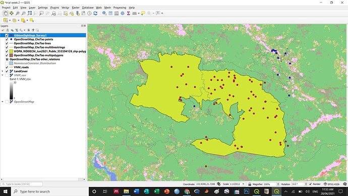
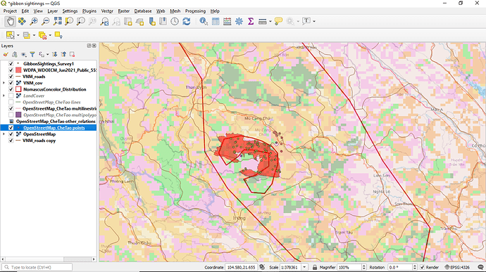
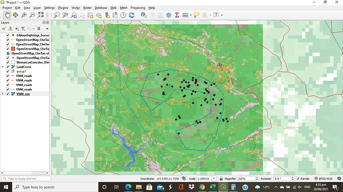
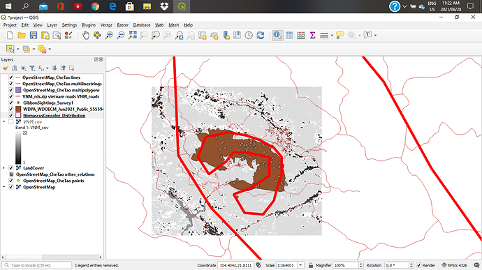
I struggled a bit with how to organise the layers in the project for best clarity but it was fun seeing a detailed picture take shape!
Looks good Emily. I’m glad you figured out how to manage the layer ordering.
So far I am loving this course! It is easy to follow and the screenshots and quizzes are very helpful. My learning goal was to feel capable with the different layer types and navigation of QGIS - and I think that is well underway. My main problem with the course so far was downloading all of the data files for this module and then uploading the right ones, as each download file was often a folder filled with different file types. Maybe a primer on file types could be helpful?
Great job, Sianes! I like how you changed all of the shapes and colors to match the image you had for your data. My suggestion might be to choose colors that are more color-blind friendly - but of course that is really only important in the final result! Thanks for emphasizing how important altering colors and shapes can be for data viz.
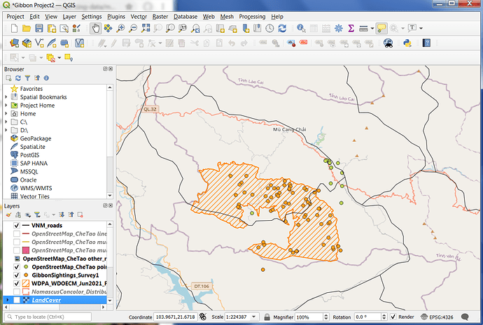
I decided to go with a simple map that shows the higher resolution layer of the distribution of gibbons against the Open Street base map. I found the land cover layers distracted from the main purpose of visualizing clearly the location of sightings and extent of distribution of gibbons. I feel I am more clear now about the difference between vector and raster data and how to recognize different file types like shp and upload them but I’m still not sure how to display the subspecies separately on the map. I initially had some issues unzipping files and got a bit confused about which files to upload. I ended up deleting the zip file after extraction to a separate folder.
Hi Mandabee,
I love the simplicity of your map and the colours you chose. Also how you zoomed in on the distribution of the gibbons so viewers are not distracted by unnecessary info. Great job.
On my map I selected the distribution polygon (your pink layer) and used hatch lines (shading) so you can also see the green land use layer underneath. Have fun!
Cheers,
Greg
This is an awesome map. I love the way your data points stand out against the background.
I wonder if you uncheck the VNM Cov layer if that may improve the visibility of the higher resolution land cover layer?
Hi Greg, Thanks for the advice. I did uncheck the VNM Cov layer and the map has better visibility. Again, thank you so much
I love this simple maps 
we can edit the fill pattern in the properties section, right?
I just realized it also great to not fill with solid color
Like quite a few people, I had trouble downloading the shape map for the reserve. There were some useful pointers from other people, and I did try them, but I couldn’t find the right shape file when I unzipped the download. It may be an operating system problem? I had a practice with transparencies, colours etc. The reminder about the order of the layers was useful.
If you want to see how it looks without a layer you can just un-tick one of them and see how it looks without it. Also drag layers up and down to change the order. I think maybe you want that layer at the bottom. Also if you double left click on the layer (in the layers panel on the left side) you can then drag the transparency slider down so that you can see through it better. Good luck 
Thank you @Herilanto for your suggestion 
i struggled a whole lot with this module. perhaps the instructions were vague for me but i think i finally got the hang of it. i have learned so much and i now fully understand the differences between vector and raster data.
data well represented. i think there is a lot i am gona learn from your work. i do not understand why my work is visualized in black and white rather than in colour and it is specifically around the area of interest.
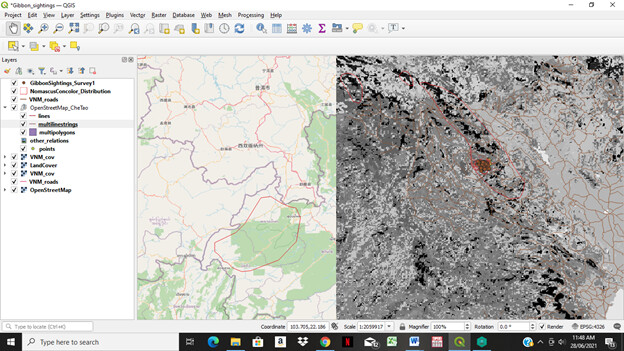
I won’t fail to appreciate the intensity and demands this module came with. However, the terminologies and when to use them is well understood. Unfortunately, one thing I am finding difficult to comprehend is the ordering and reading of layers.
While I kept enjoying every bit of the module, it is no doubt that I will have to keep practising after now so as to improve on what I already have on the ground.
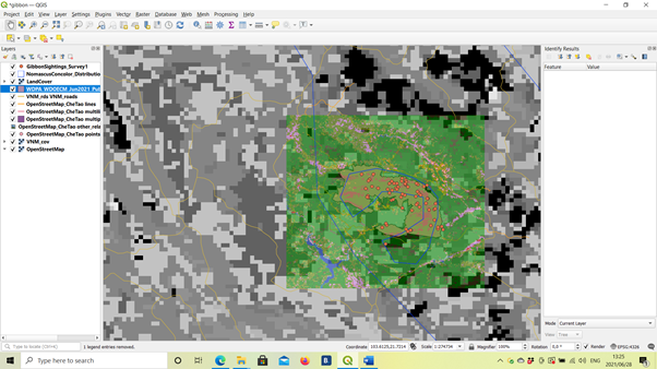
I’m beginning to understand the different data types and had a lot of fun playing around with the layers and settings. I had trouble getting the VNM_cov layer to show, so I moved it above the OpenStreetMap layer and voila. As a newbie to QGIS, it’s taking some time to understand what’s going on and what the different layers actually represent- hopefully when I revisit this activity at a later stage it will be clearer  Enjoying the challenge for now!
Hey Michael  I, too, am finding the placing of the layers a tricky subject. I suggest just playing around with them until they all show. I notice your land cover is not visible. Try placing it below Nomascus (i.e. GibonSighting, Nomascus, LandCover). Also, If you put OpenStreetMap and VNMcov at the bottom, you can switch between the two to compare the visual detail. I do prefer how you’ve kept OpenStreetMaps as opposed to VNMCov, I found the latter a bit harsh. And yes, practice will get us there- we’re in the same boat!
  Keep it up! Cheers, Courtney
Hi, sorry for the late reply. I just downloaded everything I found in the links and looked for the .shp file. Is that the one you couldn’t find?
One way to give a bit more flexibility to how the layers are shown is to alter the “transparency” of each layer so you can “see through it” to the layers below.
Also, choosing a “hatching” or “dot” pattern rather than a “solid fill” allows you to visualise multiple overlapping layers.
