Hi Ekole
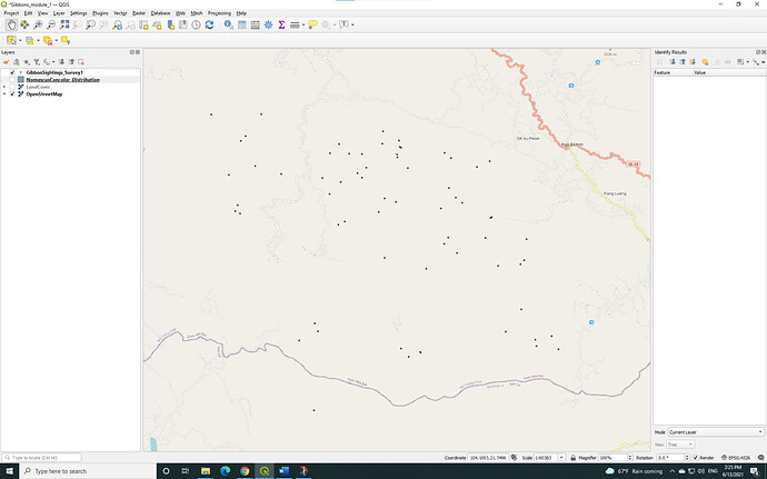
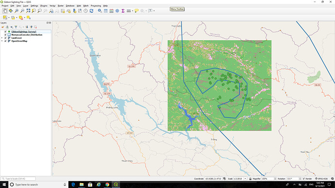
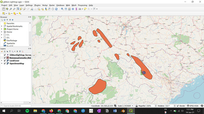
As others have mentioned, you have a lot going on in terms of toolbars and panels. QGIS is full of functionality of which most users will only ever use a small amount of it. As with all software, it is just a tool to a job and as such it should make life easier for you, so just display the tools you need - yes, sometimes you need to open up the “bag of tools” to see what you have, but once you have found the right tool, it is a good idea to put the others away back in the bag again.
The Overview Panel is useful, but in this instance, is not needed as it is displaying the same extents as the main map. It would be useful, if you zoomed in to the small area of ‘dots’ for the observations, then you can see where this small area is in the context of the overall spatial data. Also, (and we may get in to the is later when we do the ‘layouts’, it is possible to add an ‘inset map’ into your “map output” , a really useful way of identifying where in the world/country your own study area is - the layouts allow you to have multiple maps on a single “page”).
Cheers Jonathan
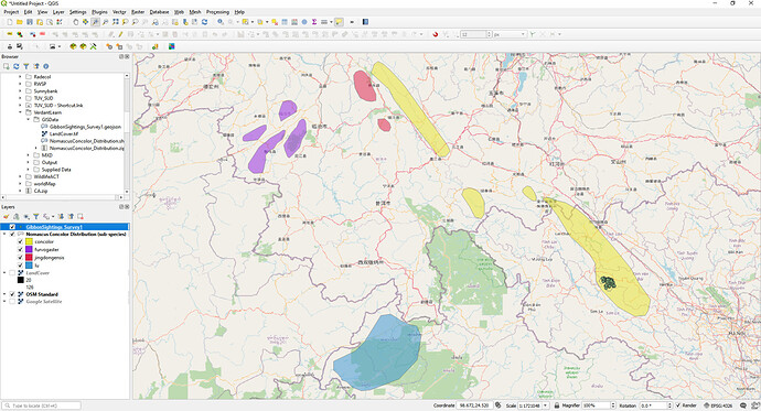
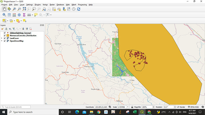
Here is the screen shot of the data layers we so far have. I’ve classified the NomascusConcolor_Distribution layer by sub-species and set the opacithy to be 50% so the OSM data can be seen beneath it.
If this was for a final map product, depending on what the main purpose of the map was (whether to identify the distributioni of NomascusConcolor or to identify the detailed distribution of the Gibbons) I would probably do an “inset map” of the full NomascusConcolor extents and a zoomed in “main map” of the Gibbon sightings.
My apologies if I am missing the obvious here, but where exactly is the module 1 assignment? I can see everyone’s results. but is there a link to the assignment and instructions?
After you’ve gone through the exercises in Module 1 here: Introducing GIS for conservation | Introduction then you just take a screenshot of the results of the last exercise. I don’t think there is actually an additional assignment besides showing these results.
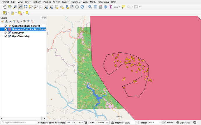
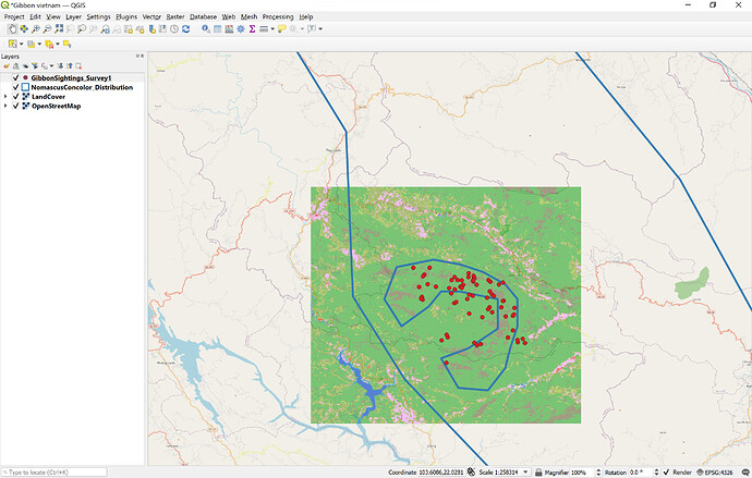
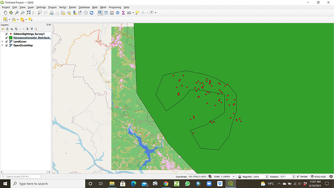
Here’s mine. This module was a good start. I was happy to learn about handling multiple layers of data, and I had never heard of the Copernicus global land cover map so that was very interesting to me! It seems like a great tool, and I’m looking forward to learning about other types of data sources. But, there are some things I hope will be explained in later modules. For instance, what’s the difference between a raster layer and a vector layer? What’s a shapefile? And I would like to know more about the types of data we have used here, and how these files are generated.
I found this module very interesting. As a beginner, I struggled a little bit to discover layer panel and add base map, but finally I managed. I am now able to create map and add different layers.
Andrew
Thank you so much, Anna!
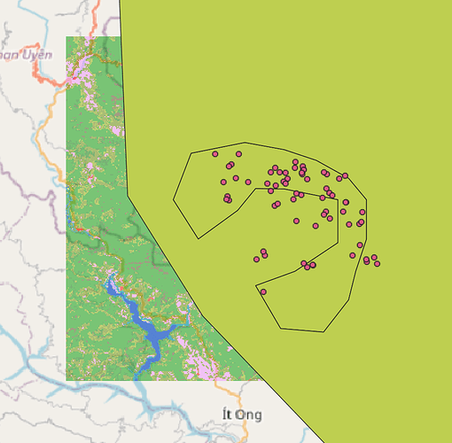
Here is my presentation of the data from Module 1. This module helped me connect language I have previously encountered (shapefiles) with the actual material. It also helped me think more clearly about the formats that data may appear in.
My learning goals for the next four weeks are to be able to perform and teach others to perform tasks that include
Combining multiple source sources of data with free environmental data to help people visualize events as they occur.
This was an interesting assignment to Learn the basics of layering different datasets and various functions that are available on QGIS. The step-by-step guide was very helpful to understand the connections and relationships between different layers. I liked playing around a little with the color and size of each data point. I am looking forward to further exploring the visual representation of information and finding ways to utilize it towards my learning goals.
Thanks for sharing your thoughts, this is very cool! This inspired me to play around a little bit more with the ordering of the layers and amount of zoom, so I have a better understanding of my own map now!
This module is easy to understand and i am looking forward to learn more about GIS. its a great tools for visualize environmental work.
Hi,
As a beginner, I find the instructions to be very clear and easy to follow. For it is very helpful and Interesting to learn. Besides that, I would like to know how do the types of data we have used here, and files are generated? Hope to get some explanation from the coming modules.
Cheers!
I enjoyed doing this assignment since
the explanations were sufficient and clear to follow the instructions and create this assignment. I appreciate being able to use the Gibbon data set since it would have been challenging to procure my own data set with confidence that it will work given that I am a first-time GIS user. Knowing how to add layers and rearrange them according to how I would like to visualize them is a valuable skill. I initially had trouble finding the “identity features” tool, but I noticed that the curse provided a nice screenshot of what the tool button looked like that helped a lot. It would be nice to understand more of the background and scientific significance of what we created! I’d also like to understand how we all have different colors for the maps.
It’s great to see that you have organized the layers on the top left in the right order! In order to incorporate the base map and view the distribution of the points, you could consider checking the boxes for “Nomenclature Concolor Distribution” and “Land cover” (the middle two layers) next time. Your comment on shape files is important since I didn’t notice the uniqueness of that material and was rather methodical about following the instructions, so thank you for making me think of that!
This has been an interesting learning experience as I have no prior interaction with GIS. I had no problems completing this but to check my understanding,I may try to find sample data online to explore more.
I didn’t realise it was possible to adjust the colour fill of the shapes to be transparent and see the map underneath. I will have to experiment with that on mine!
A great introduction to QGIS. Instructions were clear and easy to follow. I’ve learnt about adding different layers and how to order them. Excited about the next topics!
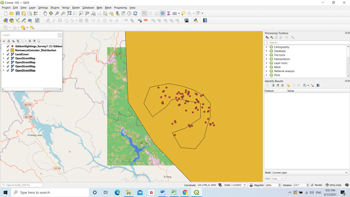
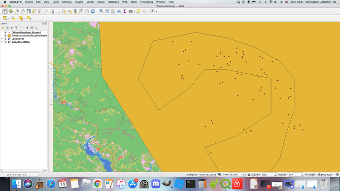
This is mine. I’m a complete beginner with this but I’m finding the instructions easy to follow and have been able to understand them fine so far. Looking forward to learning more 
I like the way you’ve classified it by sub-species. Can’t quite see how to do that on mine, there isn’t a drop down option next to my NomascusConcolor_Distribution layer (but I’m a complete beginner so I could be missing something). But can understand how that would work. Will have a look at reducing the opacity too as that does work well. Thank you for sharing 
HI Chris,
I should think we will deal with “classifications” in later modules of this course but it is within the “Symbology” options for the layer (right click on layer and select “properties”). Under the “Symbology” properties, the option at the top of the window defaults to “Single Symbol” but if you click on the options, you can choose “Categorized” and then select the attribute field you want to Categorise on.
