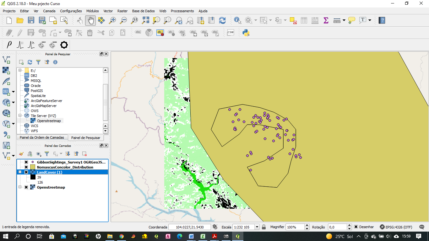
Easy to follow instructions but as you can see I managed to get my ‘Layers’ tool box spread over the top and cannot work out to get it to the right of the image again. On a previous take, I managed to get rid of it altogether and failing to get it back started over! So if anyone can let me know how I can change this - would be much appreciated.
Would love to see my own data, but not sure how to source maps for the area - if people have links to mapping sources for Botswana - that would be cool.
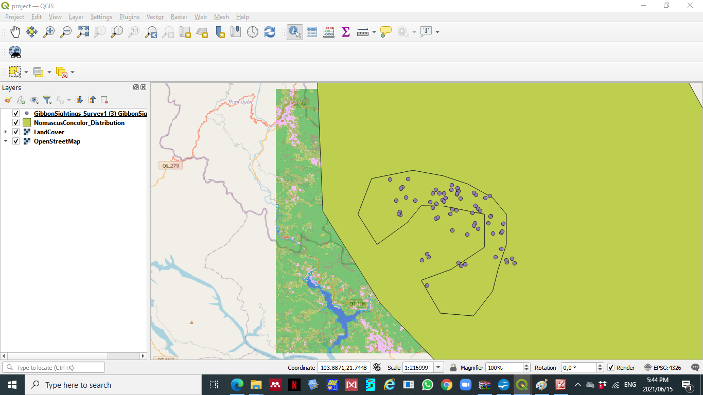
Hi @Ruth, Great start - carry on as there are a few more layers that can be added and you can start to see how these observations link to the features of the area.
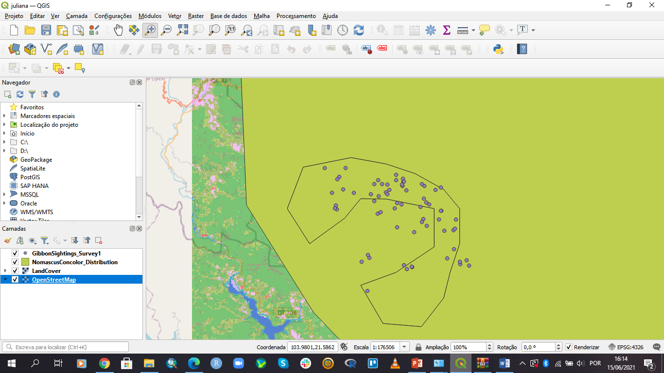
I have enjoyed this introduction module on how to operate the QGIS tool. I already feel I have gained progress towards my learning goal (to apply this tool in the working environment). So far I have not encountered any problems.
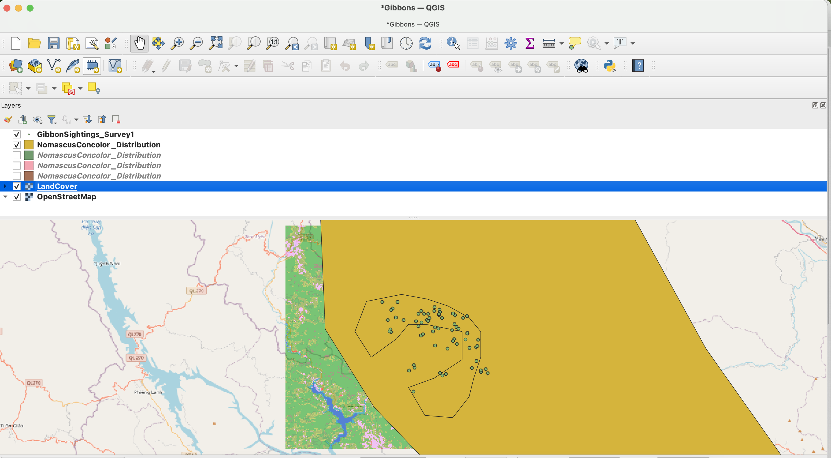
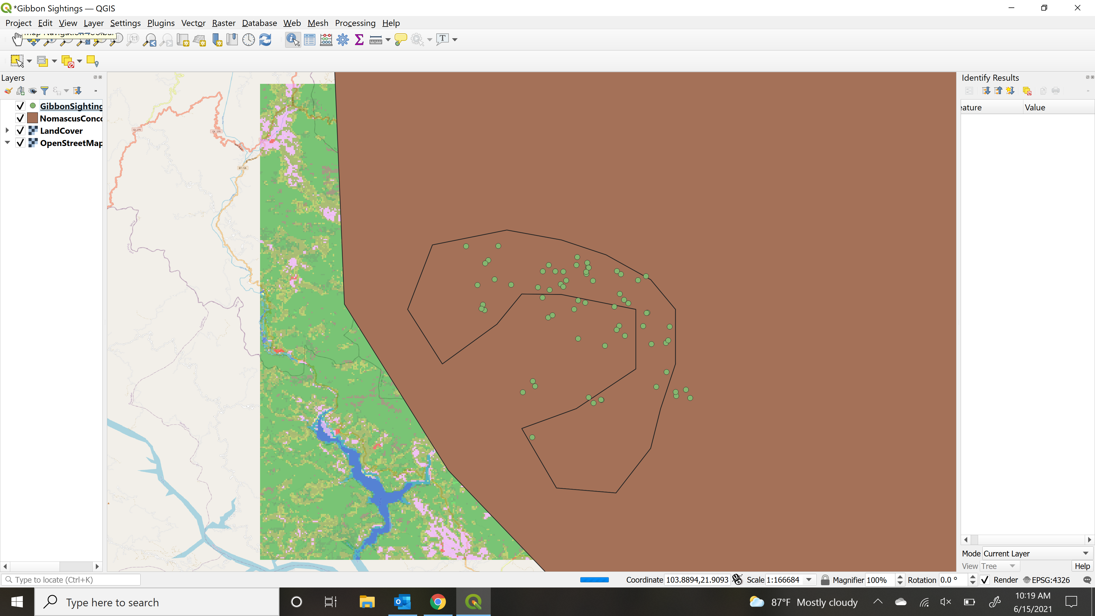
This is a great map. I like how you colour coded the sub-species, it makes for better visual understanding. I would like to know how you were able to colour code the sub-species? I don’t have any work of my own, but would like to learn this skill for future reference. Regards, Karlin
HI Karlin, I am sure this will be dealt with further in on this course, but briefly it is using the layer symbology properties and choosing “categorize” (where by default it will say “Single Symbol”). This is a really powerful function that allows you to visualise the data attibutes of your GIS layer in many different ways (eg. for point symbols that have number of counts, you can use different sized symbols to represent the different numbers of counts). There is a lot that can be accomplished just within this one function!
This was a very nice introduction to using QGIS, all very clear and easy to follow. I have never tidied up the toolbar before so it was nice to not be overwhelmed by buttons I don’t need. I’m looking forward to learning more as the course progresses.
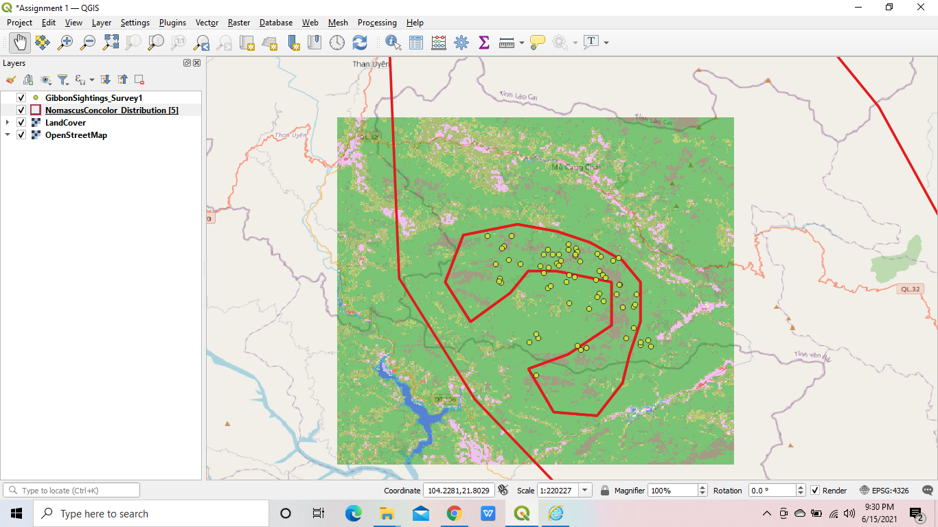
Module 1 was simple and the instructions were straightforward which helped me to understand it easily. Since, I saw some of our friend`s assignment where they were able to make NomascusConcolor Distribution[5] colorless and the outer line of polygon was colored. Well, it took time for me to figure out that. Overall, it is very helpful and I am looking forward to learn more interesting stuff.
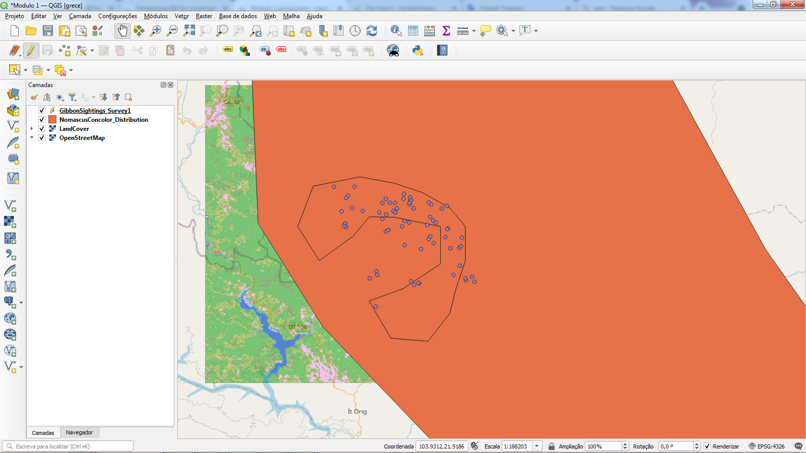
I would like to say thank you to you because after seeing your transparent map. I wanted to adjust mine because I did not know that we can make it transparent only after seeing your map. Keep up the good work and if you find some other useful techniques in future, do let us know.
This module was very helpful in learning the basics of qGIS. Through this course, I hope to understand how qGIS can be helpful for me in my grad studies. This module helped me orient myself in the program and gave me an initial understanding of how I would create a project for my own work.
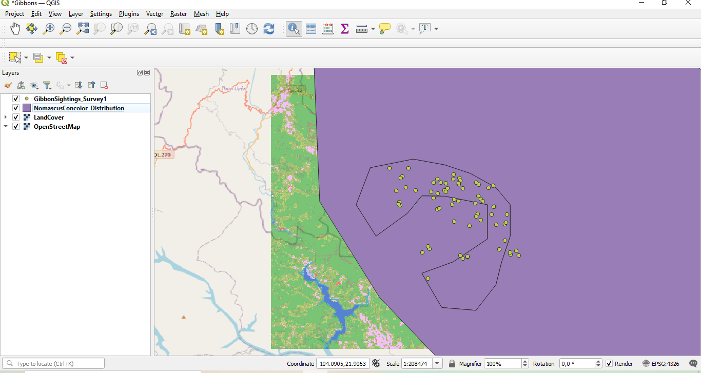
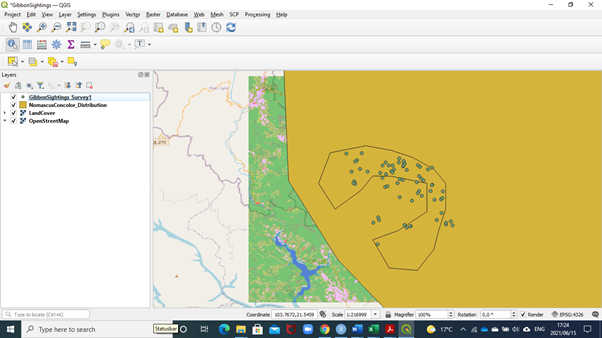
Hello! Nice job with the first assignment. It would have bee nice to see a “zoomed in” version of the map to better visualize the “Land Cover” layer and the “GibbonSightings” data.
In terms of sample datasets, I believe that qGIS provides some datasets within their program!
At first, I struggled a bit to follow the instructions. I was able to follow after going through the instructions twice. when I was done with the assignment, using the hand tool, I zoomed in a lot. I lost my map, I couldn’t undo. I had to restart. GIS is not so bad, I just need lots of practice.