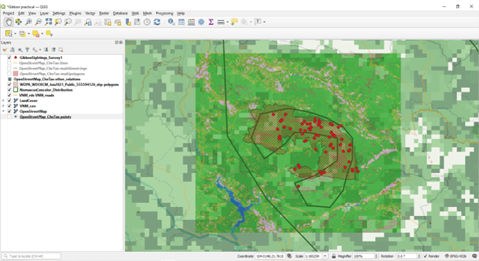
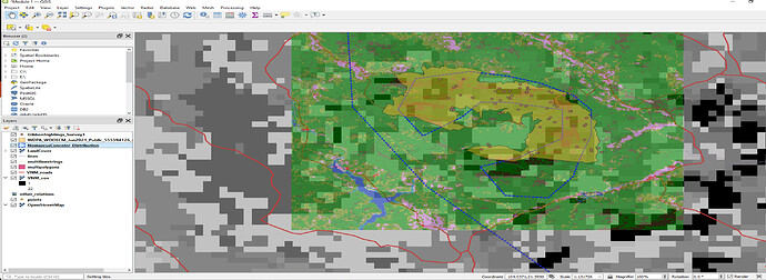
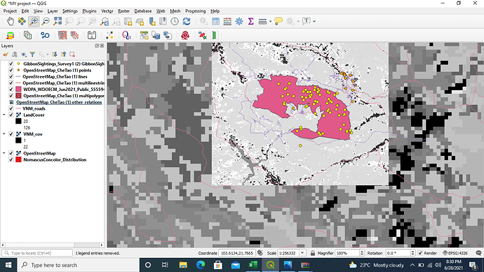
Hi! I really like your map - the datapoints are clear and easy to interpret. I’m not sure if there are any roads in the protected area, if there are you could try to bring the openstreetmap road layer up one step so it is visible in the protected area. It would also be interesting to see what the terrain is that they frequent - it looks like they occur close to the forest edges from your image? What kind of vegetation in present in the lighter area? Your research looks very interesting !
I really enjoyed this lesson, especially with the links to the different datasets, which could be very useful in my work! Hopefully I will get to use some of them later on. I enjoyed playing with the visual display - its fairly intuitive to use. I defaulted to the high resolution versions of landcover and road data as I like the look. The instructions were clear and easy to follow. I had no problems downloading any of the datasets, but then I have worked with such datasets before. I remember the first time I had to do it, it was quite tricky…
A key aspect of any GIS application is understanding what the data is you are dealing with. Often I see published maps (not on this platform but in other reports, media etc) that “look pretty” but dont make any sense. They may have been created by “graphic designers” to make something look good for a report, but without any understanding of the data used in its creation. It is only through understanding the data, its limitations and its content, the aspect you are wanting to show, and how thiings can get misinterpreted due to commonly held human perceptions, that a “good map” can be created.
For example - often a default “colour palette” on maps runs from “Green” for low values, through yellows and organges to “Red” for high values - but Red is often associated with “Bad” and Green with “Good”, so are high values of a particular attibute a “Good” or “Bad” thing ? Only understanding the data and the purpose it is being used for can answer that 
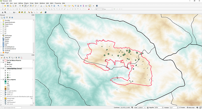
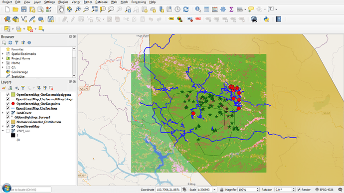
Here is my screen shot for Module 2.
It shows the Nature reserve boundary and the Gibbon sightings, but I have categorised the Gibbon sightings by the number of counts so I get different sized “Dots” depending on how many observations there are.
I have also categorised the “Roads” layer into the two main types (Roads and Trails) and have used the USGS (United State Geological Survey) DEM (Digital Elevation Modle) to replace the background satellite and landcover base maps with a colour coded ground surface raster layer (the USGS data allows you to download a variety of terrain data from this link - Digital Elevation Model (DEM) of Vietnam - Datasets - OD Mekong Datahub
I like this representation! Really clever to put the more coarse layers into B&W so that the finer layers stand out.
Enjoying playing around with how the different layers look and trying to decide how to best represent the data. I can improve on this version, but found it useful to just move layers up and down and change colour/shape settings. Had a blip when trying to upload some of the layers - forgot that some zip files need extracting whilst others don’t - got there in the end by trial and error! Also finding the links to different open source datasets useful and might have a try at putting together a few layers for ‘my’ country!
Looks good Mike! I also don’t fully understand all the different files that we download, and when it might be appropriate to use them. I also haven’t fully grasped yet when you extract and don’t extract zip files.
I have also had problems with following the instructions and loading the files. I’m glad that Lucy was able to help me. What I have found to be a help for me is to do a screen print of the instructions and then tick them off as I do them as this saves confusion when going back and forth between screens.
I think I have now got a basic understanding of the differences between vector and raster data and was ok with the quizzes the biggest trouble for me was following the instructions correctly to get the right files and display them correctly. I have played with the styles on the layers in the hope to help me to better see the different information. Not being familiar with all the different files I keep a pen and paper next to me to try and keep track of what files I’m looking for and other notes so if I get interrupted I can better get to what I was doing.
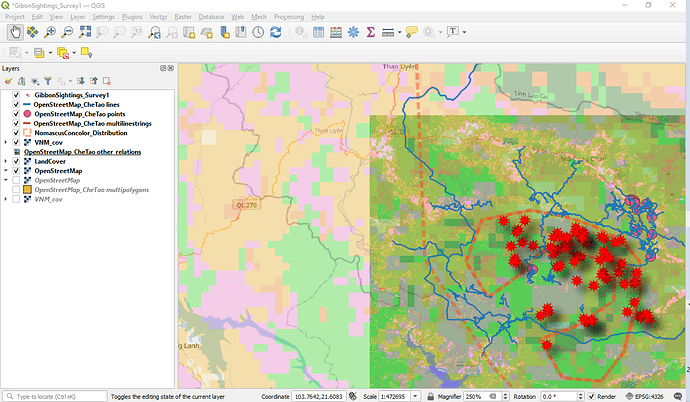
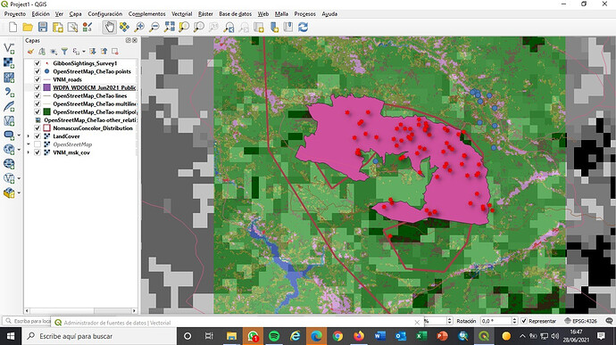
Here is my screen capture from my last efforts
This module has really given me a better understanding of what vector and raster layers mean and what kind of information they contain. I have been using both but vectors in my work but now understand better how some of my data would work as a raster layer.
I like how you can clearly see the different resolution of the two different raster layers, which helped make that distinction clearer to me.
Hi Everyone !
In this module I learned very well how to differentiate the two geospatial models, in which data to apply them. Now I know what resolution and extension is in geospatial terms.
I had difficulty adding the VNM raster layer, I had the help of one of the participants.
Hi Everyone !
In this module I learned very well how to differentiate the two geospatial models, in which data to apply them. Now I know what resolution and extension is in geospatial terms.
I had difficulty adding the VNM raster layer, I had the help of one of the participants.
Hi…
great !! I liked the color combination
This looks great, awesome work 
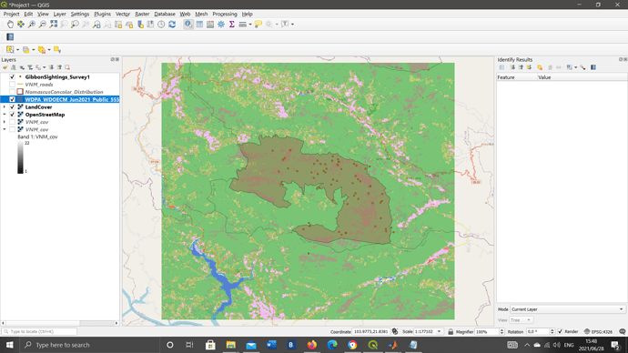
How did you get the VNM_cov layer as a gradient? Mine just shows up as black or white
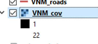
If a GIS layer in say, shape file format, is contained within a ZIP file, it is possible to load that zip file direct into QGIS, which is a good way to quickly view what the contents of a zip file are.
However, if the Zip file contains multiple GIS layers or you want to edit the GIS layer, then I would recommend unzipping the file. This makes it overall, easier to understand and be clear what layers you have and where they are stored.
The advantage of a Zip file is that it compresses the file size of some of the GIS format considerably, making them much easier to email to people - particuarly if only using mobile data coverage which may be patchy or slow.
Personally, this module has helped me a lot to understand the theoretical difference between vector and Raster layers, since many times they only teach you to load them but they do not explain the real difference in them. These have been very important.
In general, I have not had problems solving it, but some routes are different in my version than how they are explained, I think it is because of mi Qgis version, but investigating a little or searching the Internet there are no problems to perform the task.
Respecting with the uncertainly, IN biogeography applied to herpetology we can have the 3 types of uncertainty:
Define this is tremendously explanatory for the presence of amphibians and reptiles:
Spatial for limits of land use, where is the exact limit between agricultural and non-agricultural field?
Thematic for issues relationed with habitats, that is not clerar (for example if its mediterranean forest or just scrub)
Temporal also with distribution data in raster grids, since many species of reptiles have mobility and species in grids not previously mentioned can be cited.
It is very difficult to represent these variable in a totally exact way, so the good researcher must always live with a certain degree of uncertainty, and always take these deviations into account, science is never an absolute truth.
-I really liked your task!!, it is quite similar to mine I think that all the steps are correct.
-As a suggestion, I could suggest that you can click and zoom the layer, especially the Gibon distribution layer, because that way it looks much better since there is too much perspective on other layers that may not be of such importance.
-Finally, I could apply the order of the layers or the choice of color to my work, which is quite good, you have tried to have enough contrast to be able to differentiate the layers well!!
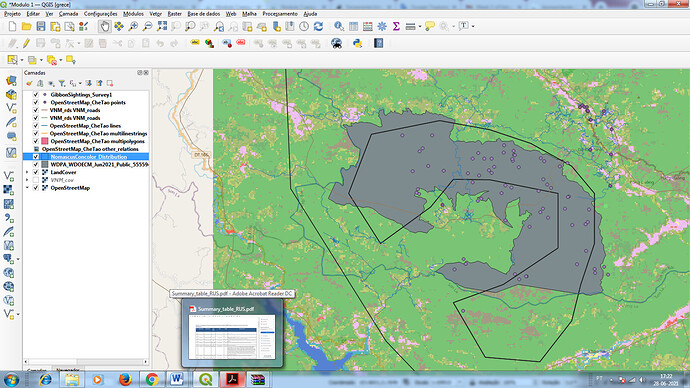
Hi michael.i found that your map is quite simaler with mine.Why it looks grey?
Hellow guys.
I become familiarized with the uses of raster and vector data. I realized that the resolution of my project is very poor that the image obtained is not clear as i wish it to be.
I tackle the confusion when it comes to download several files.
However i recognized that,it better to save the files into sub new files within the project
