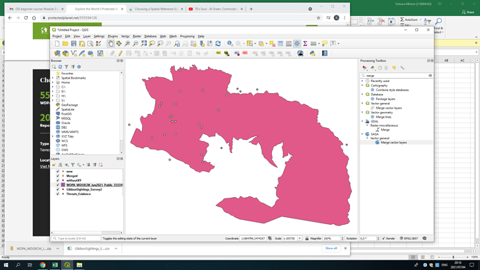
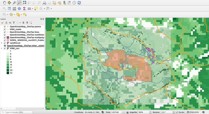
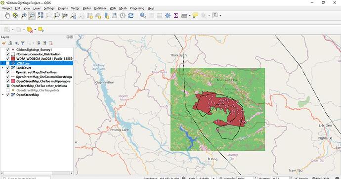
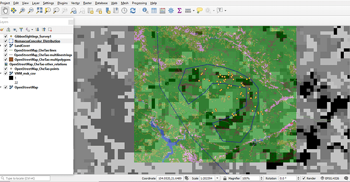
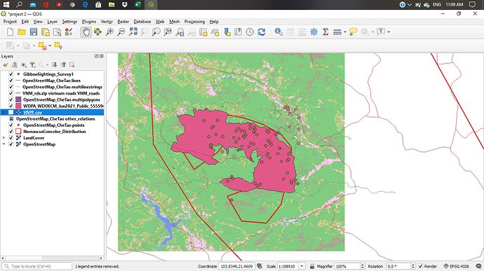
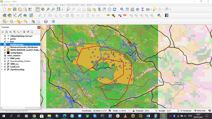
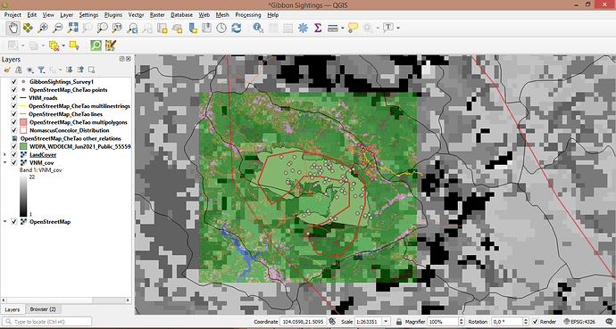
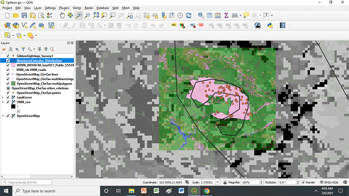
Thank you for sharing. I really like how you are able to utilize the skills learned in this course to map your own data. Overlaying different layers and creating pdf files is an awesome idea. It looks like you have it all figured out. I am sure by the end of the class, you will be able to achieve your learning goals.
I found this module fairly straight forward when it came to the concepts covered. However I think I could have benefited with a bit more step by step instruction. Something as simple as referring to a shape file as “the Landcover file used in Module 1” would be nice jolt to the memory as to where to find the cover file. I think I have all the requested layer files included in my map but if not please let me know!
Thanks for posting those links Jonathan, I am still new to using GIS for projects and knowing there are already great data layers out there to download is very encouraging. Great looking map btw, how were you able to change the sizes of the dots based on the number of captures?
This module was a little more challenging, but very interesting. It was helpful to work through the data representation exercise step by step, applying the difference between vectors and rasters, and seeing how resolution impacts the quality of the visual aspects of your datasets, and, therefore, its interpretation.
Hi Sipho. Great to read that you will be able to apply what you’ve learned to your Master project. Can you please tell me what is your topic?
Okay, this module was a lot more tricky for me as a newbie. I had to redo everything since I had trouble understanding it, that’s why it took time for me to catch up with the lesson. But then I’m not sure if I’m still doing this right. Hopefully anyone can give this some thoughts. I appreciate it. Thanks!
A job well done there! And I agree with your statement regarding the step by step instruction as things were a bit confusing to be in some parts. Your map looks good so far.
Under the symbology, you can choose to “categorise” the layer using a selected field from the attibute table (the number of captures). You can then choose to catergoise by colour or size, or go into the individual classes and alter each “class symbol” individualy.
Glad you found the info useful.
I am glad I finally managed to produce this map after +5 hours working on this module. My learning goal is to understand the theory behind the work, and I am glad the way that this course is organized helps beginners (myself included) to be able to do the tasks. I did not encounter any problems.
Thank you once again for the opportunity! 
You are not alone… I also got confused in some parts but it’s the spirit of not giving up that will carry us through this course.
YOU CAN DO IT!!! 
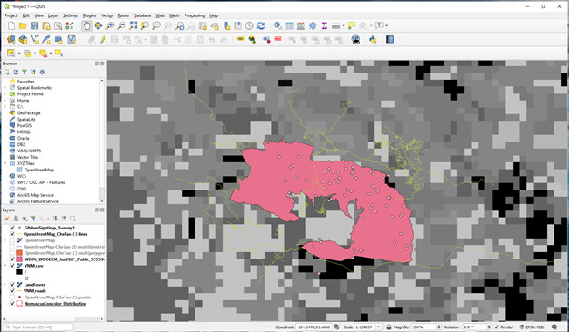
It was very useful to me to be reminded of the differences between vector and raster data. I collect and use several different types of data. Sometimes it can be difficult to determine which should be used where, or the value & quality of some else’s data set can be useful. There are times when collected data are contiguous and of high quality. However, the uncertainty caused by varying weather conditions can create issues with the quality and availability of the data. Additionally, there can be significant variations in the spatial quality of the data sets as well. I will need to spend time looking at the best use of the data sets to determine how it will be represented and used.
It looks like you got it! I had some difficulty as well because it took me a little to navigate some of the data sources, but I finally got there as well. One of the things you might think about is playing with the transparency of some of the layers. That might help with some visualization of the data.
Hi Joe!
I completely agree with you. A bit more explanation/description to the steps provided would have been immensely helpful! Even something as simple as referencing files used in Module 1 would have added clarification to the steps that I think is very beneficial to beginners.
It might be interesting to include the distribution and gibbon sightings from the first project and compare it to the park boundary that you have displayed in this map.
Hello Veronica!
I think you are missing the CheTao Park Boundary from Protected Planet and maybe the road dataset. Once you get those in, I reorganized my land cover layers toward the back and put the sightings, distribution, park boundary, and road toward the front. Hope this helps!!
Great map! I like the colour scheme - it’s very clear.
This is how mine came out. i struggled a lot to unzip the Che Tao reserve boundary file, it took me days to get the instruction correct. Ii would love some comments from the group.
I agree with LindaRulumeni
