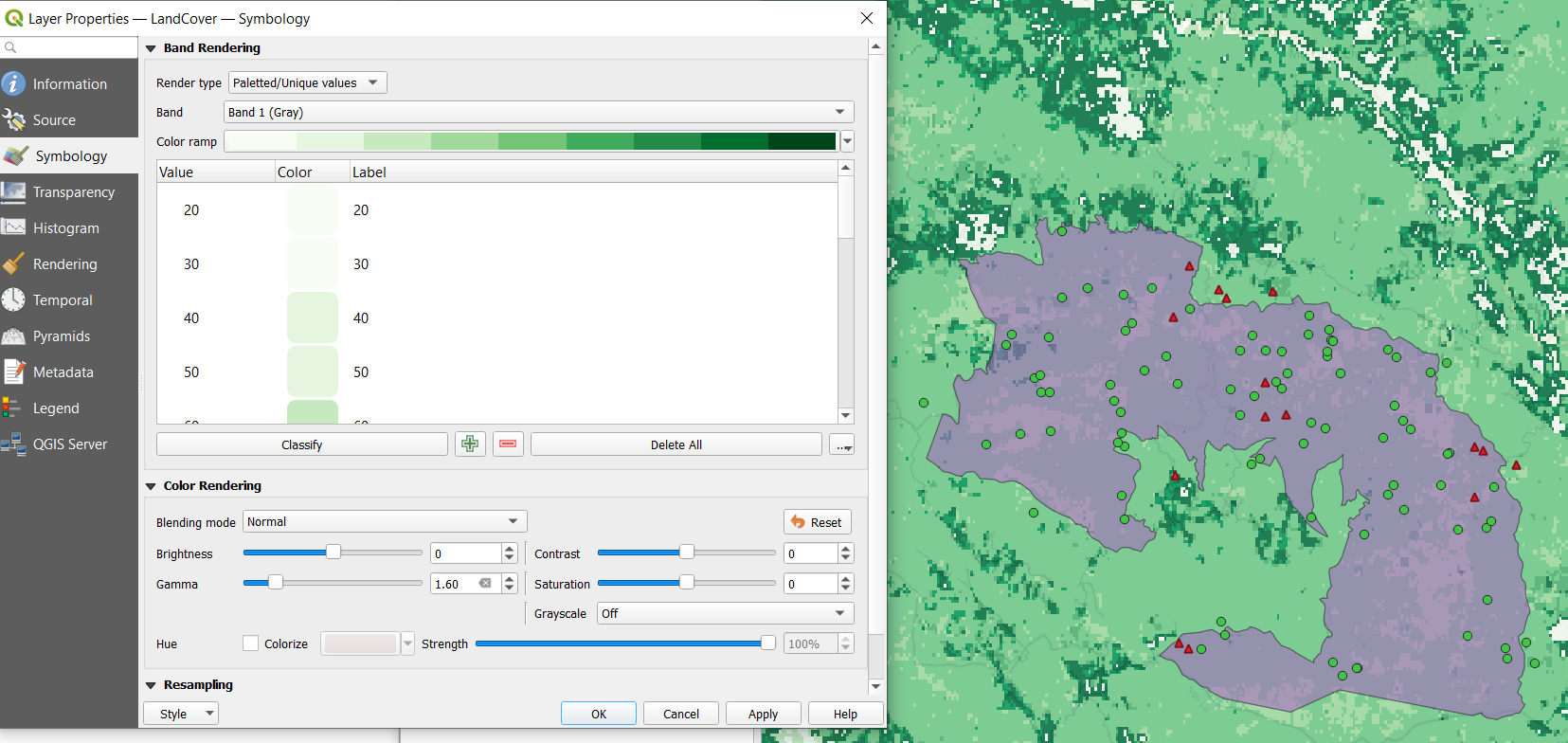
If you double-click on the layer to bring up the attributes table - head to the Symbology tab, on the left. Under “Band Rendering” you can play around with the render type, and choose the colour ramp as Continuous or Discrete. Use the “Classify” button to apply your options to the values, and the “Apply” button at the bottom to view it. You can have a play around with the various settings here. Here’s an example setup:
Ahh. Thanks so much. I had trouble understanding the procedure as they didn’t specify everything. I redid everything in several practices and gotten better in understanding it. I definitely couldn’t catch up in 1 time lesson. Need continuous revision.
it was really great to learn about the Data models actually and represent them in the project. every process was clearly explained I didn’t have any problem following it.
Hi Ana,
Thanks so much. I am grateful. I have downloaded them to use. I will revisit the module and practice again. You are a life saver and I am truly grateful.
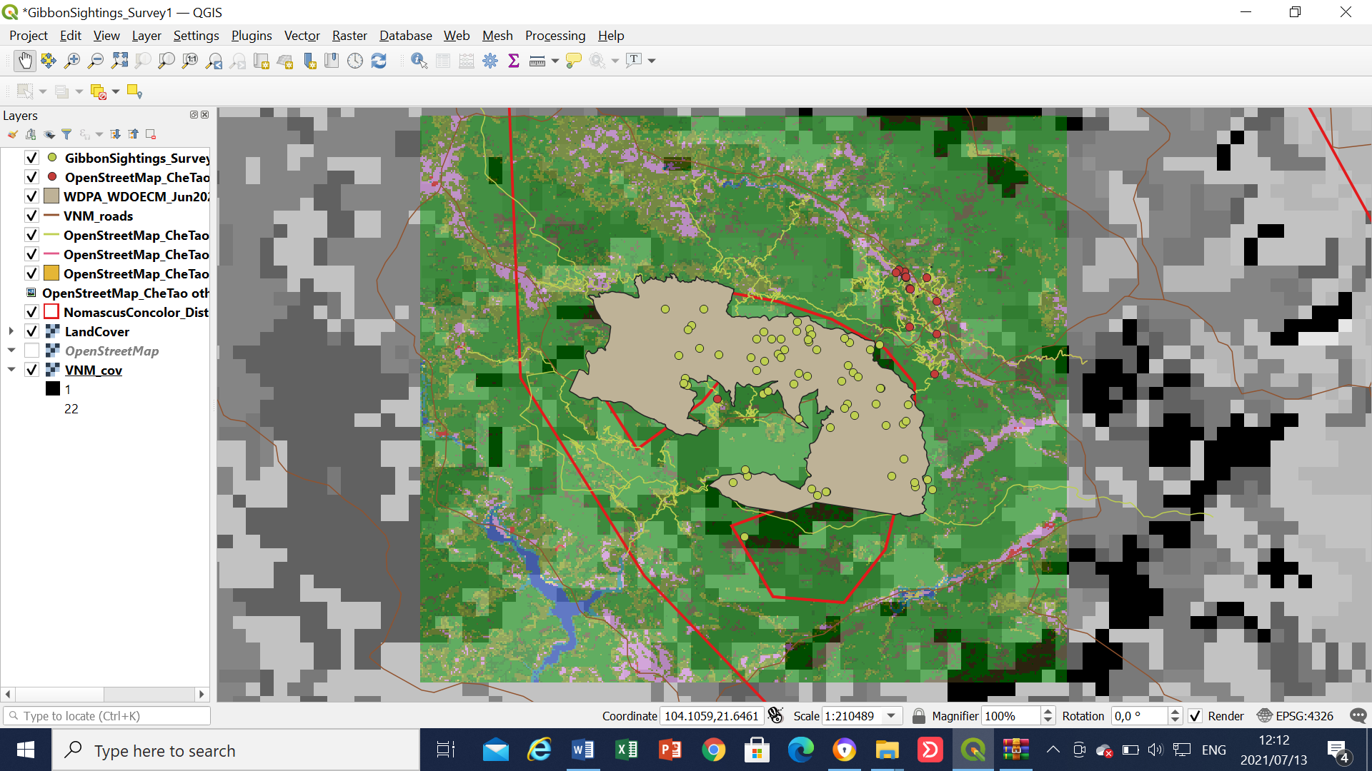
Hi Royner! I really like that you persevere, even if you don’t get it on your first try. And I think you did a great job, especially with the colours which are very visible on this background. Plus, I like how you decided to exclude the VNM layer from your representation, since I think it would be too much in your case. Keep up the good work!
In this module, I could understand the differences between rasters and vectors and how both can be used in the best way (extent and resolution) for representing different information according to the necessities of each case of study. However, it was very difficult for me to deal with so many layers.
The idea of doing different folders for each source is very useful! I will do this in the future with my data. However, I suggest that for the CheTao points, and in the future, simple forms are better than complex ones. Maybe you can try with points of different colors or others shapes.
Your map looks great. I think I struggled with the same issue. Especially because I do this in a public computer lab and I have to use different computers each time.
Hi Mates!
In this module I have learned the difference between vector and raster data layers and their application when making GIS maps. My major challenge on this module was to select or arrange layers in a correct order, but I strongly believe that with time that will also be achievable.
Hello Tamara, How is it going? !! thanks a lot for your words, I really appreciate your comment full of good vibes :’) It makes me feel happy about my work at this attempt, and it made me feel more confindent. I’m gonna do my best for learning and improving at using QGIS. I hope you are doing well at manipulating QGIS as well as reaching your goals. Take care and have a nice day
If you feel you have too many layers on the map and struggle to convery all the information within so many layers - create two maps The essence of a good map is to convey the message and the information you want to put across, so sometimes this is best done over several maps rather than just one. Using the GIS you can have all the layers in the QGIS Project, but you dont have to always display all of them in one go.
When it comes to producing the final “printed map” using the Layouts, if you think your map is too cluttered, try using two map frames side by side to show different layers for the same area, or the same layers for a broader “zoomed out” view and a more detailed "Zoomed in " view by its side.


 And I think you did a great job, especially with the colours which are very visible on this background. Plus, I like how you decided to exclude the VNM layer from your representation, since I think it would be too much in your case. Keep up the good work!
 !! thanks a lot for your words, I really appreciate your comment full of good vibes :’) It makes me feel happy about my work at this attempt, and it made me feel more confindent. I’m gonna do my best for learning and improving at using QGIS. I hope you are doing well at manipulating QGIS as well as reaching your goals. Take care and have a nice day