Nice presentation of layers
I think you just needed to change the layers properties and colors. Other than that it looks good. Keep the hard work!
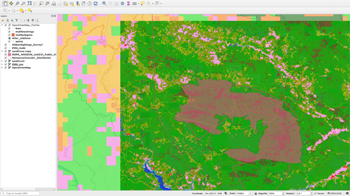
Thanks for that Laney! I went back and reordered my layers and even turned some off so that the picture looks much nicer overall.
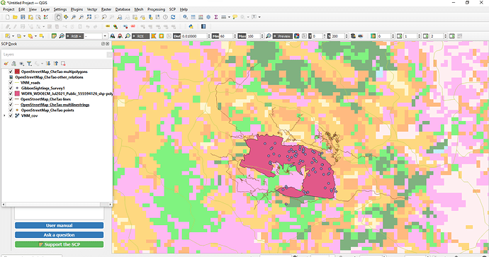
Hi there! I think your map looks really great, the only thing I would suggest is just zooming in closer to the study area so that the points are able to be seen more clearly (:
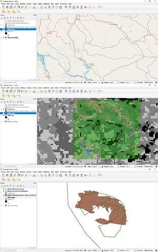
This assignment really helped me to distinguish between fine-grain resolution and rough grain resolution as well as extent. I have compiled an image of three screenshots to illustrate these differences in resolution between the roads from OSM and DCW; the fine-grain Che Tao Nature Reserve boundaries from Protected Planet with the corresponding polygon in the IUCN Redlist’s NomascusConcolor_Distribution layer; and the two landcover raster layers from Copernicus and DCW. I am struggling to illustrate this on one image though without it looking rough!
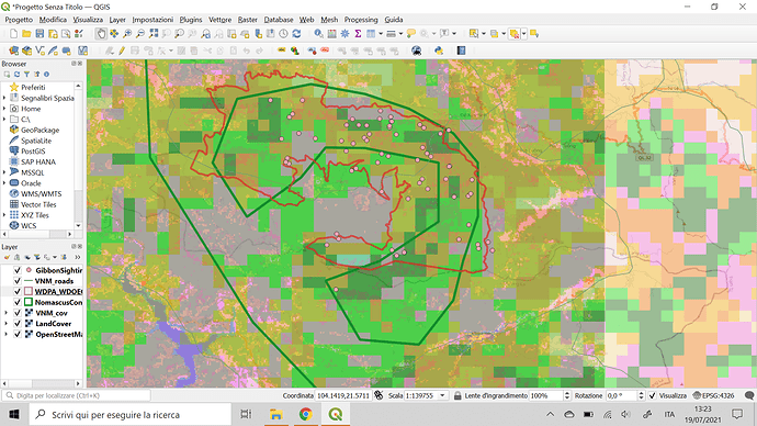
Hey @MariaELopez I also think that the amount of layers stacked on top of each other make it difficult to discern between the different layers, however, this is not your fault because we need to screenshot all the layers so other than that I like the colors and I think you’ve done a great job dealing with all those layers.
good job, the arrangement of layer looks nice because doesn’t cover all the important layers
Hello Dessiew
If you reorder the layers, it will improved their visibility.that is points at the top(GibbonSighting Survey),polygones(NomascusConcolor Distribution ) at the middle and raster layer(Landcover) at the bottom.
And also you didn’t add the Che Tao Nature Reserve boundary from protected planet.
I hope the visibility of apply in the properties of layer will be fixed by shrinking the size of dialog box.
Hi everybody,
This module was interesting but a little bit more complex for me, I am still not sure about how and where find the right data for my study and if I miss something important in the data reporesentation.
@Chiara The map looks good so far, you have found the transparency options and have got the layers all there.
In terms of finding the right data for your study - do you mean your study outside of this course ?
Finding the right data sources for your GIS work is always a key (and often time consuming) part of a GIS project - most of the time in GIS projects (about 80%) is spent in dealing with data issues, whether it is sourcing, cleaning or manipulating the data.
If you want to describe a bit of what type of data you are wanting for your study, then I can give you a few pointers in where to look. If data isnt available, then it is an issue of getting the data for yourselve from field survey or other methods.
Hope this helps.
Hi @JonathanGatward thanks for your feedback, yes my doubt is about the sources to find data such as land cover, habitats and similar, it happened before that I downloaded data sets about land use from two different sources (opendevelopment mekong and the data from a private owner) and the two were quite different, that change drastically the outcome of the study. So my question is more about reliability and if there are criteria we can use to identify the best data sets!
Hi, great job!
I find quite useful changing the transparency of the layer to be able to visualize all the layer, you can change that right clicking on the layer > proprieties > symbology tab > under the color bar there is a blue bar with the transparency / opacity.
I hope that was useful
@Chiara yes, data from two different sources often gives two very different results!. The key is picking the right data for the purposes of your project. Sometimes freely available data sources are only available at limited resolution or levels of accuracy. When you look in more detail (which a private owner may have done) you will get very different results of the data - either due to the scale it was sourced at, the survey methods used or the time/date of the data collection.
It is really important in doing any research with any supplied data, that you specifiy your data sources - and this is partcuarly an issue with GIS as the issue of scale and resolution is of key importance to the data.
So, when you are starting a GIS project and need to source data, have an understanding of the scale, accuracy and resolution of the data you are using. Landcover data can at an “opensource” level is often limited in terms of resolution (Landsat8 vegetation data is down to about 30m, but if you use UAVs (Drones) vegetation can be mapped down to 1cm resolution !).
Terrain data (eg. Height, DTM etc) is also available as open source from the USGS, but may be down to about 100m grid interval (not detailed enough to show local topgraphic variations) so on site survey or obtaining LIDAR data may be the solution.
The issue is about getting data that is “good enough” but for that you need to know what the data parameters are that you need to work with - it is all about the data, all about the scale and all about the appropriatness of the data.
Im afraid I cant be more precise as so much of it depends on the exact requirements of your work but hopefully this gives an idea of the things to look for in the data sets you are using.
That was my major challenge too. I think will be easy when we get familiarized with the program. Great job!
Hi, I love your map and the colour scheme!
The layers of your map are arranged nicely and I can see them all.
Great job Maria. I love your map, the layer were nicely arranged and I love the colours used.
@reasley awesome work.
In this module, we were supposed to gain a clear understanding of raster and vector data. While in theory, I understand the difference between the two types of data. In practice or execution, I am still not sure why we added some of the files to our map. I feel like they did not add anything useful to our map. Maybe that was the takeaway. Nonetheless, I found my map to be less concise and discernable after this module. I would be lying if I said that this module was not frustrating and that I didn’t have to restart my map. Once I got my files organized and into a special folder, the files and map started to come together relatively nicely. I initially struggled with figuring out the layers and which order they should be arranged in but I think I finally came up with an order that I can live with. My learning goal is just to become familiar with QGIS and this module definitely helped me gain more experience, deal with frustration within the program, and learn a couple of new skills/techniques.
Natasha, fantastic post! Thank you so much for taking time to screenshot and share the different types of data using our example from the course. Your post provides me with exactly what I needed to gain a much clearer understanding between raster and vector data. I too struggled getting my map to look aesthetically pleasing and feel like mine too looks “rough”. Honestly, adjusting the layers really helped a lot but I still feel like it is hard to discern anything tangible from my map. Keep up the great work. Thanks again for sharing!


