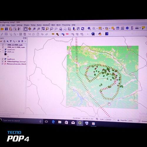
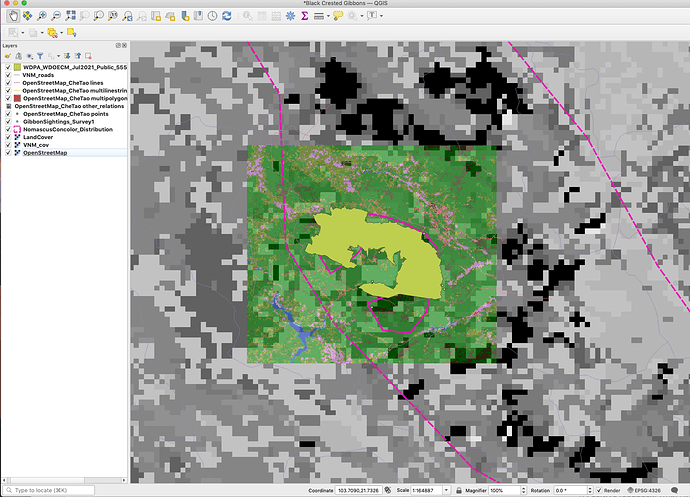
this is really nice man but I would recommend using various colors so that you can easily identify different layers. A green layer on top of another green layer may make it difficult to distinguish them
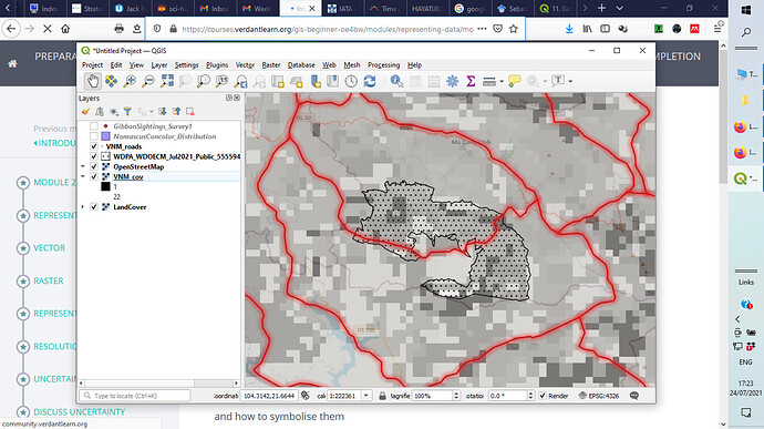
It is good to play with the OSM base map. Very useful to impose with multiple data in a single raster. But still could not know how to analyse the grain map tho.
Beatiful grain map, tho…
Regardless of the difficulties you had, the progress of your map seems fine. The layers inserted for you are good, you can modify the names from the layers menu and make them shorter. quiet, we are here to learn. 

Hi Natasha. Love your map where you are able to separate it. It look so great 
Great work. Faced a few challenges on understanding what vector and raster data can be imported but now am well knowledgeable
Inspiring indeed. But how come your screenshot looks smaller/
Nicely done. Kudos keep it up
You have tried but you ought to have zoom up/increase the font for clear visibility. Fairly Excellence.
I think you are heading in the right direction with your map. I cannot see the layers panel on your screenshot but if I can it could help determine how you can change your display. If you have all the layers uploaded try reorganizing the order of your layers and see if anything works.
I played around a lot with the order, settings (e.g. colour, width, transparency) and looked at the differences between the data sets. The two road and two land cover files do not seem to match very well. Also the IUCN distribution and the reserve boundaries do not match very well. The coarse scae data would not be very useful in my opinion for management of the reserve and the endangered species but could be useful for a global overview of where these items of interest are on a world map.
thank you, highly appreciated
This modules’ activities have contributed to my learning goal of re-learning GIS as it has been a couple of years since I last learnt how to use ArcGIS. Some of the terms such as vector and raster were familiar to me however I couldn’t remember the details and I found it interesting to consider the uncertainty that occurs during data collection and map-making.
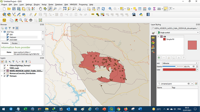
Hi CJ. I really like your map and that you’ve put a transparency on the WDPA layer so you can still see the layer beneath. I think if you were to change the colour on the Nomascus layer it may stand-out better. I also like the colours in your VNM cover. Well done, looks great!
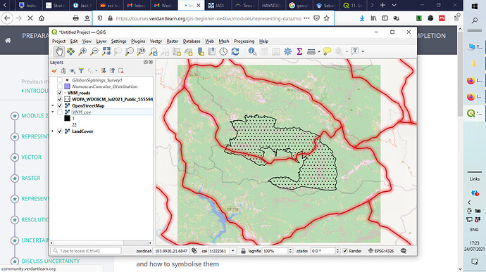
This looks really good! I like how neat it looks. One brief suggestion is that I would suggest including the dots from the Gibbon Sightings Survey, as each dot represents an individual gibbon sighting in the region.
As far as I know, organizing like “point, line, polygon, raster” is the best way to do it. One more way is you can use symbology of each layer as transparent to be visible for all layers.
In this module, I’ve learned Vector and Raster layers and their attributes
You have done good work. You just need WPDA_ polygon layer to add on and there is some plugin missing in your QGIS installing. Thanks.
Thanks Luis! I did but you couldn’t see them as they were underneath the WDPA layer haha! I’ve moved my layers around now, thank you for the suggestion 
