Hi Abigail, well done on your assignment! I like how you have visualised your datasets. I have also learnt a bit more from your reflection paragraph the relevance of each dataset 
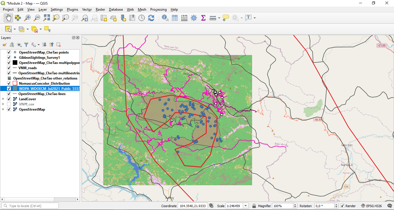
Nice map, I like the layering, However I think you could make the lines a bit bolder and more contrasted. It has given me ideas for some of the things I did not do on my posted map.
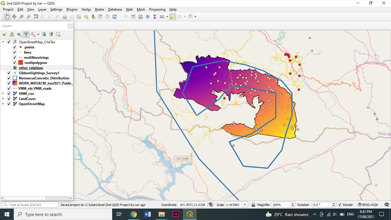
You may need to rearrange your layers
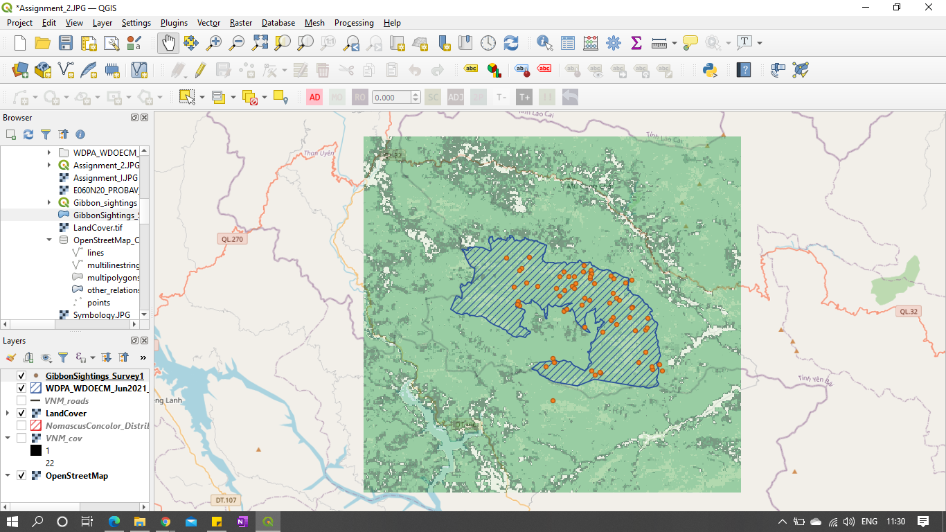
the gibbon sightings look very tiny may be you need to address the size settings
I like the 3D effect, helps sighting data pop out. I’d be inetersed to see the map at greater magnification - perhaps individual sighting data points would become even more clear
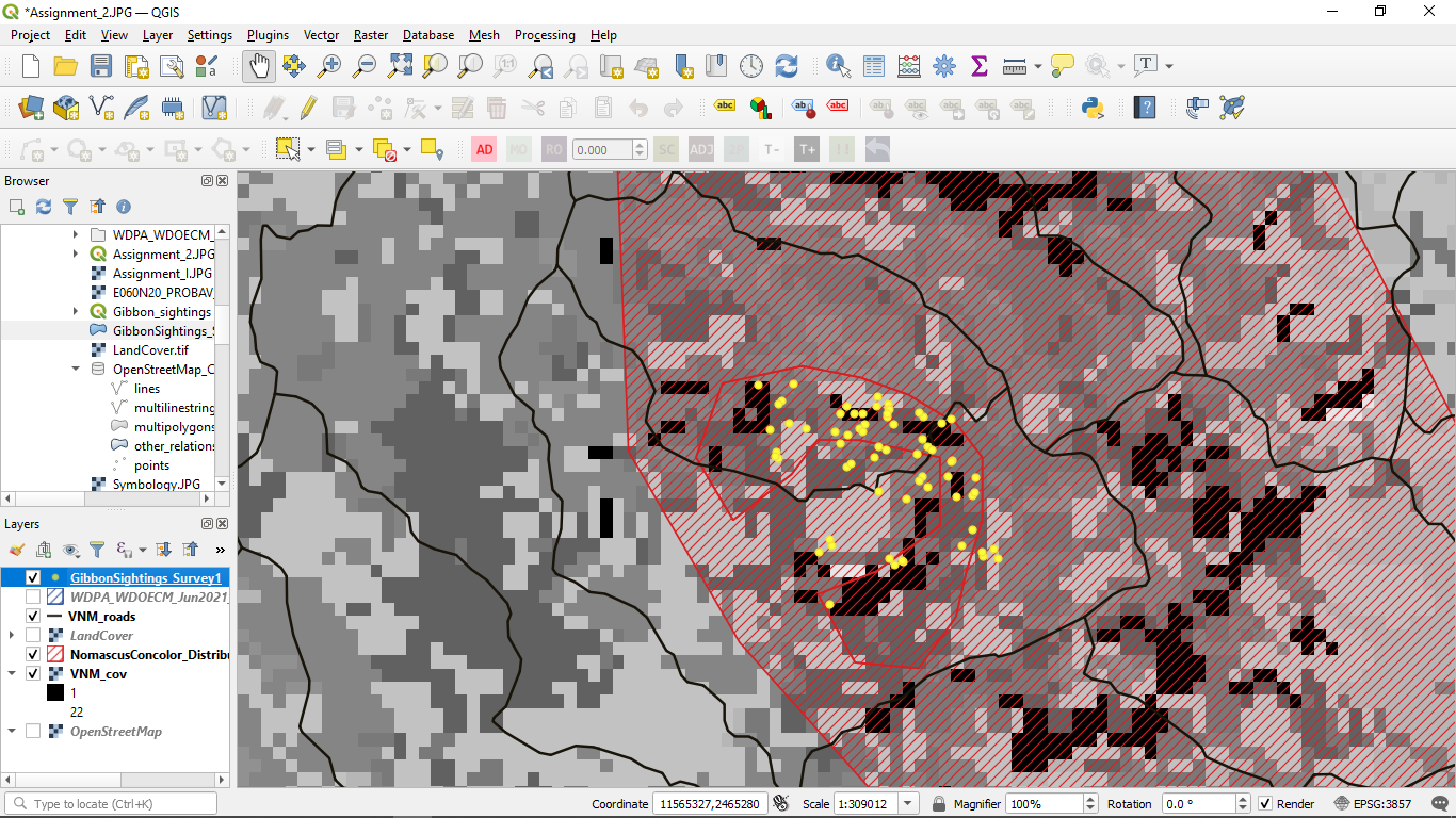
Your map looks great to me! Did you find you preferred greyscale or color for the low res land map?
Really cool how you played around with the settings to produce different looks, and in that way compare the data sets. I didn’t even think of doing that, and it’s so important for accurate presentation.
Hi!
Your map is amazing! I recommend you for the next occasion to work on the opacity of some of the layers, so that all of them can be appreciated in a better way
Greetings!.
1 Like
Hiya,
I think that some of the layers are included so that later on, you get to choose which layers are important to your map’s message. For example, I imagine that in the field you may have lots of layers of data which you could use to create various different maps. In this example, perhaps the end goal would be just to show the size of the gibbon groups within the Nature Reserve area so you’d only include those relevant layers. Or maybe, you would want to show where those groups are in relation to the threats they face and therefore would add the Threats layer on the map too. (This is what I did on mine). So, I believe it is to help you decide what layers are important for your particular map.
Looking great so far, keep working through those frustrations, ask for help if you need it and good luck 
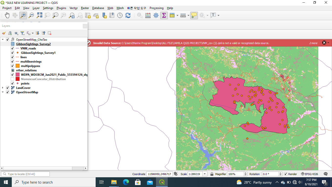
Your map looks goods. u really arranged the layers well. I like the you have used different colors to plot your map
Hello All,
In this module, I understood the difference between extent & resolution and how to identify whether its a spatial or temporal data.
-
High-resolution spatial data
-
Low-resolution spatial data
Thanks & Regards,
Rutuja
1 Like
Hello @Kingsleychekwube,
I liked how you have represented the boundary of the vector shapefile of National Park. Here, if I am not wrong you have put one high resolution raster layer of the area, two low resolution vector layer of national park boundary and roads. I would suggest try other combinations as well by keeping base layer as open street map and compare roads layer with it, etc.
Thanks & Regards,
Rutuja
Initially I found this module quite difficult but once I started playing around with the different layers and the order of them, things became a lot clearer and now I finally feel like I understand the difference between raster and vector data and the different ways they can be presented. This is how I ordered my layers. I left the VNM_cov layer unticked so that the final map was less cluttered and easier to look at.
2 Likes
Hi Rutuja_Bhatade.
Stunning maps! I really like how you presented the two maps for this assignment, the clearer, high resolution one and the more cluttered, low resolution map. Great idea to share both so that the differences can be easily identified.
Cheers!
1 Like
Good Work. was very interesting you share with us the two maps, help a lot to understand the difference and in the practice how they look. regards
Yes, i agree with you. More detail will be helpful to fill in some gaps so we aren’t spending too much time figuring it out.
I like what you did with the data btw.
Dear Dessiew.It is wonderful job. well done.
Hellow.
As i said earlier am not here and am not doing this so that i can get a certificate am repaeting this course because i didnt understand very well at the time it was rileased.i had difficult time to copy with the how it moves.
Now i get used to it.especially this assigment.as it equip me with new skill as i am able to manimulate datas
I finally got it in module 2 the second time around. My first output was so far from this and I could really see the big difference. In this module, I finally understand that raster and vector layers affects the image of the map. I really tried my best this time just to make this output. And the best thing I develop aside from this is my patience and attitude towards things sometimes I cannot understand. I took some rest before finishing this and yeah, regaining my energy was the best action I did because I was refueled to work on this module again.
I can see the progress on your output and I was touched by your perseverance to finish it. This is nice that in spite of difficulties you are still eager to learn. I think that its something that inspires me today. Your work and your attitude while working it.