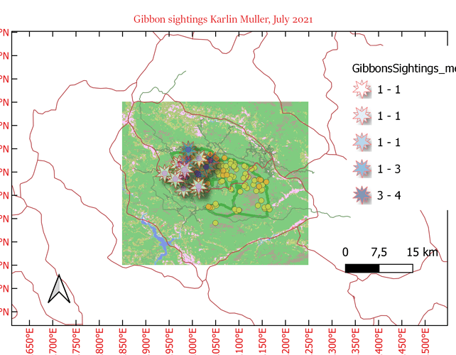
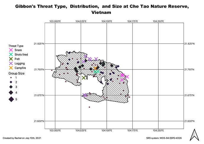
My first ever QGIS map! A little rough around the edges, but hey, my main goal for this course was to get to know how to use QGIS as a tool. I have gotten to know the basics and will be able to expand from here hopefully into my own projects in the future.
Wow! this map looks great, easy to understand and follow from with the colour coding. Well done!
Hi, thank you so much for your comment and suggestion. I will definitely do this in future 
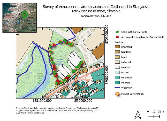
Here are my maps!  Interestingly, the biggest problem I had, was with determining grids. Once I finally figured that out, everything else was just playing with the features. That’s why I wanted to try again with my own data which is in a different SRS. The biggest difficulty I had there was with setting the proper map scale (still not sure if it’s the right one). On my second map, I wanted to present the ID points from a bird survey we did on a field trip a couple of years ago in a Nature reserve in Slovenia. I have also included some land-use characteristics as well as waterways that are important to these birds. Another problem I had was when I wanted to insert the OpenStreetMap for Škocjanski zatok. Since I didn’t have the XYZ URL to insert it in the QGIS, I tried downloading the map. But that also didn’t work.
  So instead I just used the map from QuickOSM. If anyone has any advice for me, I would truly appreciate it!
Hi Veronica! I like your color scheme; points on the map are easily identified. But I see you had similar problems as I did with setting grids.  Maybe next time you can try a bigger interval to have a smaller grid on the map? Or you can increase the scale so that your degrees do not overlap, as they do at the bottom of your map. You can change this by going to item properties > main properties > scale. Hopefully, this helps.
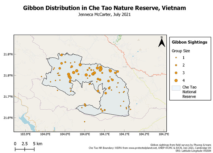
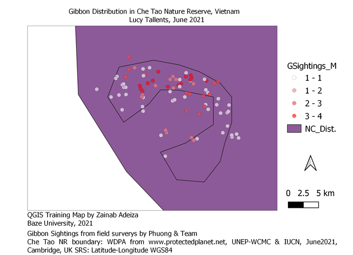
Here is my final assignment - I decided to just focus on the group sizes. This module was really helpful in learning the map layout process in QGIS. I do still have some questions about adjusting map extents while in the print layout (in arcmap you can just zoom in & out to adjust the extent being displayed in the print layout view & I couldn’t figure out how to do anything similar in QGIS). I was going to include a greater extent map, but because I couldn’t sort out the zooming while in print view I had to scrap that.
Hi Anele! Back in the map view, you can do categorization by selecting the layer you want and then right clicking & going into properties. If you click on ‘symbology’ that is where you can change how your data is displayed! (in this case, you’d change it from ‘single symbol’ to ‘categorized’ in the drop down menu)
This module was extremely useful because I finally know how to create a map with all the items needed to make it easy to read. I had some trouble adjusting settings such as font size at first, but once I figured how to do it, I didn’t have any more problems. Now I feel like I can create maps on my own.
I’m really happy with the end result and can’t wait to apply everything I’ve learned here to my own projects!
Hi! I really like how you used the basemap and created the inset map to give a wider view of the region! The colors are also very nice and make it easy to identify the features you’re showing. I also like how your labels have a frame, I’ll go edit mine and add that right away!
- I learned how to create a map with the different characteristics that need to be present such as labels and scales. I think I can now create maps for my own data, the instructions are easy to follow and I can’t wait to keep exploring the different functions of QGIS!
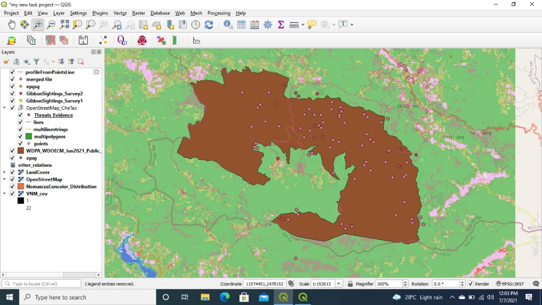
This is by far my most challenging module. I was unable to download the Che Tao data from Protected Planet and I got a bit confused when my map kept on looking different. But as soon as I realised why, it was smooth sailing from then on (I had to stop and start several times 
 )
)
As a beginner, I thoroughly enjoyed how easy it was to follow the steps and get results. I know I am far from perfect but this foundation has given me the knowledge and confidence I need to learn more on my own as well as prepare for the myself for the next phase of the training.
I will also like to say than you to @LucyTallents @Victor and @anaherrerav for all the assistance and support along the way.
Great work. I suggest you be careful with the items that are out of line of the page, because when someone prints out this map, some items won’t be seen.
@anaherrerav You have an amazing map, have you been practicing a while? I will like to learn more, I hope to reach out to you when if I get stuck. Well done!
I was unable to use the data you sent me. The internet here at my institution (Baze University, Abuja-Nigeria) is somehow incompatible with the Protected Planet but thanks again. 

Thanks.
I’m sorry to hear that you were unable to use the data. I hope you find something else to solve this situation. 
I mused what was available. I am more than happy to learn the techniques so I can use if for future data sets. And I really learnt a lot. I don’t feel like a beginner any more.
Wow! Everyone’s maps look great!
I didn’t have a lot of time to do extra. I was also struggling with how to get the scale showing correctly and it still wouldn’t work, so I just had to leave it out for now. I might have to update QGIS. Did anybody else struggle with the scale part?
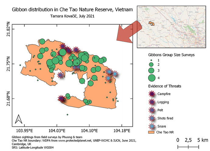
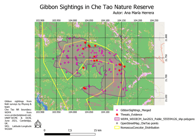
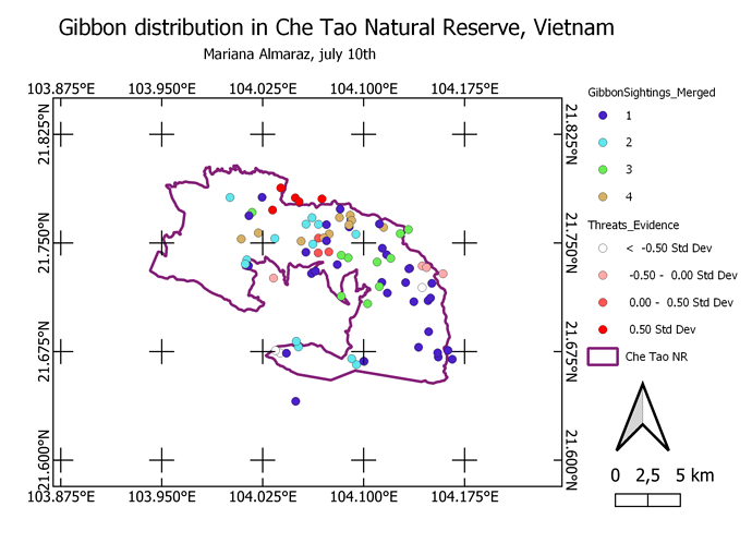
This is my map: It shows the study area, gibbon sightings and threats evidence. It was very useful for me to learn how to construct a map step by step. Still have some problems understanding the categorization o symbols and how to choose the grid for the map.
This one looks great! It’s very complete and organized. I see you differenced the types of threats, which is what I missed.
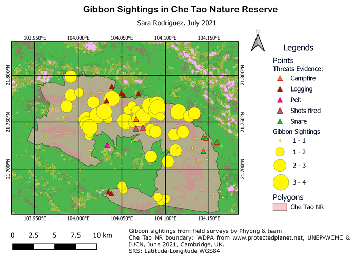
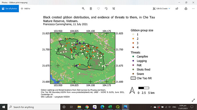
I found this final module very useful as it helped me think about what I wanted to show. I may have made the map a bit overfull but working in conservation I wanted to highlight the threats to the gibbons as well as where they are found. In a publication this would probably be better to show as two separate maps to not end up over crowding things as I feel my map in this example is. However, for learning purposes it was really good for me to think about what to show, which layers to include and which ones to have in the legend.
