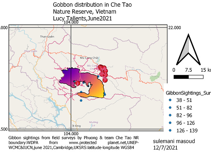
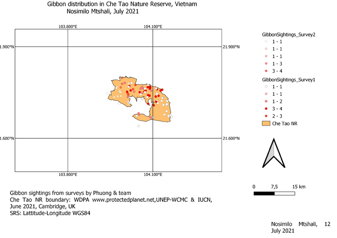
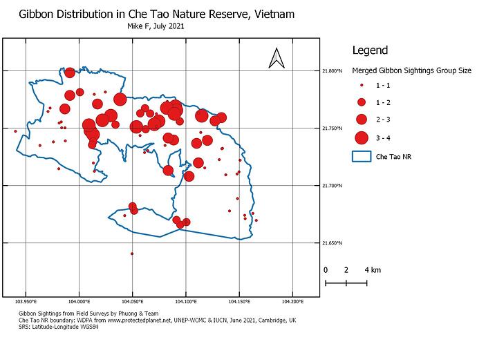
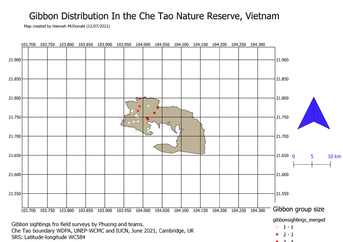
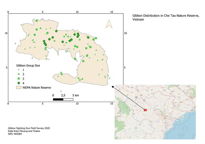
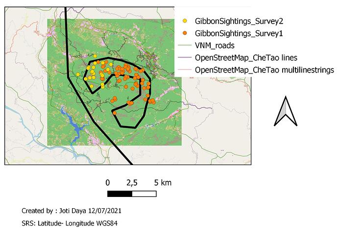
Great to see you have used your own data! I did this excercise with the gibbon survey points but must get back in there now and go through it all with my own data to make sure I cna make it all work!
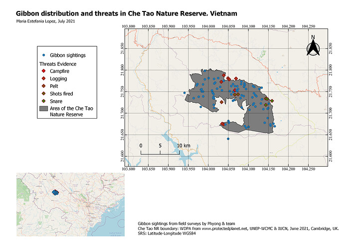
Great map, clear and easy to look at. I did the same as you as I thought the overlap between the gibbons and the evidence of threats to them was really interesting and the sort of thing us as converationsists are so concerned by. I like the way you simplified the image by removing any surrounding map to the Che Tao Nature Reserve as this still shows all the relevant information but takes away the clutter that I feel my map has.
I really enjoyed this module! I learn how to display different layers with a purpose and in an organized way for delivering a clear message. I struggle to try to add a second map but in the end, I was able to do it. This definitely gives me the tools to improve the way of representing geographic information in the future!
Your map looks great! I also want to include the threats to the gibbons in my map as well as the localization of the groups in the reserve. I also like the way you put the lines of the coordinates because I think that is less distracting than the solid lines.
Hellow everyone.i think i am the last one to submit the asignment.it was a nice training for me as a beginer.but this last one was very complicated to me.i hard tought situation to understand and to make it.please next time make sure that you create atleast a video clip showing how things goes it would be simple .thanks in advance
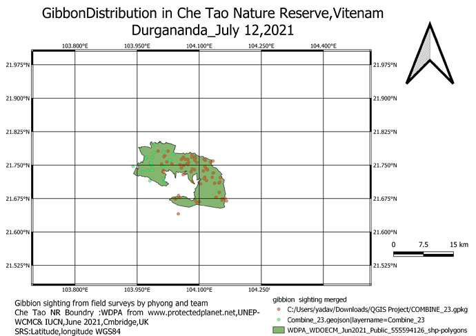
Thanks Edmund! The cross grid was not my first choice but I couldn’t click on the option I wanted - I think there was a glitch on my software.
This module has helped me design a map that I was not perfect at. Learning new things Day by day has been great. In comparison to other modules, this module was quite exciting as we had to lay out a map which is always good to get the result of your data.
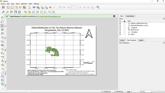
And here is the evidence of my work.I enjoyed doing this module.
Hi, Your maps look Great @MariaELopez the colour mixture and the good representation of the attribute make it nice and clear.
Hi, Justine.
i love your work, everything looks clear to understand
A good exercise to come up with a final result. It actually exposed an issue as I hadnt merged the layers properly in the previous weeks assignment, and only picked that up when adding the Legend for this weeks map. So I went back and did it properly. Not sure how that happened but all fixed now. Overall the results from the GIS work are good but I find some of the steps to be quite cumbersome and the editing of map features arent very user friendly. Not sure if this is because QGIS is freeware and if it was sold the creators might spend a bit more time on this. Ill just need a bit more practice to get used to it and it should get easier.
Quite elaborate icons for the threats there. But they certainly stand out. I like the inclusion of the background street map, I tried it with mine but my map looked too busy so removed it, but with yours it looks good. Did you reduce the opacity of the streetmap at all? Also well done on the insert Map, I also tried it but couldnt find how to lock the layers between the two maps, so the gibbon sightings overan the smaller insert. I ran out of time so decided to just remove it.
I’m not sure why my map has so few sighting data points (when I converged the servey files I had checked there were the right number of entries but perhaps I missed something). Otherwise I think I have started to become familiar with these functions.
It is easy to work with symbology and labels in the legend print page. It is also easy to manipulate the scale. The process of adding inset map is now clear.
In the print page, I struggled with pan (moving map area). Adding grids was also a challenge. How do you decide on the grid intervals?
Open Source data is a useful data layer to have. I would like to know to extract data from Opensource files.
Nice grid,maybe you need to zoom in a little bit more. Also more the legend so that all the map elements are evenly distributed in the map page.
Nice grid. Maybe you N arrow is too big relative to other map elements. In layer properties, you can change symbols and labels easily.
Looks so neat.
Well done
This was so interesting.
Mine looks very much different. However i will play around more to get it to the correct way it should be . I will definitely incorporate this into my work in the future
@mafuza_maya HI Mafuza, there are various ways to download a whole variety of open source data, but if you are refering to downloading of the Openstreetmap data, you can use https://planet.openstreetmap.org/ as a way of downloading entire areas.
There is also a QGIS plugin called OSMDownloader which allows you to download OSM data directly within QGIS for the area you are looking at.
Once the OSM data is downloaded, it can be loaded back into QGIS as vector files, from which you can filter or extract features that you want to look at.
Certainly the process of editing features in QGIS is a bit more cumbersome than other commercial packages such as ArcGIS / ArcPro. The way QGIS was developed from different opensource “add ons” means that the Print layout manager is not as fully integrated in to the workflow process of other QGIS functions as it could be - Elsewhere I have commented about the differeences between ESRI ArcGIS products and QGIS, and the main conclusion I came to is that you can do pretty much anything in either of them and come up with identically looking results, but the workflow and efficient working is so much better in ArcGIS (but you have to pay for that!).
