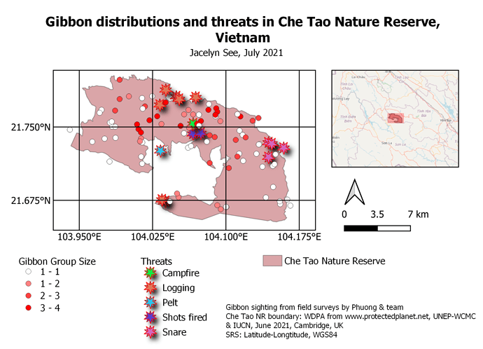
I really like how you have given extra context to your map by including the zoomed out map of the surrounding region. I am not sure how to do this and would love any tips on how I can include this in my map.
I really enjoyed this part of th course but did find it quite challenging. I ran into trouble when trying to recover my maps after saving them, but then discovered you can recall them by going to project > layouts.
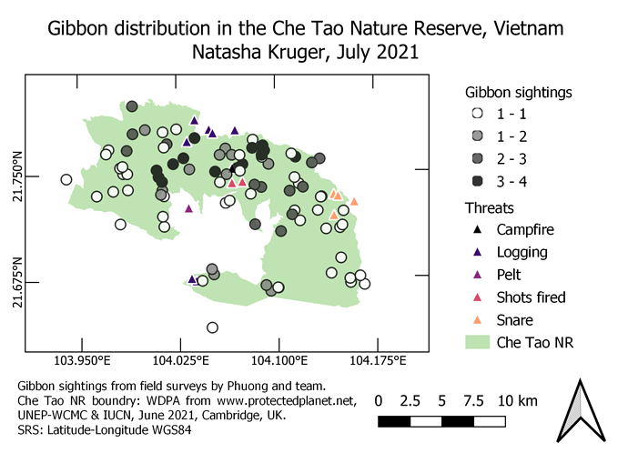
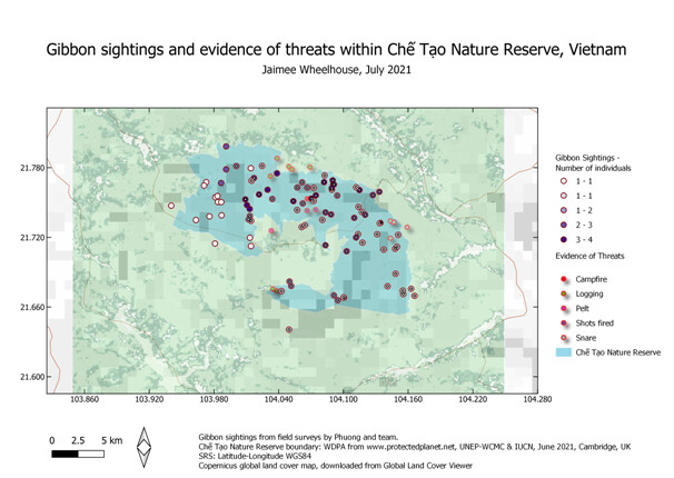
My map is a bit too busy, but it is trying to demonstrate where gibbons were sighted in relation to known threats.
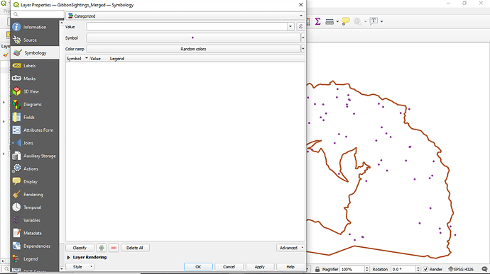
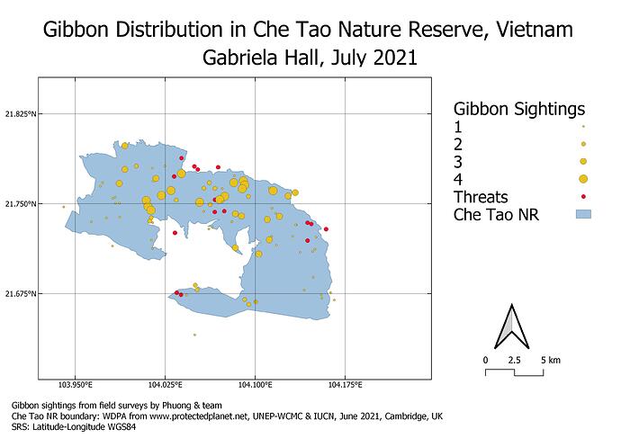
Here is my exported map! I can follow all of the instructions except the categorisation of the data.
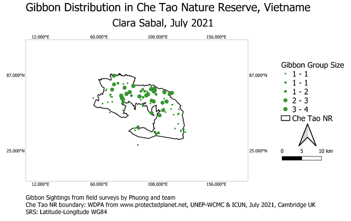
mine is like this: why there is nothing in the symbol/value/legend box? so that I can’t choose the column I want to symbolise. Would you help me tho solve this, Lucy or anyone? Thank you.
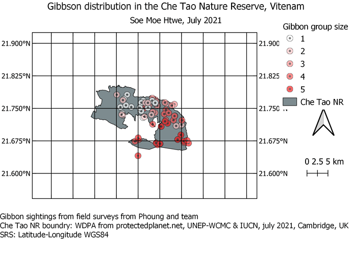
Waaw! great to see this. you add the smaller image of your map on the right top. I think should do that in the future more make the map/survey location more clear.
However, I think it will be great to take out the grid line on the maps, or make it thinner. because is a bit crowded and may distract from the message of your map with unnecessary detail.
@alex_S - Nice looking map  - the only thing I would suggest is remembering to alter the layer names from your initial QGIS map Layers Panel so they have something more meaningfull to the user of the map. Chaning the layer names in the layers panel doesnt alter the actual file name, just the way it is displayed within QGIS, and whatever the name in the Layers panel of your main map window, this will be what follows through in the Legend of the map layout (eg “Gibbonsighting_survey2” could just be “Gibbon Sightings”)
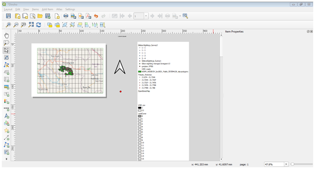
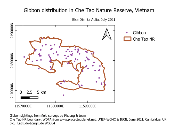
It is not easy to bring the scale and sill I am stragle on it.
Thanks @Tandie . I’ll be honest, I am a novice at this and even after following the instructions, it took quite a bit of trial and error playing with the settings for the various components to get them to look as intended. I see JonathanGatward has replied to your message and offered some help, reach out to him as I believe he is quite experienced at this.
Please give some comments. I am sure that I miss some point and different with others map. Even the module has ended, I am sure that I need to do reflection from the previous studies and do more practice. Thanks
This was really fun to make. I like the final result and I definitely learned some useful skills that I can now apply to making my maps in the future!
Hey @dianita_els I thinking the solution might be to use your merged layer and then click on “value” choose “groupsize” and then click on “classify”. I think this might solve it. Otherwise I really like your colors and map overall. well done!
I just noticed that my categories weren’t clearly defined so I just adjusted them in the image below.
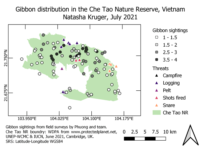
@Natasha_Kruger Good clear map.
Some comments though, probably best to have your “interval” for the scale bar to be 5 divisions so that it breaks naturally at 0, 2, 6, 8 and 10Km or 2 divisions so you have 0, 5 and 10km.
Also, while I see you have adjusted the categories for your Gibbon sightings, I would make sure these go to integer (whole number) values (unless of course there has been some massacre which you are trying to convey and you are identifying “part gibbons” !).Given you have a maxium of 4 sightings, and you have 4 categories, you could have “unique classifications” or you could label the classifications just as 1,2,3 and 4. This makes more sense than a sighting of half a gibbon.
Otherwise a good map.
Hello Dessiew you have done a great job, but you did not indicate the source of your spatial datasets and adding a north arrow up to indicate the orientation of your map with respect to the magnetic poles and also drawing coordinate on your grid.
@fekadulema All of the elements you want to include on your map (north arrow, legend, scale bar etc) should be included within the white “Page”.
It seems as though you have expanded the “map element” too much so it covers the entire ‘page’. If you reduce the "map element’ size, then you will have room for the legend , north arrow and scale bar next to it (or underneath it).
If you want more room on the “page”, you can alter the page settings to a different size. Normally it defaults to A4, but you can specifiy the page size to be anything you want (A3, A0 etc).
Here is my map for module 4.
My map is showing the distribution of Gibbon using sighting combined from the two surveys and the threats evidence recorded. Took some times to figure our the grid intervals and the srs. The module is fun and easy to follow through!
@jacelynsee Good looking map. and nicely laid out on the page.
Just a couple of points to improve the “cartography” of the map;
The scale bar can be adjusted both in terms of the intervals and its “length”, so better to have whole number divisions and adjust the size or specified interval to something “neater” (eg. have intervals at every 5km so you have 0km, 5km and 10km.)
The Gibbon group size categories are a bit miselading (eg. if you have 1 gibbon sighting, is it in group 1 or group 2 , both of which, as written, include “1 gibbon sighting”).
In this instance, as there is a maximum of 4 sightings and there are 4 categories, you can change the legend text to be 1,2,3 and 4 or change the classification to be unique values.
The message of this map was to show the distribution of gibbon sightings in relation to their known threats within the Che Tao Nature Reserve in Vietnam. This module has helped me get even closer to my original learning goal because it detailed how to create a functional, exportable map with a legend, scale, and grid system which I can apply to my own future projects.
Hi Jacelyn, I think you did a wonderful job on your map! I really liked how you were able to differentiate the different types of threats to gibbons. How were you able to do that, was it difficult? I will definitely be applying that to any of my future maps that will need it. Your inset map also looks really good. One of the things I would change would be the color scheme of your map. The colors of the polygon, gibbon groups and some of the threats are quite similar which I think negatively impacts the overall readability of your map.
Finally managed to complete Module 4, It was the most demanding of my time compared to the others. This module covered a lot of the finer details of map making that I hoped to learn. I struggled a bit in the beginning with the Grid line but I managed in the end. I learned a lot in this course and feel a lot more confident using QGIS.
The size of your map reminds me of my own, I feel like it could be bigger. I really had a hard time zooming in to make the map the right size.
