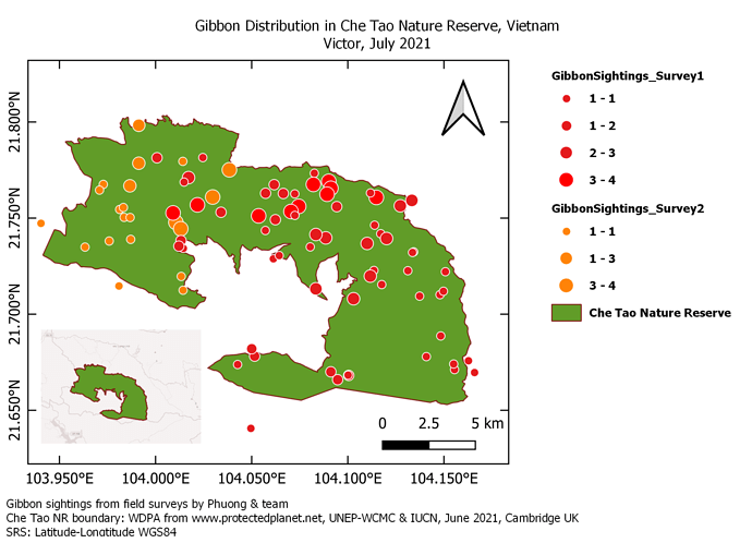
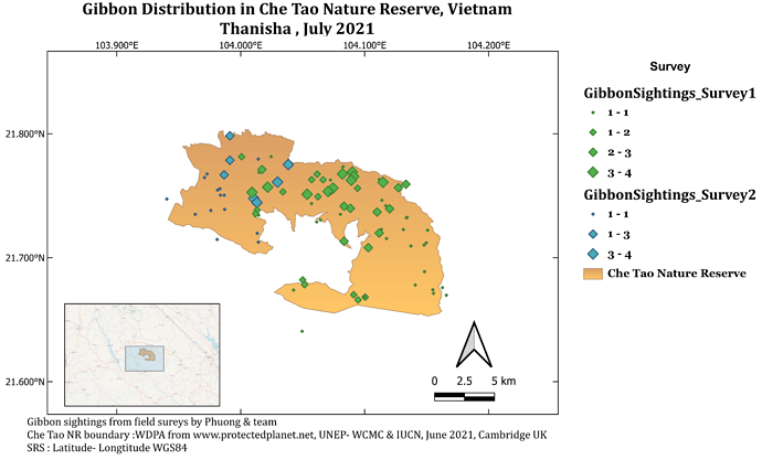
Nice work. Your use of the second map to indicate where the first map is coming from is very good. I will also try to do so on my end.
Hello Lito_Bagona. Your map is beautiful!
I liked the way you categorized the caption information.
Good work.
Thank you, Oladoja_victor.
Really the use of the second map is very good.
Good work!
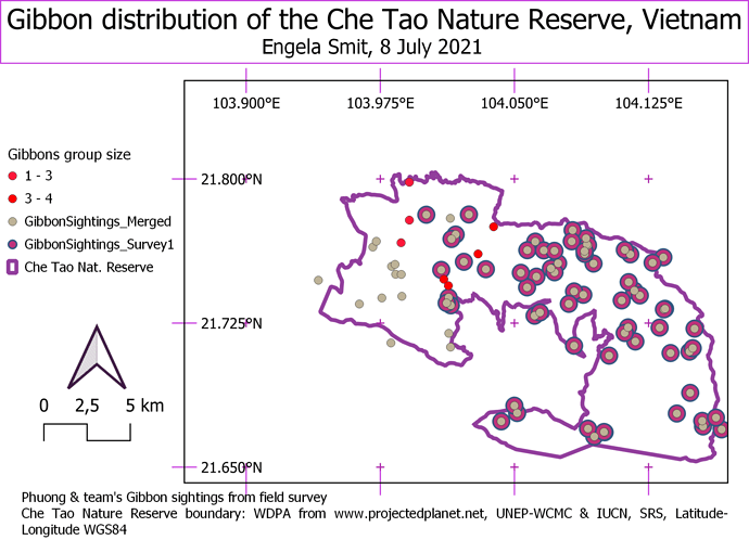
I found this challenging as it took me some time to playing with the sizes and grids around but is knowledgeable to finally come out this fine piece.
It got me excited to know how it can be done!
Cheers
Hi, Your map looks great!! And you added the inserted block too, well done!! How did you get your group size symbols to all be the same? And which layers did you include.
This weeks module was a bit more challenging than the previous weeks, but I felt like their was more space for being creative. I learned a lot during these few modules and am so glad that I enrolled in this course!
I really enjoyed this module. At first, I struggled with adjusting the grid lines but after a few tries and tweaking around, I finally got it to look presentable. I had some problem with exporting the map too. Turns out I accidentally ticked “Exclude page from exports” from the “Item Properties” panel in “Page Properties”.
I guess when it was initially just in the software, the grey area appeared very unclear, hence the arrow. But in it’s published form, it appears much clearer. Thank you for your feedback!
This was the most difficult but quite interesting module of them all. Just glad that I was able to create my first ever map, now cant wait to start looking for shapefiles of areas within my own country. Was stuck with how to change legend information still have to work around that if there is someone who can assist will aprreciate the help.
I love the colour contrast in your map quite beautiful
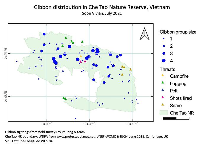
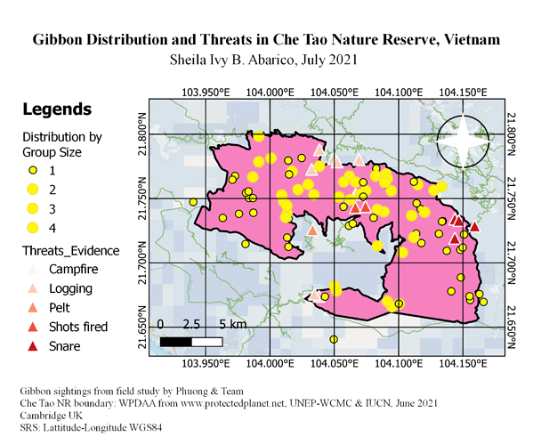
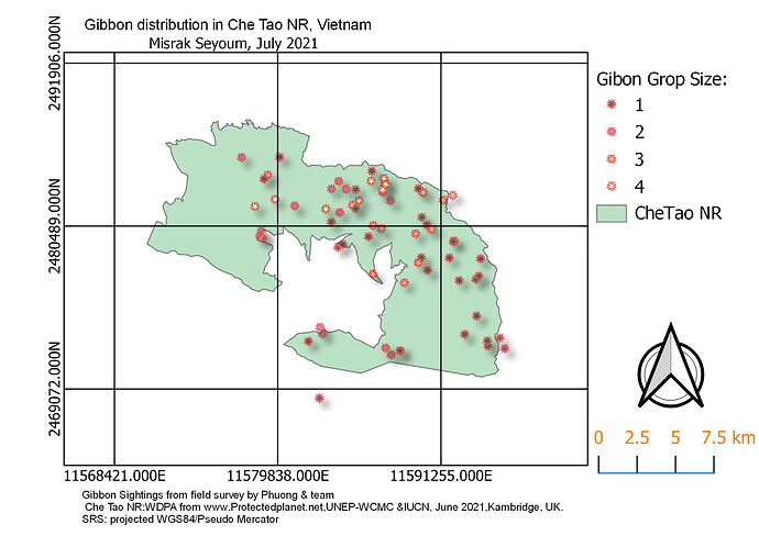
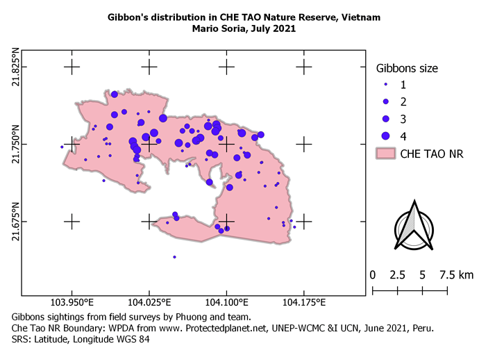
By engaging in this kind of online courses is a good practice and a great opportunity to us students to practice our skills in new things that may influence and used in the future. Above is the map where I made by days that shows the distribution of the Gibbons by group it size together with its threats that being encountered in Che Tao Nature Reserve. By doing this I experienced such emotions and great feelings because of the steps given in the module of this activity. Instructions were clear but sometimes it made me confused how to used it and to move such things but still I used in using the QGIS and maybe in the future studies and research, this might be a good help where I learned so much things from those modules that surely we can apply to other projects in the future.
I found this module very helpful but also very challenging. One problem I encountered was I could not change the legend to anything other than a range. Even when I double clicked the specific intervals and changed it manually as suggested, the values would always change back for some reason. Additionally, I could not change my arrow to one other than the default. No matter what I clicked, it never showed the new image on the map. Other than that, the instructions were easy to follow and I found very helpful.
I like your map. Its very clear what each point represents, and it is not too “busy” where it distracts from the message.
What I do when creating a new map of a study site is I add a layer using google maps. When you start a new project, follow these steps.
View → Show spatial bookmarks → right click XYZ Tiles → New connection → Name whatever you want → paste specific URL
When you get to the paste specific URL portion, you can paste one of these URL’s depending on what type of map you want. Then just zoom into your study site. Unfortunately if you want a border around the study site then I think you will have to create one yourself, which I do not know how to do. I got the instructions from this helpful YouTube video. https://www.youtube.com/watch?v=7X4KogKh_pQ
Google Maps: https://mt1.google.com/vt/lyrs=r&x={x}&y={y}&z={z}
Google Satellite: http://www.google.cn/maps/vt?lyrs=s@189&gl=cn&x={x}&y={y}&z={z}
Google Satellite Hybrid: https://mt1.google.com/vt/lyrs=y&x={x}&y={y}&z={z}
Google Terrain: https://mt1.google.com/vt/lyrs=t&x={x}&y={y}&z={z}
Google Roads: https://mt1.google.com/vt/lyrs=h&x={x}&y={y}&z={z}
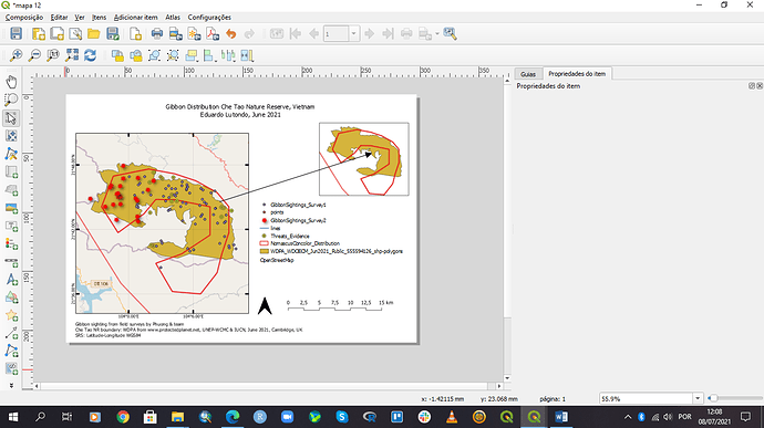
This week’s module was challenging and informative as well. I have been trying to work it out for days. Happy to say that I finally did it even though I could present it more creatively. Do let me know which part can I improve more?
A big thank you
This online online courses gives us students a learning opportunity to practice our skills by creating new things that may be quite vital to us now and in the future. The map above shows the distribution of the Gibbons by grouping its size together with its threats that being encountered in Che Tao Nature Reserve. I experienced such emotions and great feelings because of the steps given in the module of this activity. Instructions were clear but sometimes it made me confused how to used it and to move such things but still I used in using the QGIS and maybe in the future studies and research, this might be a good help where I learned so much things from those modules that surely we can apply to other projects in the future.
Hi @gelo Your map is beautiful, excellent work. The information are very clear and easy to read.
Great Job !
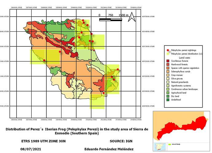
My map reflects the Distribution of the common Perez’s frog (Pelophylax perezi) in the “Sierra de Enmedio”, my personal study area for my master’s project: A mountain area in southern Spain
You can only find this frog in a couple of pools in this dry area (southern Spain)
I will include my personal observations of this species from my personal database and will compare the distribution to land use of this study area.
The objective of this map combined effort in field work with the use of GIS, in order to reflect the distribution of this amphibian at a smaller resolution than that found in national atlases.
To create the map I had some problems with the size of the legend! but finally after a lot of “trial and error” I managed to adjust the font size 
This module helped me a lot to be able to make my maps in Qgis, although I had some problems especially in how to classify the data, but it was very useful, fun, thank you.
Looks great your map, How did you make that reference box appear at the bottom left?
