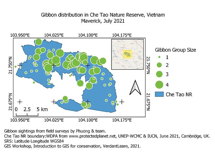
I like your map, well done! Although the graduated colours are good, I wonder whether they perhaps portray something informational about the NR, which isn’t the case? I think using colours like that might suggested a gradient (like soil type, or relief) which isn’t the case here, so I might have stuck to a single colour instead. The insert is great and everything else is clear and easy to understand.
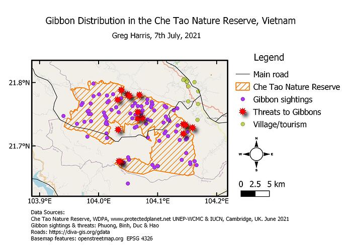
The background of your map is great, clear and easy to understand. I wonder whether some of your symbols for the sightings and threats are too large - the overlap means that it is difficult to interpret and makes the map look very busy. I’d try to make the symbols smaller so that the map comes across more simply and easier to interpret. Great job with the colours and use of different symbols for different data!
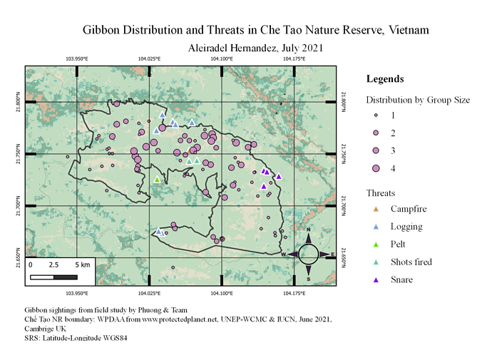
The map shows the distribution of the Gibbons by group size and as well the threats they may encounter in Che Tao Nature Reserve. I had lots of fun doing going through the steps of this activity. Instructions were clear and I am now used to using the QGIS in the future and I think I might be able to use it on my future projects. I learned a lot from this module and form the other modules as well. I didn’t encounter any problems with this task.
Hello there,
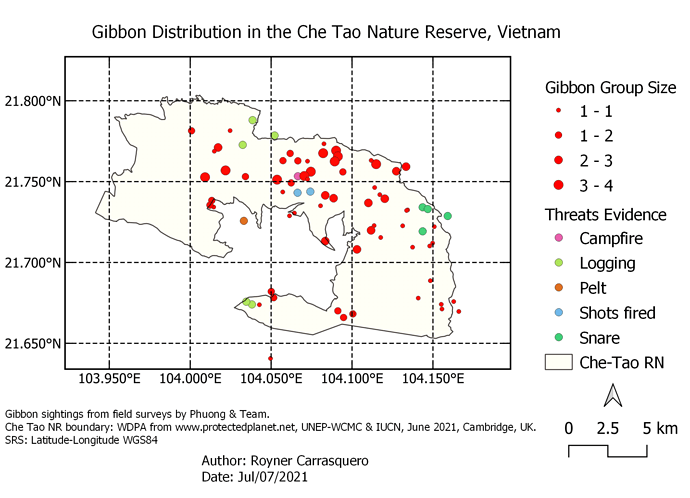
Your map looks great! Although I think you forgot to put ticks around the frame of your map as the module suggests, and personally I would like to suggest that you rename the Subgroup titles on the the legend section (i.e. Threats_evidence to Threats) so they would not retain the layer name. You can also delete the “WDPA_WDOECM_Jun 2021” on the Item properties for “Legends” by clicking the “-” sign at the bottom of the layer list. It would be great to change the legend item names to 1-1 to 1, 1-2 to 2 and so on. Also, picking a color ramp with wider set of color range would make your legends more distinguishable. Lastly, I suggest that you merge your GibbonSightings_Survey1 file with your GibbonSightings_Survey 2 file as instructed on the 3rd module to give a cleaner effect on your map. Your inset map is nice though. I would love to try that next time. Keep it up!
This is tricky and need ample time to complete the task. This is really one of the biggest achievement I’ve done as a beginner and learner here. Module 4, was quite challenging and with the help of the given information I was able to provide an output. My classmate also really did well in helping me to comply and accomplish this task. Thank you Lucy for a great opportunity, experiences, and learnings. More power!
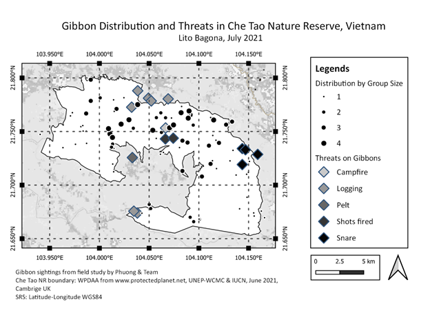
I really like how you presented your map. It is so clear, and the color choice highlights the details of your dataset. Well, thanks for helping hands! God bless!
The map is so presentable. I really like the color of your map that really emphasizes the dataset.
This was a great activity to learn how to make a map and add a title, legend and scale and then to export it as a file. This course has provided a good foundation to make a basic map so it has been very useful. I couldn’t work out how to change the font style for title and legend. I wasn’t confident in adding an insert map so I stuck to the basics. I also wanted to add symbols to indicate features on the base map (Open street map) but wasn’t able to do so.
Hi Sichelesile,
I really like the simplicity and clarity of your map. It has no distracting features like mine does.
I’d love to know how you separated the different group sizes of the gibbons. I couldn’t work out how to do that.
Cheers
Greg
Hi Seneiya,
Nice map - I like how simple and clear it is but I am a little puzzled by what you are trying to show. Your map shows the location of different threats but it is not clear that it is the gibbons that are being threatened and there is no spatial information about gibbons included on your map. It might be more informative if you add in the layer showing survey data for distribution of gibbons. Just a thought.
Cheers,
Greg
I found out that the symbols are indeed too large. Thank you for the suggestion!
This module is more challenging than the last 3 modules. It took me a while to get it right. However, it was a good learning process. Thank you so much.
I absolutely got astonished with this task, I really enjoyed it! As far as I concerned the module 4 was the most challenging because it has a lot of steps, new commands and tools which require close attention at applying Otherwise everything would be failed with the map. I learned something that I wanted to know from the beginning of the course by the end of this module, such as to create and export my own map with all the elements and characteristics needed to communicate the purpose I planned for my map in the best way as well as highly detailed, in order to other people can understand what message is contained it.
Hey!
Thankyou for the feedback and suggestion. I will make the changes.
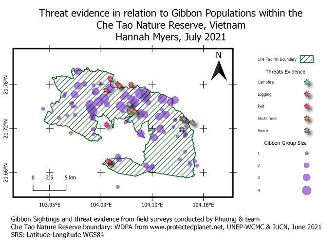
This assignment definitely took the longest, but I think I also learned the most! I decided to focus on observed threats in relation to Gibbon group sightings. With this information, nature reserve staff can better assess which areas should be prioritized to reduce poaching and other human-animal conflicts. I am not completely sold about how I chose to display the group sizes, as some of the areas with lots of overlapping sightings are a bit hard to read, however I tried to mitigate this issue by making them semi-transparent. There is probably a better way to display this information though and I am open to your suggestions.
Overall this course has helped me to better understand the fundamentals of QGIS and I am very excited to use what I have learned at my new job in Alaska!
Excellent job on your map. The information is very clear and easy to understand. I was worried to use such small points for the gibbon sightings, but yours turned out great. I think I will go back into my map and play around with the group size settings to better display my data. The only suggestion I would make is to better differentiate between the 1-2 and 2-3 group sizes. They look very similar and its hard to tell the difference on the map.
Hi Greg, Thank you so much
hope this help
- You select layers properties
- Select symbology, i think the default symbol would be single symbol change that to graduated symbol,
- under column select group size
- on method click on the drop down arrow and select size
- A tab with size from will the show underneath the default would be millimeter, change that to points.
6.you can change the number of classes you want, then click classify and apply
N.B the options i did not mention, are up to you to change other wise you can just ignore them
Hello everyone, everything good?
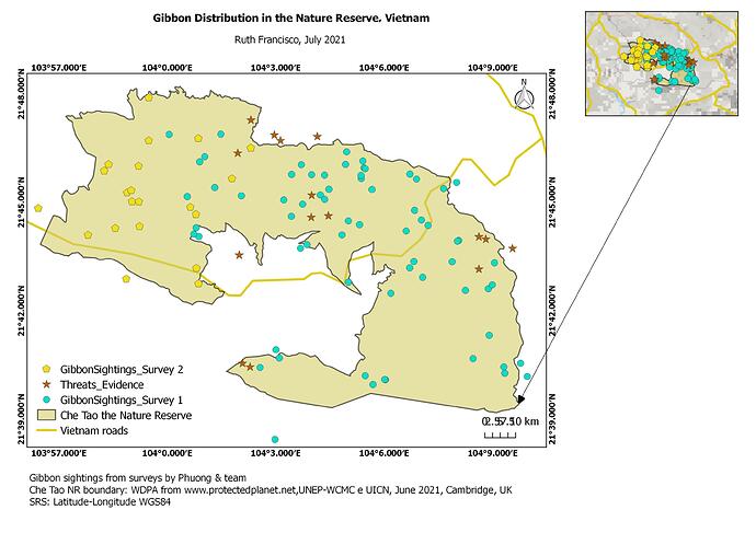
Here’s my work for this week. The map shows the distribution of Gibbon (represented by the circle in blue) in the Nature Reserve, a second observation of this species at the western end of the Reserve (represented by the pentagon in yellow) and evidence of threats to wildlife, evidenced on the map by the brown star.
It was good to know that it is possible to include a second map in the composer, to highlight the area we intend to show, making the map’s message clear.
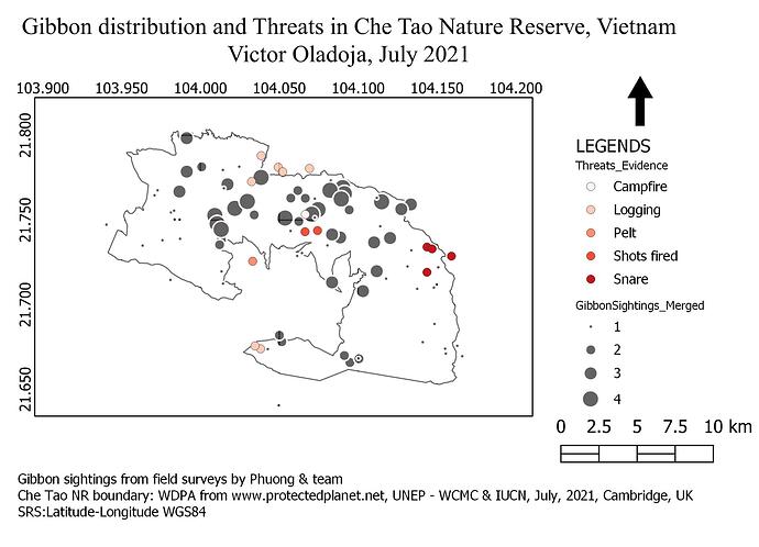
My map shows the combined gibbon sighting from the two surveys carried out. I also used different shades of the red dot to indicate different threats to the gibbons in the park.
I was able to produce the map as described in the module on the first trial. But when I closed the course content to do it on my own, I had problems recognizing the uses of various tool kits and determining what next to do. So, I will keep practising till I could produce a map on my own without consulting the module. Thanks so much.
Here is my work for module 4.
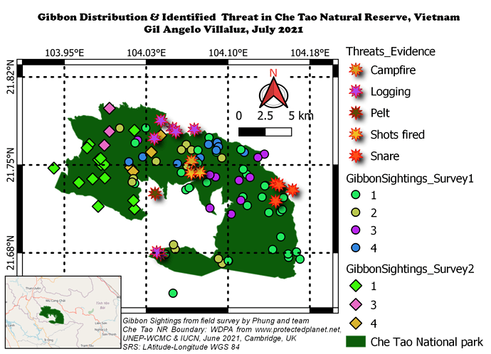
Although I find it tricky in getting the coverage of the map to fit on and not cut anything off, I still enjoy doing this activity especially in editing and changing the format to be used to look my map easily understand and presentable. I used different symbols and colours to easily recognize the two different survey and the different threats in the area. I am hoping that this new learning in creating my own map using QGIS can be used and apply to our incoming research study for our thesis.
