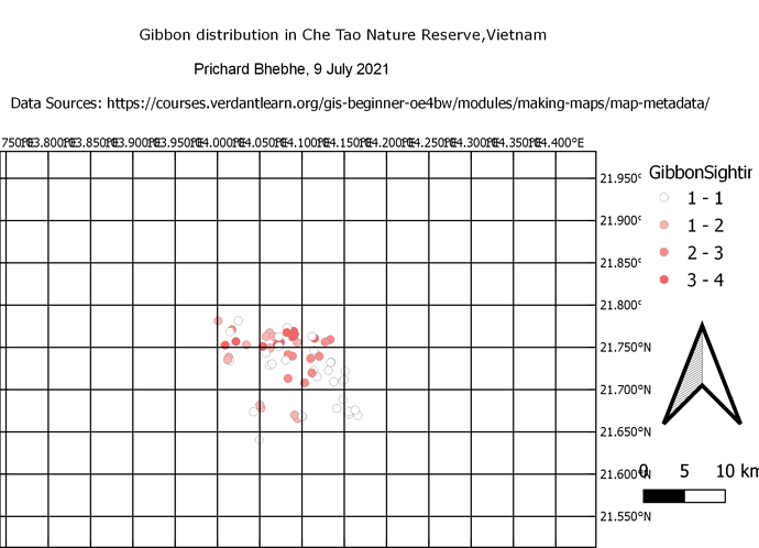
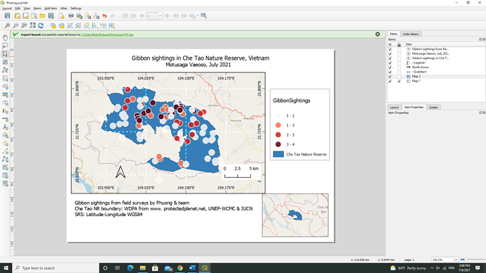
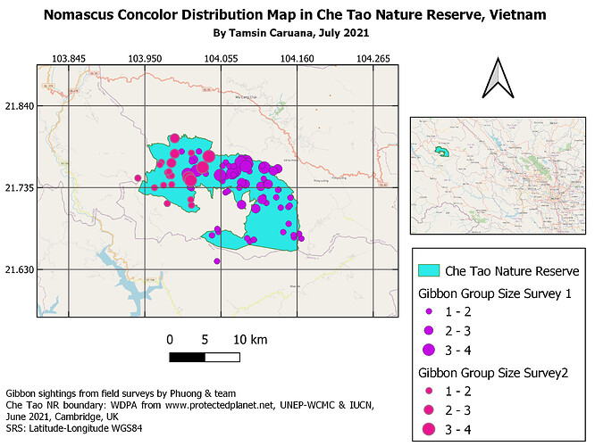
hi. this was a nice try. i think you were supposed to zoom your project to where the survey points are, before creating a map. However, i think you did a great job following the instructions and creating your map! you may want to change the author name on your map tittle though.
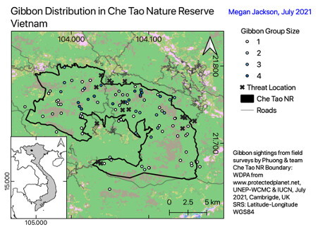
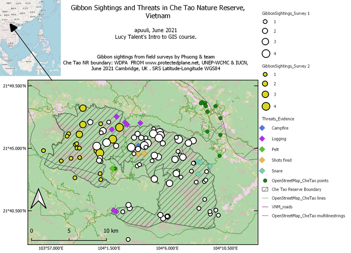
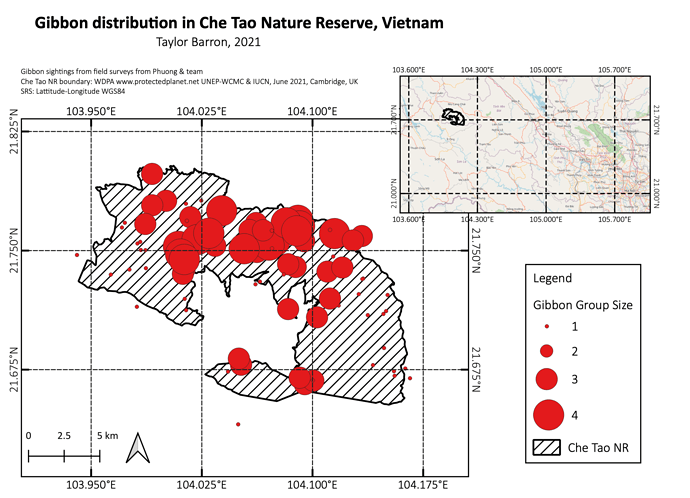
I enjoyed this week’s module and found it very useful. I could probably spend a few more hours on the map trying to make it better, but it was useful to play around and get to grips with the layout tools. I tried the graduated setting for the gibbon group size, but I don’t think it came out as well as the increasing sized circles came out – will probably change that for next time. My main message for the map was the distribution of gibbon sightings and the size of the groups they were found in, in relation to the location of identified threats and the land cover types. I included the co-ordinates in decimal degrees – because I hate degrees minutes seconds with a passion, though I will admit degrees minutes seconds does look better on a map because you can immediately see whether you are east/west/south/north.
Hello
I like your colour scheme!
For the intervals, I think what might work is if you go to the main window and change the symbol type from graduated to categorical and then it will treat each group size as a separate category instead of treating them like a continuous variable (and therefore giving each group a range). Hope this helps!
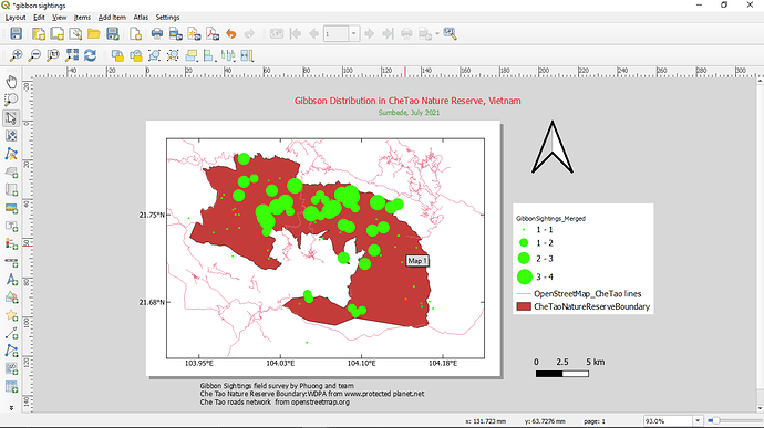
My map shows Gibbon Distribution in the Cha Tao Nature Reserve in Vietnam. I have learnt a lot from this exercise. Working in the print layout window is interesting and fun.
Problem:
I have not been able to export my final map. This is why i am uploading the screen shot instead of the export. When I export the map, I do not see it in the destination folder. I even tried exporting as pdf but still did not work. Even exporting to the desktop did not work . It shows the ‘successfully exported layout’ notification when I export but when I go to the destination I don’t see it. (Any Ideas?)
this was an interesting lesson. I tried to keep it basic and add things but yet seems i left the actual map out. The lesson was interesting and its helping me towards my goal of understanding and using gis in my studies.
great stuff sir, quite interesting. excellent work
wow, inspiring, this is beautiful
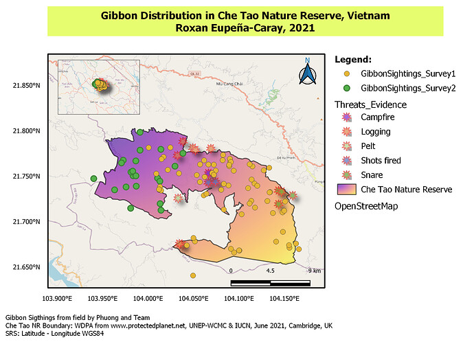
In this map I attempt to show the most data and context I can fit without causing confusion. I spent a lot of time balancing colors, sizes, transparencies, font and placement. I felt like a brushed up against some of the limits of QGIS editing capacity but only barely scratched the surface in terms of number of features to explore. I seemed to have a lot of trouble getting the Gibbon sightings data from surveys 1 and 2 to display as I thought they should.(in categories 1,2,3 and 4 respectively). However it is possible that I have mis-interpreted the data. I felt like I met my learning goal of having enough competence to learn how to learn more about QGIS in a relatively efficient manner. I will experiment more with linking features to datasets and making maps that are interactive.
Dear Lito,
Thank you for your work. Before seeing your map I had not considered that black and white might show data more clearly than colors. My only suggestion might be to include the inset map for greater geographical context. Because of your map, I will experiment more with contrast as a way of making salient data stand out more clearly in a data-rich map. Best regards!
Here is my output. I tried exploring all elements based on the instruction. Inset maps for me is challenging because it was also not clear. I would like to thank Ms. Lucy for this opportunity. This course GIS for beginners is very useful. It really guided us on the basic about GIS. Hope there are more like this to come. Again thank you for this.
@Prichard_Bhebhe hello sir. good day. i think you left to check the layer for Che Tao Nature Reserve that is why the shape polygon for this was not seen
It is rewarding to finally get the point where I can put together everything that we learned in the last three modules. My map shows gibbon sightings within the Che Tao Nature Reserve. I decided to use color to show a gradient from 1 - 4 of gibbon sightings instead of size because I wanted to test how this symbology would look. Size would probably be the best way to do it but I found it helpful to test different symbology so that I could find the one that works best for each layer.
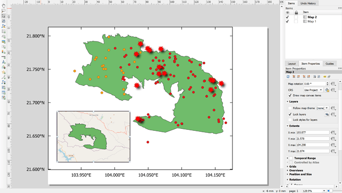
I had a hard time trying to insert an inset map because any changes that I would make in main map would show on the inset map. Locking the layers between maps did not work. Anyone have any advice on how to fix this problem?
Wow your map looks great! I was wondering how you were successful in creating an inset map with the Gibbon Sightings layer removed? I have not be able to do this without changing the main map.
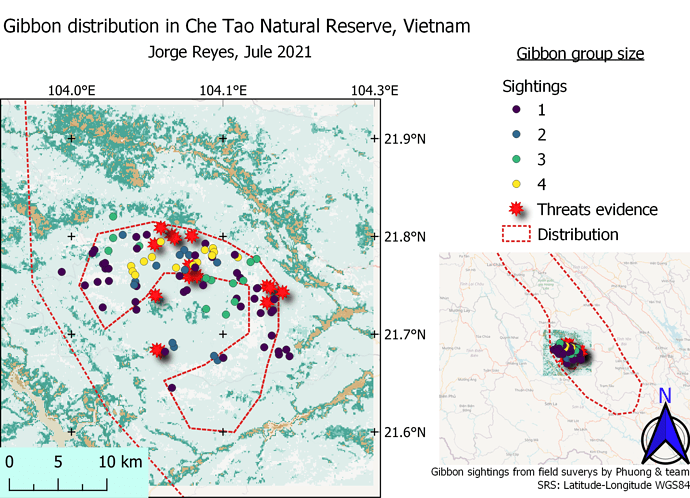
My map represents the sites where gibbons have been observed and recorded in Che Tao Nature Reserve, Vietnam. As the legend indicates, the records vary in color depending on the number of individuals per group. Likewise, places where possible threats to gibbons have been registered are observed with red stars.
Without a doubt, this week I have deepened my learning. I have had to use most of the knowledge gained through the four modules in order to create the map for my task. I know my map isn’t perfect, but I just have to better explore the tools to format it better and make it more eye-catching. I will continue to explore all the tools and hope that I can meet my goals set out above.
This assignment was very useful! I had never tried adding a grid, and I enjoyed playing around with those settings. I also liked trying to add a second, zoomed out map- although I could not figure out an accurate way of adding a square to the second map that shows the exact extent of the first map. Did most people just add a polygon to their main GIS project of the approximate extent? The main goal of my map is just to show where gibbon populations are concentrated in the reserve.
Not much to say, your map looks pretty professional. Congratulations! Perhaps you could decrease the size of your North arrow a bit, but it is not necessary. It looks pretty good like that.
I like the way you chose to display group sizes- I think making them transparent is a great way to show the overlap! I also like that you chose to display both the group sizes and the potential threats on the same map, although the shadows from the threat symbols might not be necessary
Hi @Motu
Thankss!! I used to faced such struggles too and played around to finally understand why.
Once you’ve created both maps you may head to lock the layer for both maps:
Item properties > Layer > tick - Lock Layer
Here’s are the image for you to refer  Hope this helps!!
Thanks for answering my query - unfortunately I did that but I think maybe my computer was being a bit glitchy anyways so am hoping it will work in the future and behave itself.
Thanks again 
Wow this was huge learning curve but I managed it in the end and learnt loads! I just hope I can remember all of this!
I learnt how to show gradiated group sizes (by looking at everyone else’s maps so thank you!), how to add features to make a map presentable and that I needed to streamline the information presented as not everything can be included as otherwise it’s too much!
However I couldn’t figure out how to create a box/ polygon on the main map to show the sections of maps displayed.
