This module was really insightful as I learnt about the different datum, SRS etc. I always thought that it was a one size fits all type of measurement, alas, I was wrong. This module also helped me move more towards my learning goal as I learnt how to transfer field data into QGIS using CSV files and how to make sense of them in QGIS.
It’s been a wonderful module and I can’t believe next week is the last!
This module was amazing! I learned so many new things, looking forward to what is yet to come. Thank you!
This module was very informative and insightful. All the points about CRS, SRS, datum, Reprojection were well explained and the instructions for the assignment were very clear as well. It took a little more time for me to understand this module compared to the previous 2.
Please let me know if I can improve anywhere.
This looks really neat. Great job!
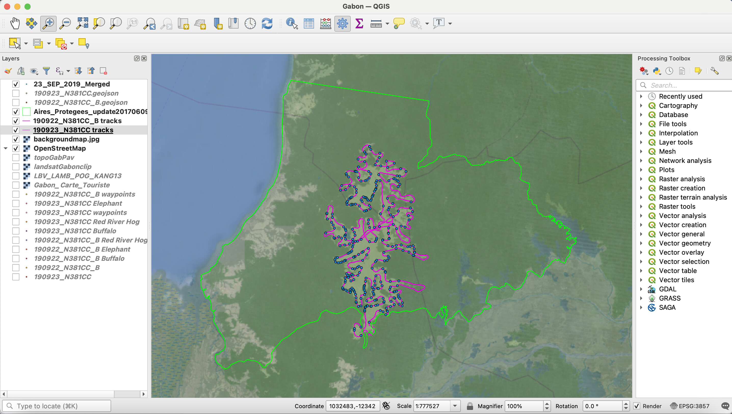
This module was particularly interesting because it refreshed my knowledge of the various map projections. In aviation we use the lambert conformal projection (conical) for mid-latitudes, the mercator projection (cylindrical) for equatorial regions, and the polar stereographic (azimuthal) for polar regions. Now I know how these can also be applied to GIS applications and this will be very useful in my future work. Of particular use to me was learning how to import .csv files (which I use often) and also learning to re-project and merge vector layers. Again, I used my own data for this assignment from a fauna survey in the Wonga Wongue Presidential Reserve of Gabon. The blue dots represent fauna sightings (elephant, buffalo, etc), and I imported the .gpx file of my flight track which is represented in pink. I also changed the transparency of the satellite image to 70% so that the Open Street Map showed through. Next, I would like to learn how to use a different icon to represent each type of fauna sighting so that each species is represented by a different color or icon. Then, I would like to learn how to make a map legend so that the data can easily be interpreted by the user.
1 Like
Hi @JonathanGatward, your map is really impressive! It certainly stands out to me compared to the others, particularly due to the “hill shade” effect that you added. Can you explain how to do this? Is there a specific base map that you used which already had terrain data? Or is the terrain data already included in the Open Street Map? This feature would be quite useful for me as a pilot. I also appreciate how you clearly explained the various additions that you made to your map so that laypeople such as myself can (somewhat) follow along. Thanks!
HI Foggy,
Thanks for your comments.
The “hill shade” effect can be provided in a number of ways, The starting point is having a digital elevation/ terrain model (DEM or DTM). This is frequently provided as a Raster layer, but can be generated using a TIN interpolation method (available from the QGIS Processing Toolbox) if you have a set of “spot heights” or “levels”. In this instance, the DEM data was obtained from this link - Digital Elevation Model (DEM) of Vietnam - Datasets - OD Mekong Datahub
but the source of the data was actually from the USGS (United States Geological Survey) who provide DEM data for most places around the world at a variety of resolutions.
The “hillshade” effect (the effect of the shadows from directional sunlight) is a standard QGIS function when handling Raster data, (found under the “Symbology/Render Type/Hillshade”.
Putting this “under” the actual height categorised DEM layer set with a transparency (in this case 80%) gives this “3D Type” rendering of the topographic base map.
Hope this helps - If you want to contact me direct then my email is jongatward@ntlworld.com.
Cheers
Jonathan
1 Like
Hi! It took me a while to get my head around all the new jargon in this module but I am glad I have learnt about map projection as I think it’s very important to implement in a project and I would hate to have started a project in future and not been able to take correct measurements - it would have been really unprofessional!
I am also feeling more confident in using QGIS and am able to change things a lot quicker than when I first started!
I had problems with adding the files with the SRS name - it did not seem to accept such a long file name but I added it and then renamed the layers in the Layer Panel and it worked.
2 Likes
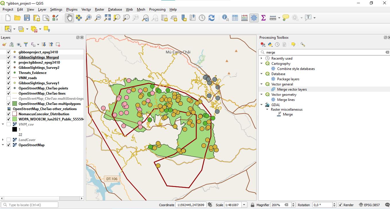
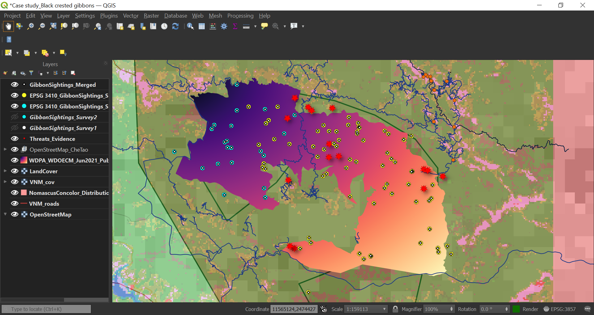
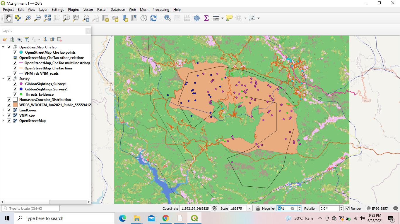
Hello again! I really like how clear your map is and that you used primary colours to reduce confusion (I wonder if mine is too colourful now lol!) so well done! But maybe it could be an idea to change the colour of the Gibbon Sightings Survey 1 to a different colour to the boundary of the nature reserve? Sorry as that messes up using primary colours! Maybe just a lighter blue for the nature reserve?
And I definitely agree that it’s good to know we can change the SRS after importing as things can always be changed if there is a mistake. I seem to remember ArcGIS not being so easy or forgiving!
I can say the progress is so far so good. This model has been a very good model and it has opened my eyes especially in combining data sets. I did this kind of exercise 4 years and I had forgotten it completely. I had difficult in locating processing toolbox until I had to plugin it. It worked in well. Any feedback about my work is highly welcome.
Great choice of a basemap
Very Informative discussion.
This is my updated assignment of module 3 after topic (Reprojecting) has been included in this and it was one of the most crucial thing that we are suppose to learn, so i would like to thank Lucy for including this on time. Thanku so much
1 Like
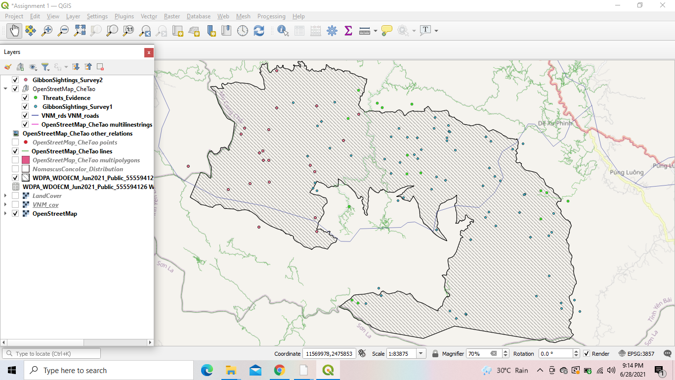
A
B
Hi everyone
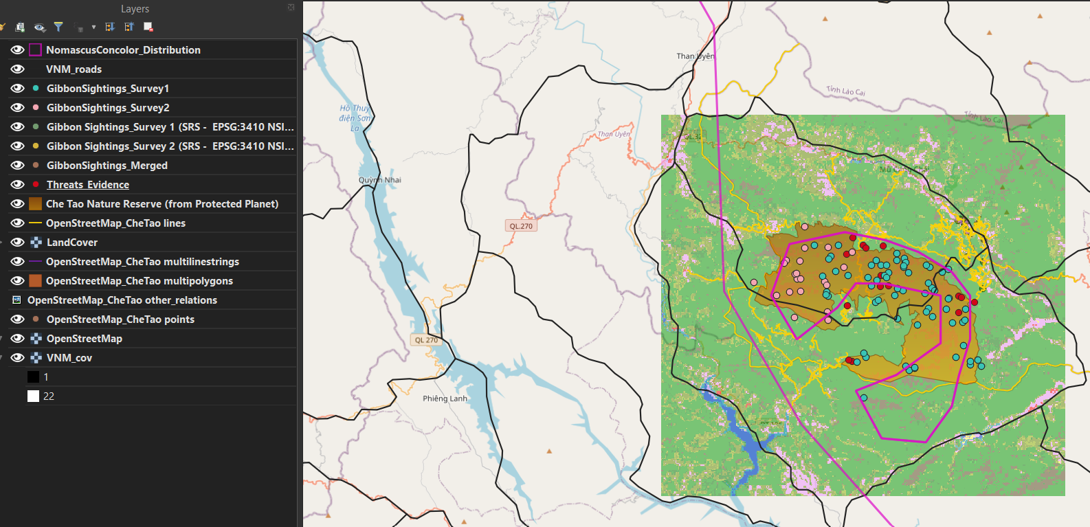
I have posted two screenshots pictures A without the land cover and Che Tao points and B with the land cover. Both the maps have their significance and kindly let me know which one of the map is easy to understand?
Anyways coming to the module this week module was fun, and visual instructions were more helpful. Module 3 help me to understand the differences and the use of the SRS concept. Plus, module 3 teaches me important facts which would be a great help so I will be able to collect better data during my sampling.
Thank you!
1 Like
Hii @Thanisha14 your 2nd map (B) is more informative and easy to understand though first one is also cool but its just the selection of layers and symbology that is making the second one more eye - catchy.
1 Like
Hi @dasanshita your work looks very impressive and you have presented it very well. Great job and happy learning
Hi @gautam_wildlife thank you so much for your feedback, really appreciate it!
1 Like
Hello!!? when I posted my assignment 3 screenshot 2 days ago, the topic “Reprojecting” wasn’t included in the module. so, here I am forced to post again the revised screenshot that includes additional layers and I’m sorry for that.
In the middle of module 2 while I was downloading & adding those encoded data to my QGIS project, I was wondering how my field datasets will be ready and in what format for the QGIS. But now, I think, I get a clue as to how QGIS deals with the field data collected using different SRS types/ Lat-Long, projected/ and how a field data is added to QGIS project.
Moreover, this module 3 comes with more details. The steps with visual instruction (screenshots for example) are helpful for new beginners.
Ha, I thought it was just me to skip that topic by mistake the first time I did the assignment (in fact I just edited my assignment as a consequence too)! Thank you for letting us know, @mamushmiss !
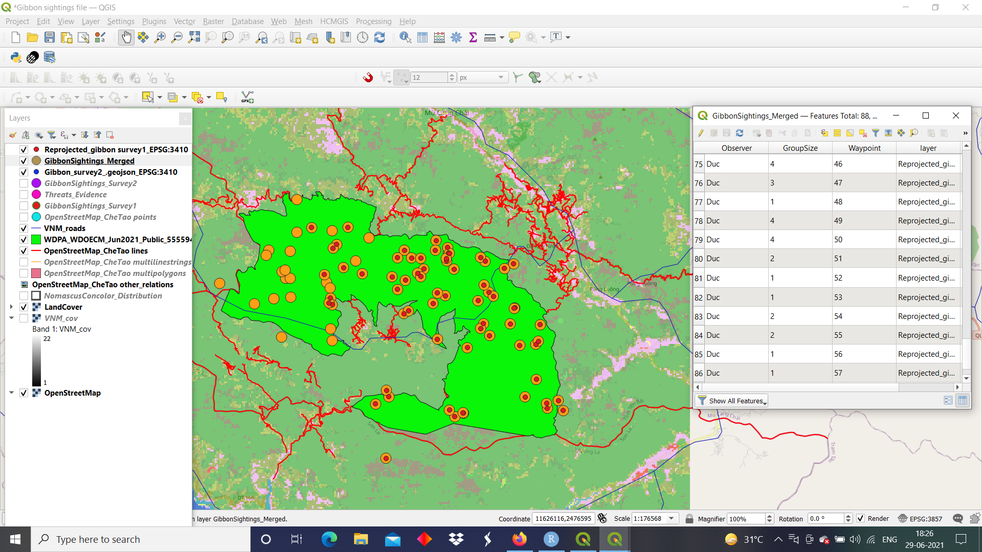
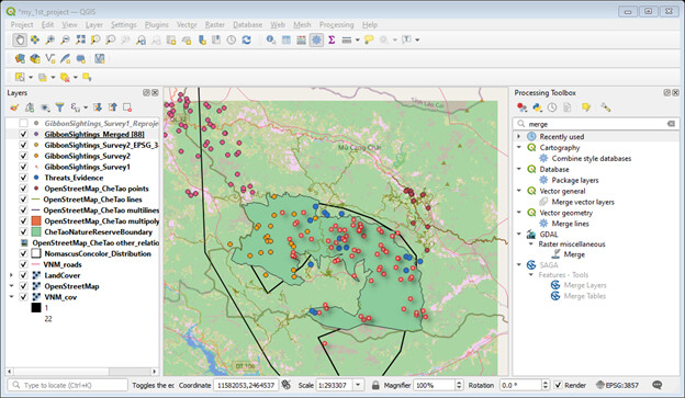
Hello there!? I like your layers arrangement! It makes your map neater. If you choose another color for GibbonSightings_Survey1 layer, it will be more visible. The rest is good. By the way, I can’t see the ’ Reprojected’ & ’ merged’ Layers in the layer lists. Any reason for that? Thank you and bye.