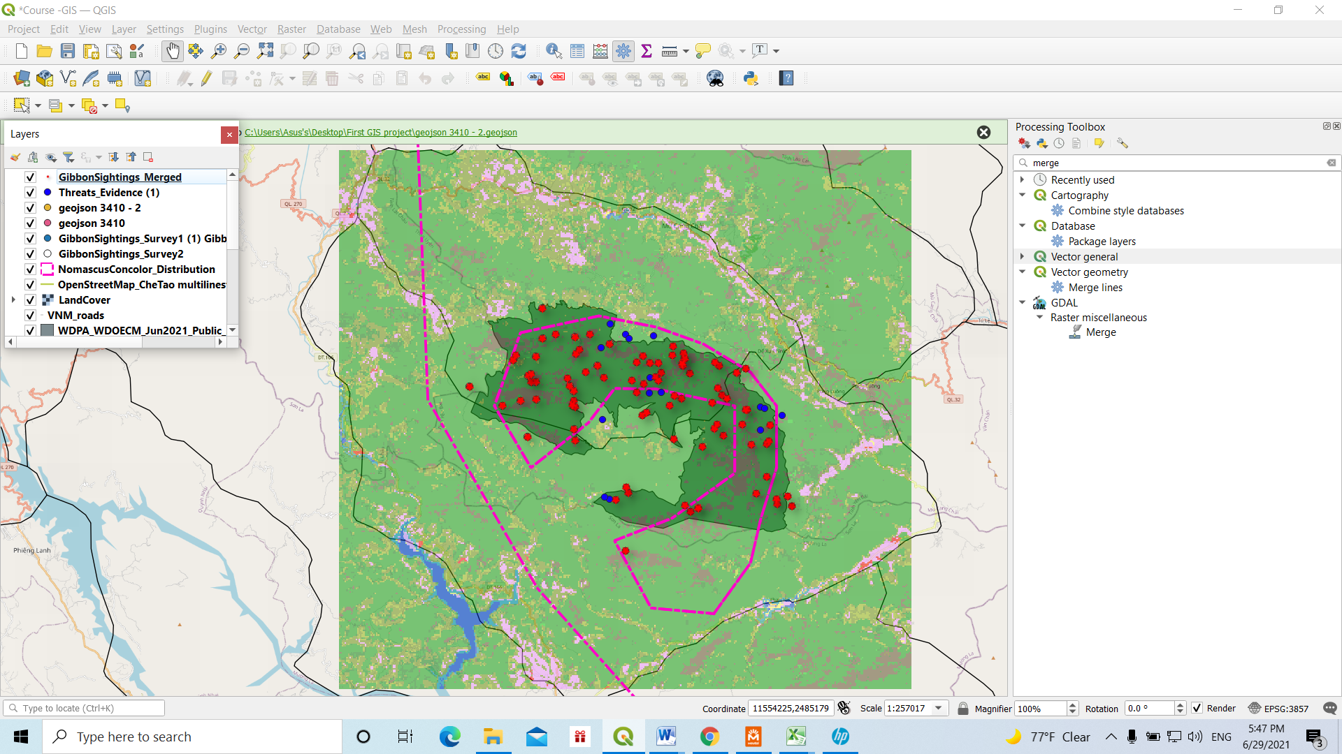
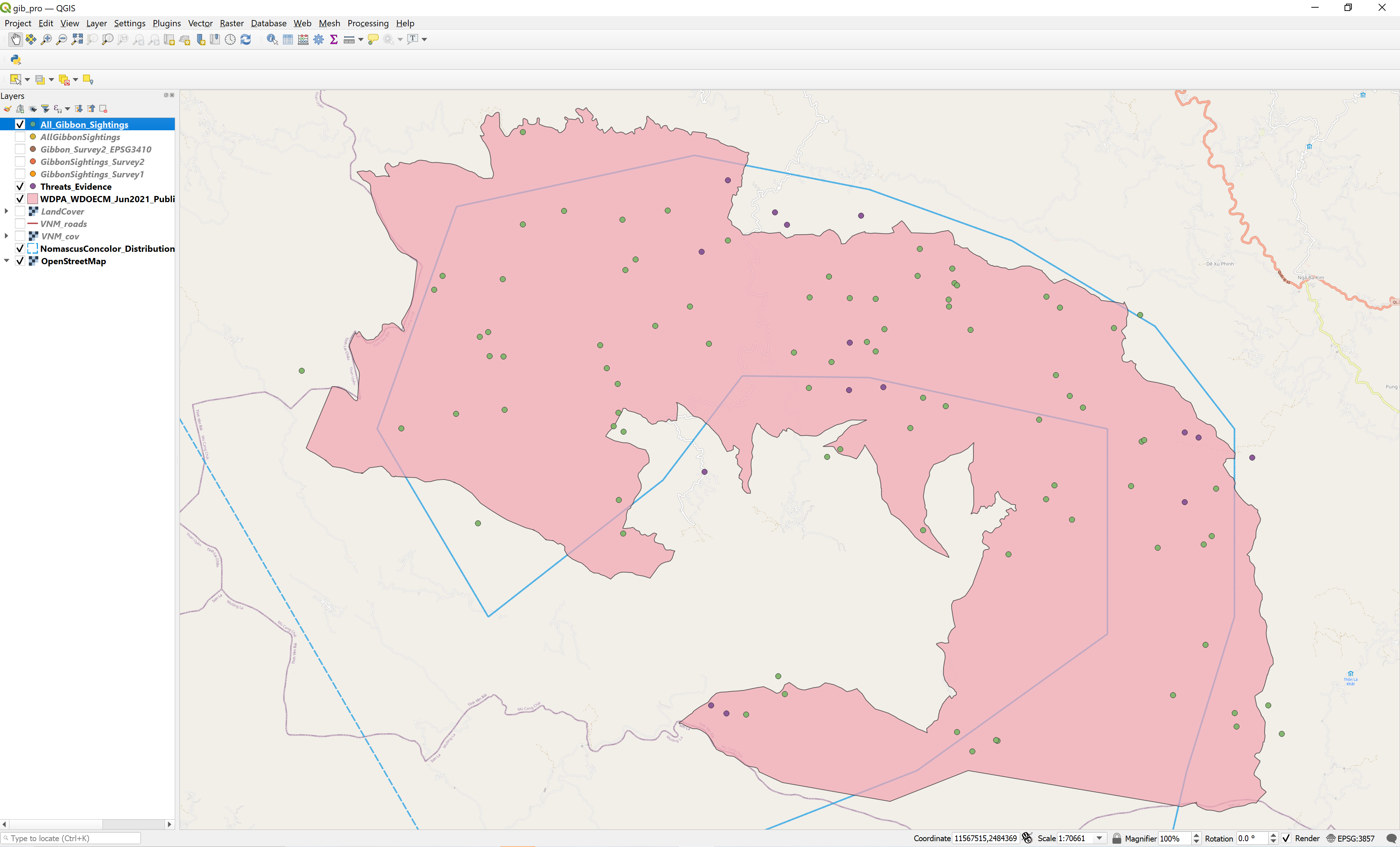
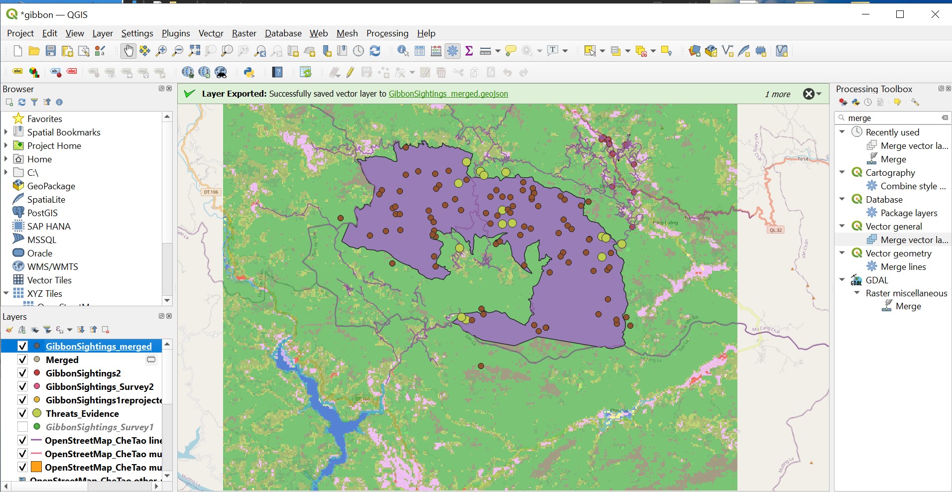
I found this module challenging. It needed more reading and attention on Map projection and reprojecting latitude and longitude data to SRS. On this QGIS map, I prefered to represent GibbonSightings Merged data and Threats Evidence. But it also have all other layers I converted and the original Gibbonsightings.
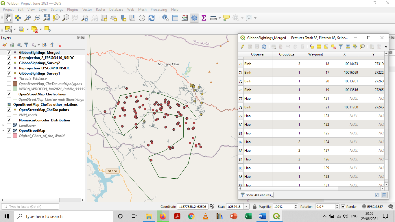
The most important part of this module was to merge two surveys into one, which I think we can merge multiple field work of the same kind into one file. Up to now, I have found latitude and longitude (X, Y) coordinates simple to represent on GIS map.
This module was quite an eye opener on merging data sets, reprojection a layer and setting SRS of a QGIS project. Had a lot of reading also especially on definitions.
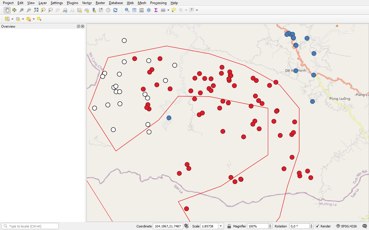
Deleece, I think you have really put the effort into playing about here and I think the ‘jump off the page’ look works for tha data points as well as the bold colours. I wasn’t sure if this was the map before merging of the csv files as I could not see ‘merged layer’ in the left column.
I really think that we all learned a lot in this module and the value of projections systems and datums is just that - invaluable as without getting this right at the very beginning of our project all else can go awry … so worth keeping and eye on and double checking until it becomes second nature, muscle memory!
This week’s module was very helpful in thinking about projections & how to consider the correct one for our research. It was also helpful to be guided through combining data & use of the processing toolbox this week! I am still running into issues with layers not showing up/populating after I add new layers or zoom in/out. I am doing a lot of saving & restarting
This looks really nice! The only thing I would mention is the colors you choose - this is something I’ve been working on in all my data visualization. Really bright colors can be difficult to differentiate, and red/green is something to consider avoiding where we can so that our maps are more accessible to folks with color blindness. (also something I’m actively working on & keep forgetting - there’s red & green in my own map I just posted! )
I think this module really helped my understanding of how different coordinates can affect how the points lay on a map. I never understood these features before, and therefore I never thought about what system I was using and whether I was using data from two different systems. I liked the explanations of how the spherical earth gets translated to a 2D rendition. I think this really helped to further my understanding of what I was doing in this activity.
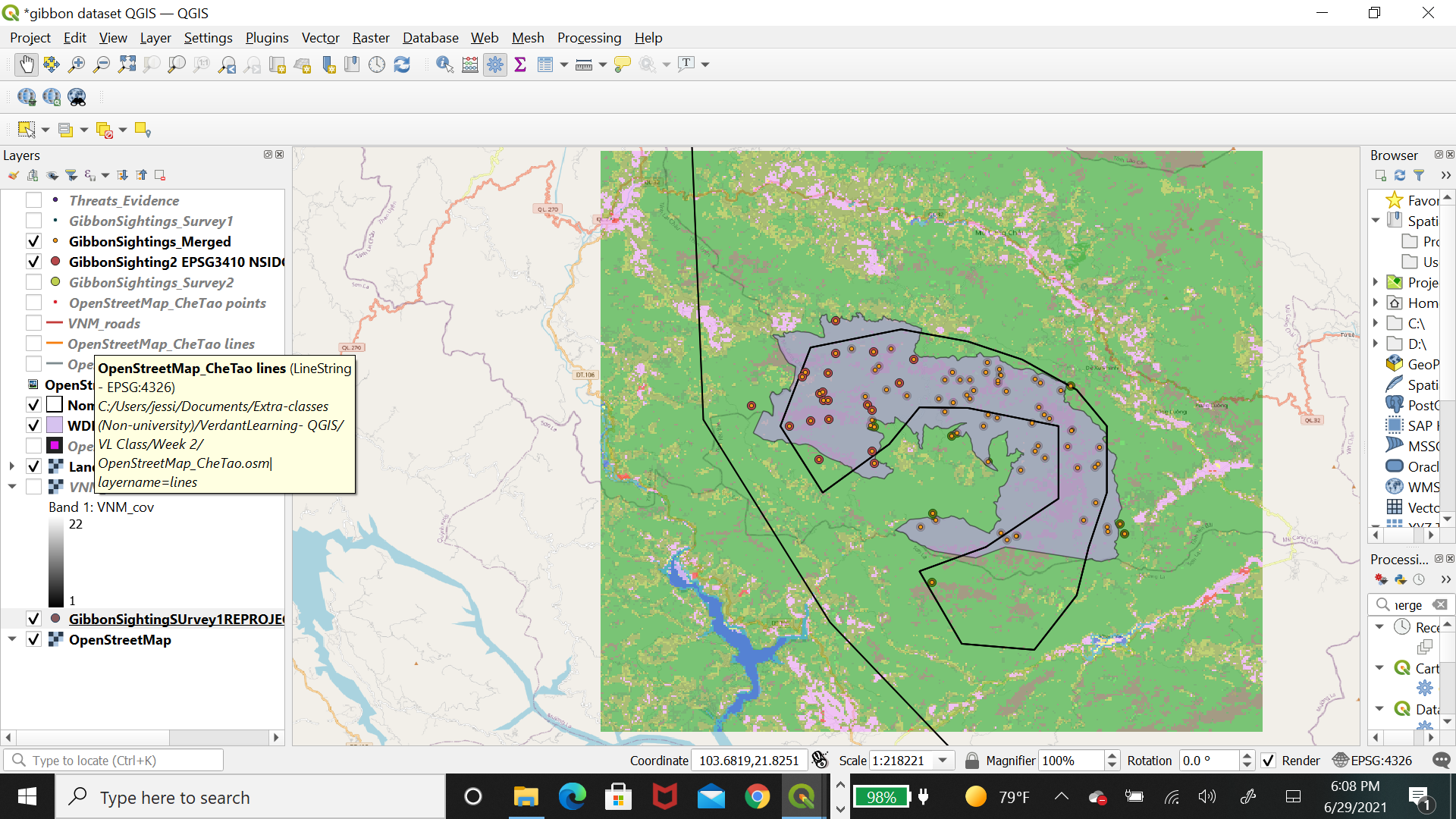
One problem I did encounter is when inputting the gibbon sightings 2, I still had my DMS (degree minutes seconds format of GPS coordiantes) box checked from a previous activity, which caused the data to be entered in an unreadable layer. I simply reentered the data and unchecked this box, which fixed the problem.
Great map! Your data is very easy to visualize. I agree with you, I always thought that each map and all field observations were using the same lat/long. I did not know about the many different SRS’ available. This module has given a great explanation for a beginner like myself
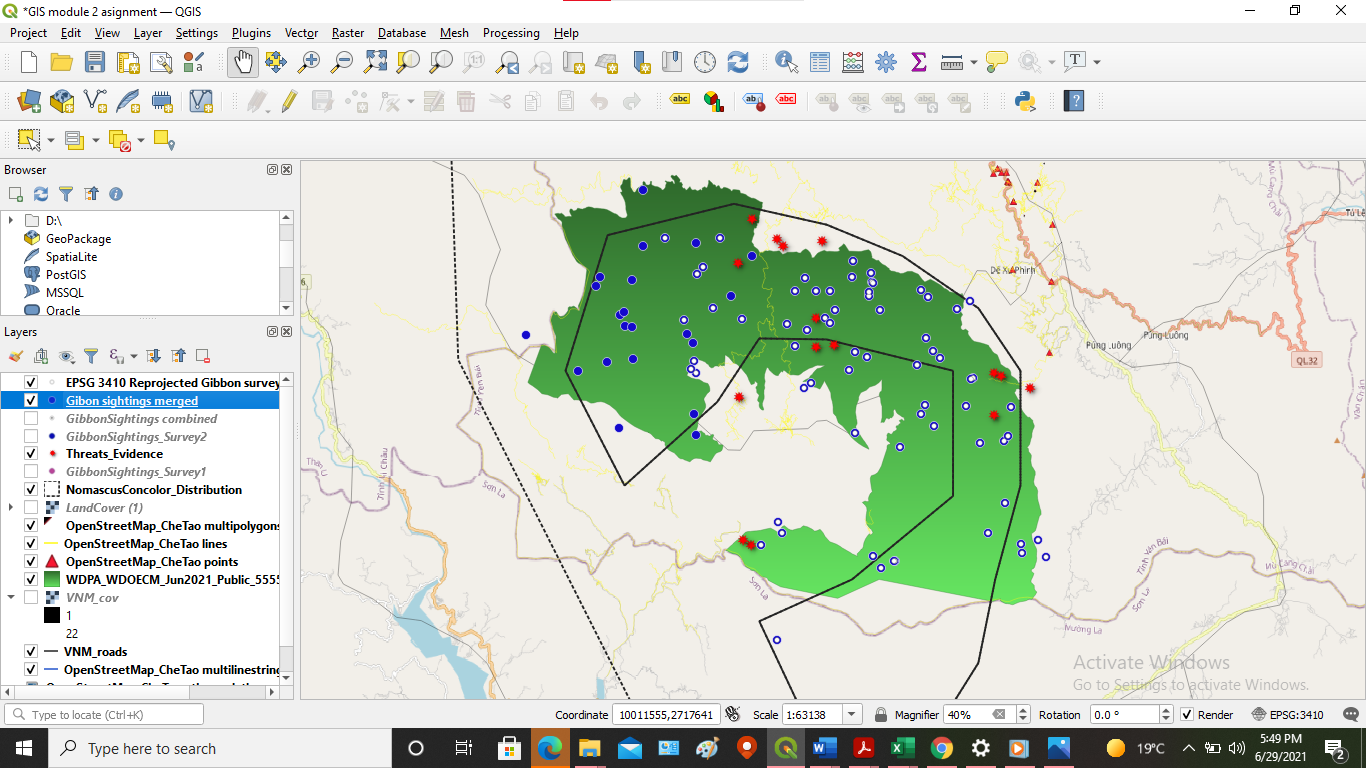
I decided to keep both Gibbon Sighting surveys checked so I can overlay it over the merged data for visualization purposes.
I had to reread over the module twice to get a clear understanding of what coordinate reference system (CRS), spatial reference system (SRS) and map projections mean and when it is appropriate to use these systems (CRS/SRS). I found this module useful in introducing new users of QGIS/ArcGIS to a few spatial reference systems and how to reproject to a different SRS to make is easier to manage, combine and analyze GIS data. I have been using WGS84 system since I started dapping in GIS and never knew why until this module.
This is a very important lesson as I didn’t know how to reproject and change it to another SRS. Now I can take any SRS system and reproject it and merge it into anything else that I have in my system.
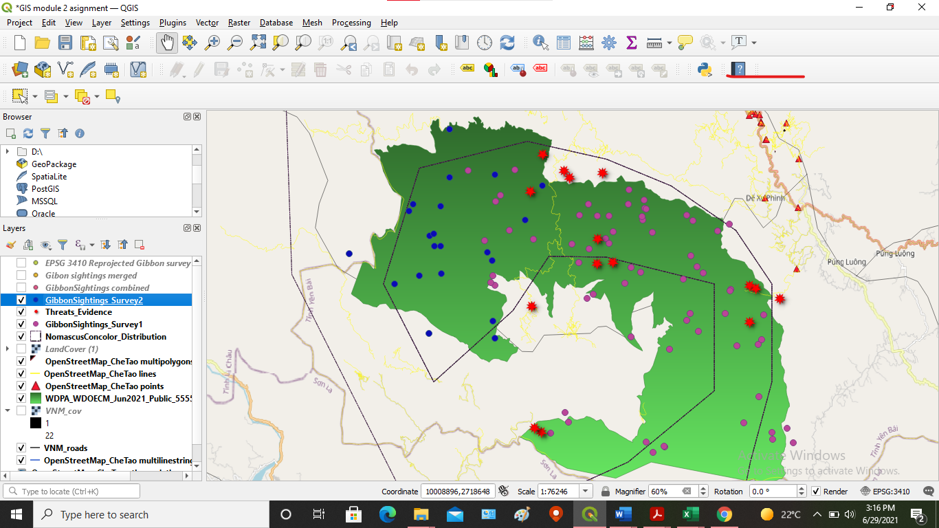
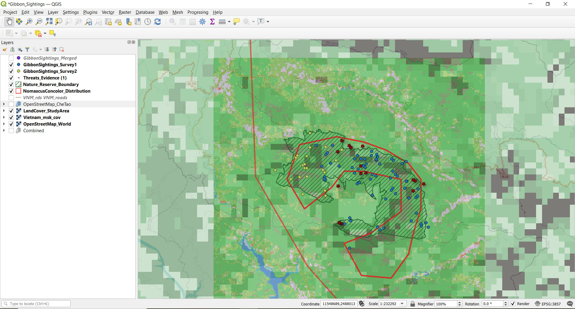
I Decided to leave the two gibbon sighting studies as separate colors, however I organized the layers in a way that, if selected, the combined data points would just overlay the two separate study points. I think this keeps the original intent of the study intact, but allows for overall good data organization.
This project went much smoother than last week and I found the instructions much more clear (or I am just learning from my previous mistakes…). I am still a little confused on when to use which kind of SRS, but I now have the general knowledge and tools to dig a little further into them.
Great job! I also did something similar to incorporate the 2 gibbon sighting surveys along with the merged data. I think it is nice to be able to choose which layers to view, and do so easily. I would suggest using slightly more opposing color schemes to better differentiate the two studies as the yellow/green points can look quite similar. I had to play around with my color scheme as well to make them stand out.
this module surely challenged me, at the same time i am really thankful for this programme i am learning so much thinks i did not know. this is honestly going to help me in future.
selecting appropriate CRC and importing csv file. for now on this task i am not satisfied but this is the best i could.
The SRS (or CRS) used is dependant on where abouts in the world your project is, the area of study (global, national, regional site specific etc) the type of data you are using and where it comes from (eg. national mapping agencies, GPS, global datasets etc) and the purpose of the map you are going to produce (The standard Transverse Mercator projection that has been accept as the “normal” map of the world was designed specifically for east west travel across the oceans hence lines of longitude remain constant. Its not much good for exploring polar regions or to give an accurate representation of land mass on a north - south axis).
In the UK, we have the British National Grid, on which all our national Ordnance Survey maps are based, but this is a different map projection to lat, lon so co-ordinates provided from GPS need converting, and it is impractical for detailed construction work (hence local site surveys for building works are often on a local grid covering the area where the building is going to be.)
Our own UK national grid is also doesnt extent to Republic of Ireland (even though the two countries are close together and adjoining, so any mapping project that covers both Republic of Ireland and Britain would not work with either of these two natinonally recognised projection systems - a UTM based projection would therefore be required.
It IS a very complicated issue but as a general rule, use one of the WGS84 projections for global datasets (Google Earth and other online global mapping system use WGS84 Pseudo Mercator) and co-ordinates supplied as Lat, Lon, in the absence of any prescribed natinoal projection (eg British National Grid) use the UTM zone appropriate to which ever area of the globe you are studying.