For those that are interested in the implications of choosing global map projections, I would highly recommend watching this clip from the US TV series “West Wing”. It is very funny, but also incredibly informative about how choosing map projections can completely alter perceptions of the world.
I found it very useful to learn how to reproject data into different SRSs and how to convert between file types. I didn’t know how to merge datasets and I’m glad I do now. Really enjoying the course!
I’m very pleased to be doing this course. I have never worked with coordinates or GIS before and it’s great to be learning how it all works. Thank you for the course.
I found this module really helpful. I was able to integrate my vage notions about proyections and datum and now I have a better understanding of it.
The guidance through the module was clear (and very necessary )
I believe a made good progress on my project. Thanks to the knew knowdlege I pointed out a few mistakes I was making with coordinates systems and projections.
Great module! I’m looking foward next one!
It was the best and most fun module so far to me. I’ve learned A LOT!! I could understand many things I didn’t about the projections and coordinates. I had no problem at following the instructions and the explanation about the entire module 3 was amazingly well explained and the didactic was great
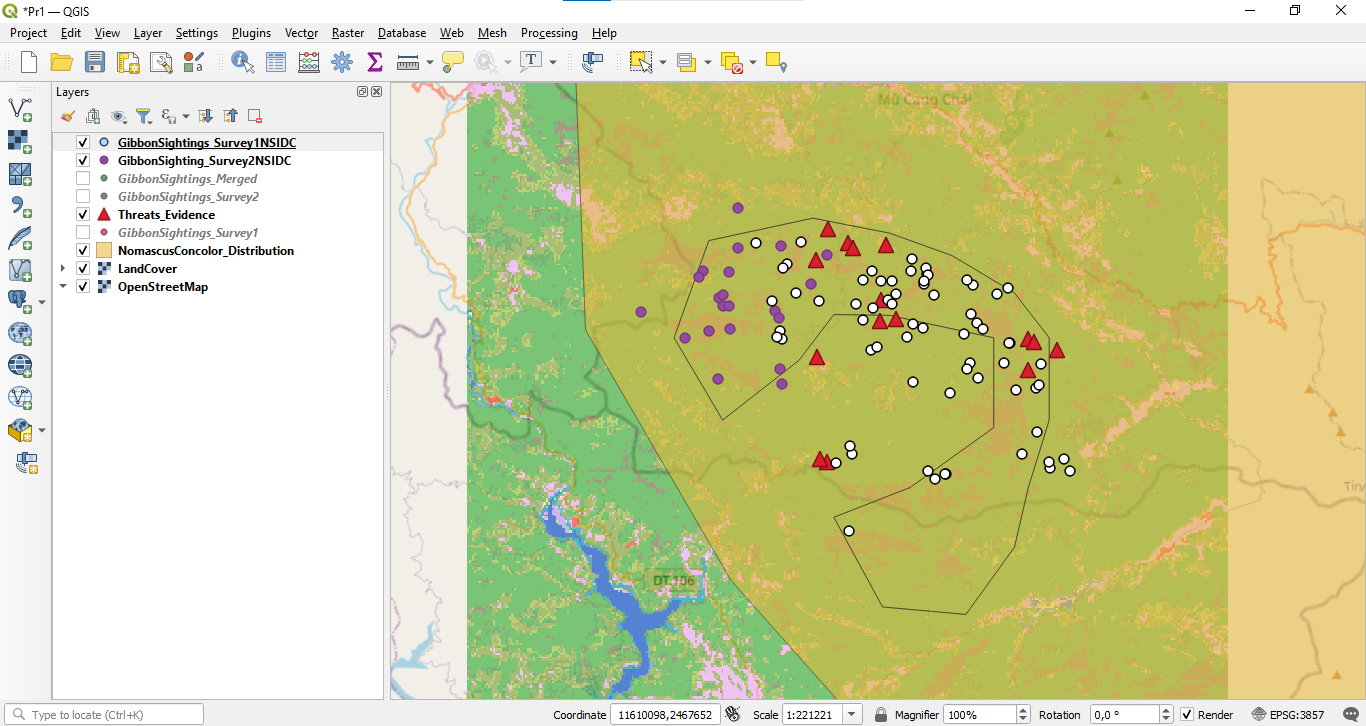
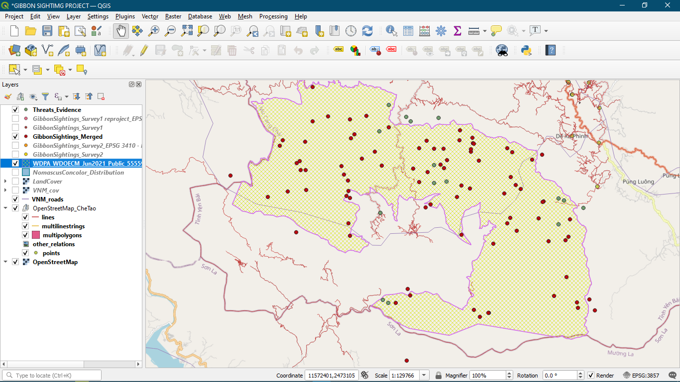
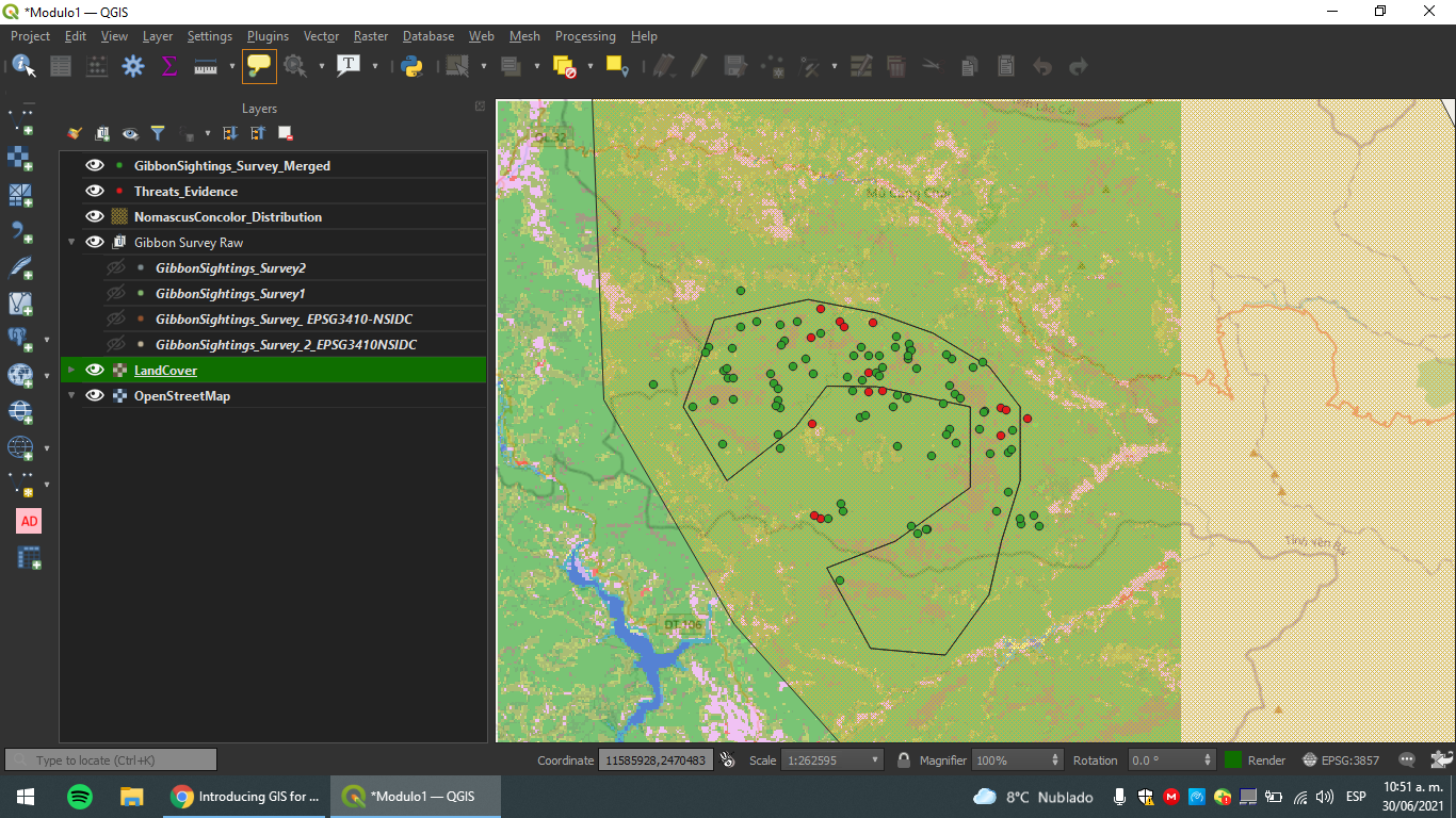
Apologies for missing some layers but I did this homework over the 1st module map. I tried choosing bright and contrastable colors for data points.
This look great! Very clear and clean map. One suggestion I have is to make some changes of layer’s colors. For example, Gibbon survey 1, 2 and threats_evidence might have contrastable colors because it look quite the same at first sight. Also the lines of layer NomascusConcolor_Distribution might have a wider line.
Great job Lee!!
Hello Andrew! Great work! I like how you represented the Distribution layer in a shadowy green.
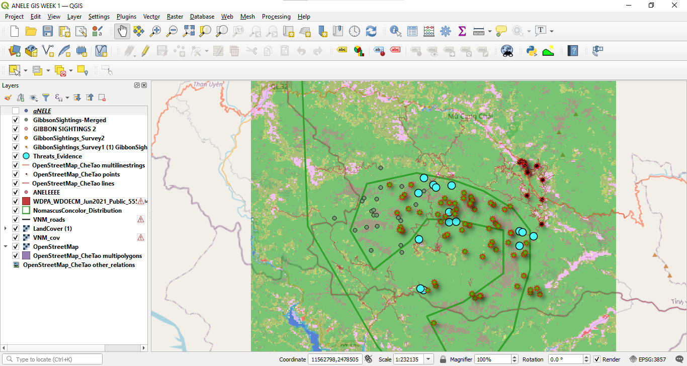
I’d maybe reconsider the points colour, maaking the survey points less bright so they’re easy to diferenciate from the Threat points…
A small mention, Latitude and Longitude corresponds to Y, X respectively. I made the same mistake and ended up exporting my data with inverted cordinates!
I found this module to be the most informative so far! I feel confident now that when I have my own data collected, I will know how to input it correctly into qGIS. Knowing how to do this was one of my main learning goals.
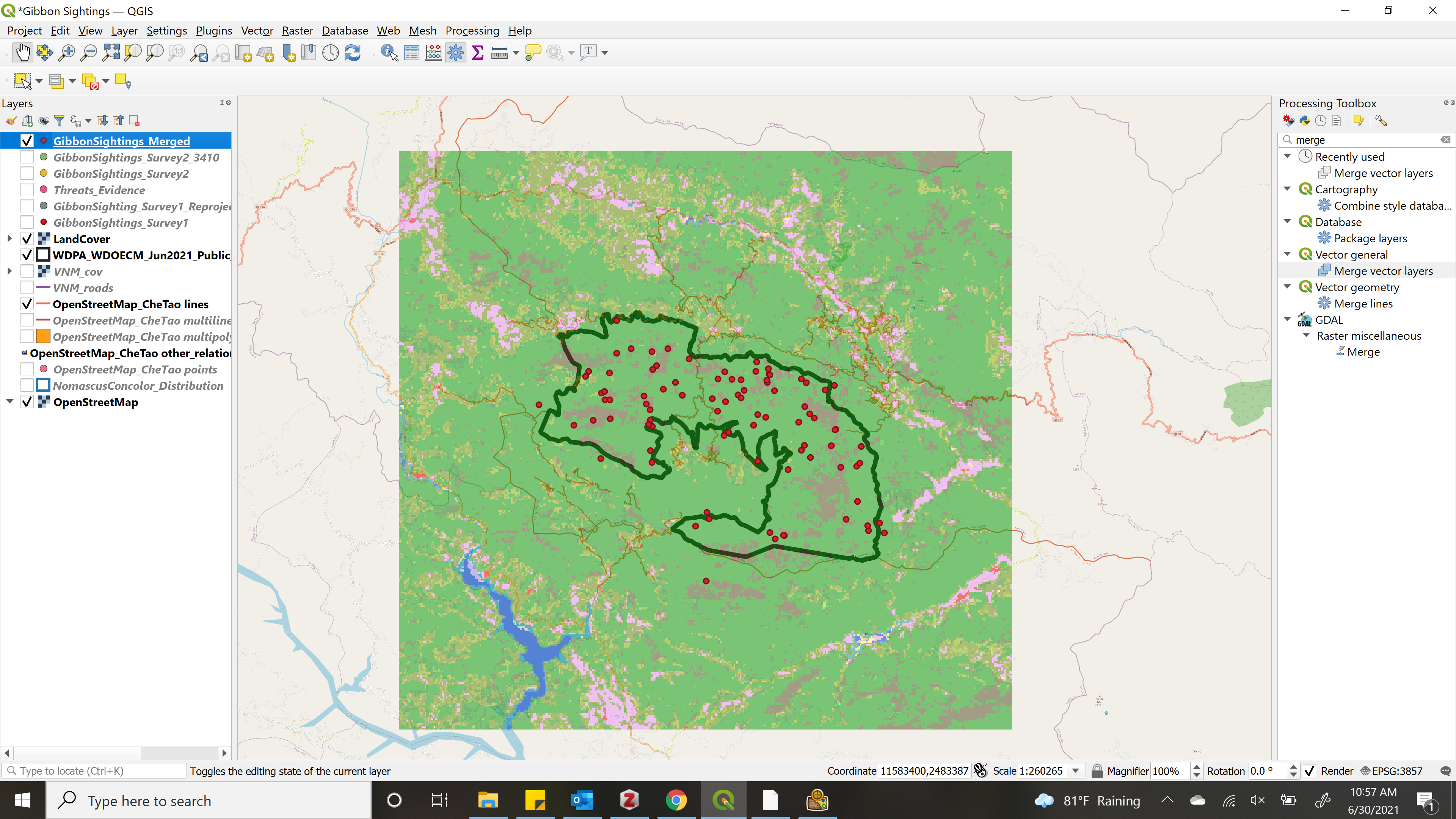
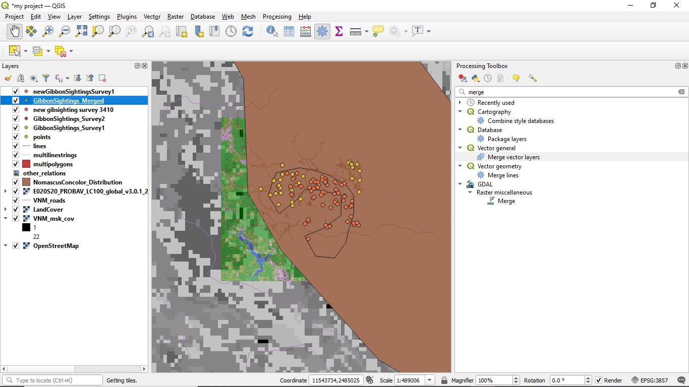
I did have some difficulty merging the files, but I think that was just because I must have selected the wrong one the first time. I chose to show just the single boundary of the preserve and the merged sightings data to make the map look simpler.
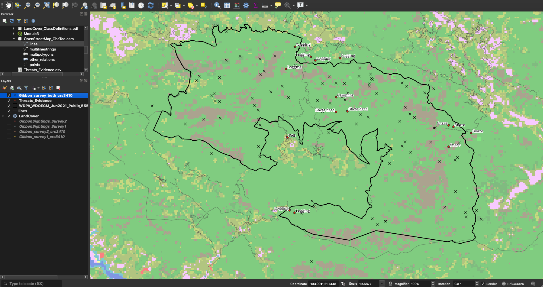
In the screenshot I’ve hidden a lot of layers so that the points generated by this module stand out more clearly. I’ve left the more detailed reserve boundary to show they’re in the correct place.
Converting between SRS is something that I sort-of already knew how to do. I knew how to set defaults that could automatically convert inputted data into a standard system, but I didn’t know how to use processing > toolbox or any of the functions within. I’m sure this will come in handy!
However, I’m having an issue which I haven’t been able to resolve. Whenever I attempt to merge the gibbons sightings layers, the merge box closes immediately after selecting both layers and clicking OK, before I get a chance to actually merge them. I couldn’t figure out what was wrong, as I re-did the reprojecting and such to make sure both were in EPSG:3410 and were .geojsons. Has anyone else had problems with the merge not working?
Hello,
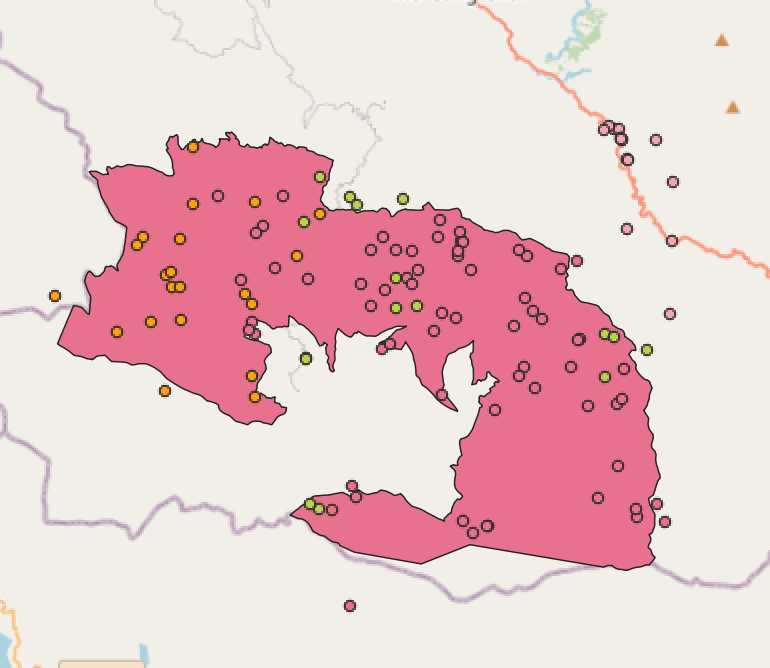
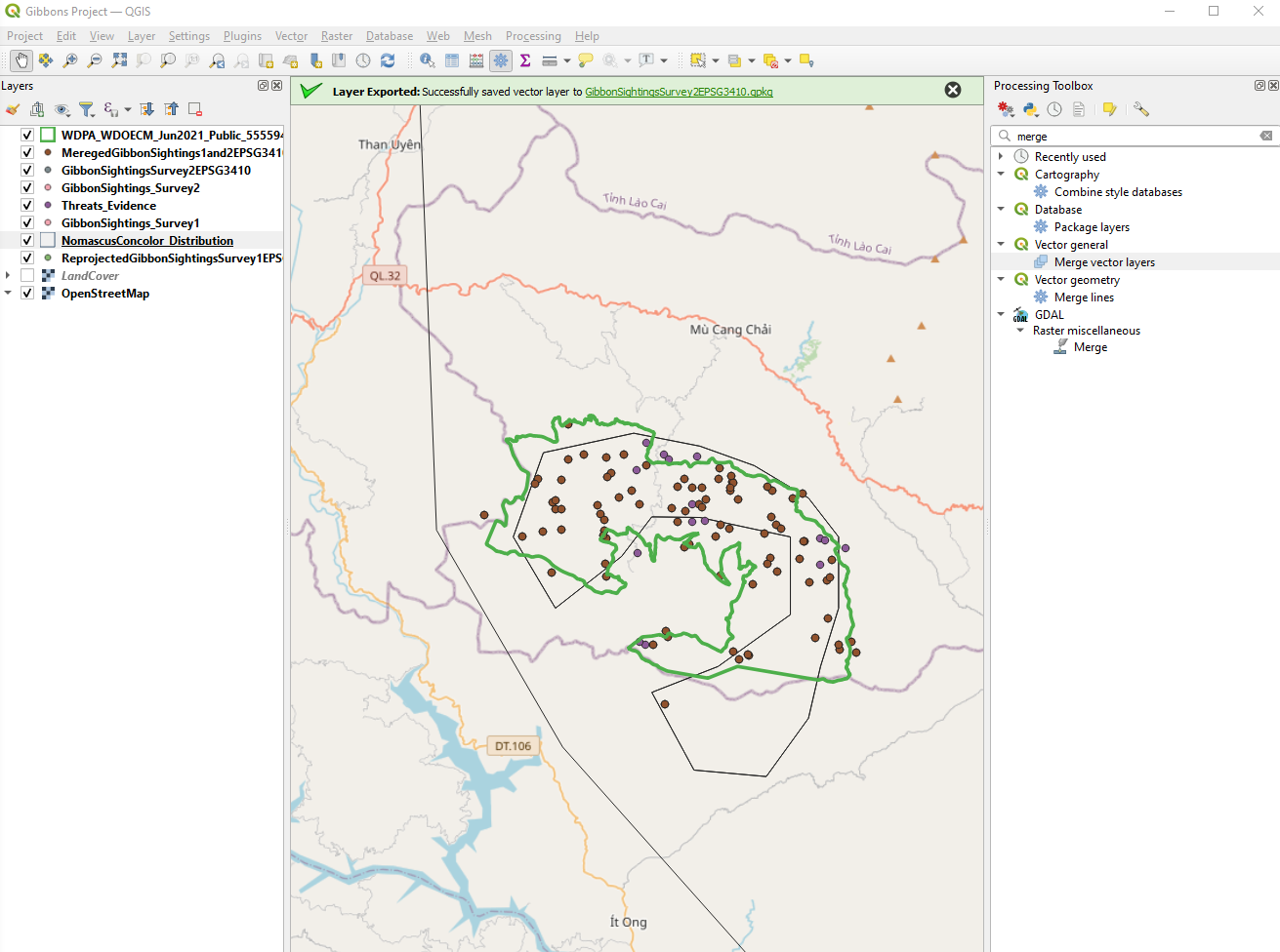
I really like how you adjusted the size and colouration of the merged group so it’s possible to see them “behind” the other gibbon data. If it was one layer down in the list, someone could see, at a glance, the two datasets, and then the merged dataset behind them. Very cool!
I should really try to change the colours and sizes of points to make them more readable in future, instead of just hiding layers.
Hello! Nice maps! Both definitely have their purposes. I think that the first one is clearer if you are just wanted to look at sightings within the preserve. I like how you changed the fill of the preserve boundary to see it more clearly. The second map does show that too, but there is a little more going on. There are multiple boundaries and with different fills. This makes it really cool to compare the two sets of resolution, but it can be a lot to understand if ultimately all you want to look at is sightings.
I am still coming to terms with various SRS mentioned in the module and when to use them. But I could understand the importance using the same SRS throughtout a particular project. It was a challenging but fun module.
i am elated and i believe am on course to sharperning my gis skills. it may not look like it but wow, interesting stuff indeed. I was shocked to discover that am following, which i hope am doing the correct thing, the given tasks. It is an eye opener and this lesson was infused with a lot of new knowledge which is improving my skills a lot.
the problems i encountered was at times was overwhelmed with new information but i kept pushing and the need to do the lesson on time. i was a bit late, but pushed through.
this is fantastic, how you have interpreted the data is quite interesting. i suggest that you should also teach newbies like me. Excellent work, i have learnt that i can change the backgound cover layer


 !!!
!!!
 )
)