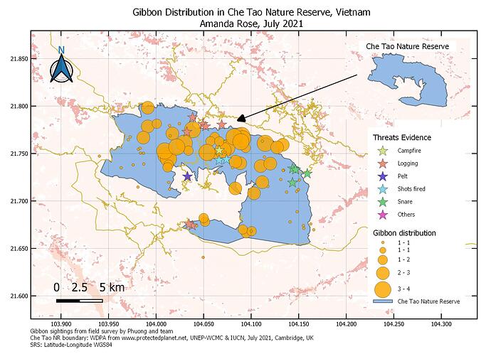
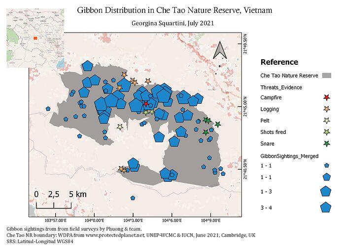
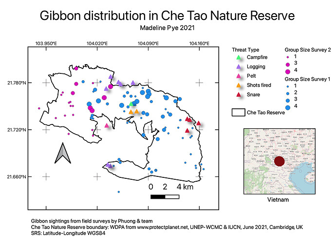
I like how you have put the two surveys on separately, very informative
It took me a little while to get the national park area positioned how I wanted it within the frame, but got there by changing the extents.
I have done some work creating maps like this, e.g. with scale but previously had issues with the scale bar being wrong - I had not set the CRS correctly so now I know this. I found it useful learning about the legends and how to change the labels in just the legend without altering the full map
If you uncheck layers on the original map in QGIS, then press the little circle of blue arrows to ‘Update map preview’ in the Item properties menu you can hide layers you don’t want. In the example it only shows the data set (I think it’s gibbons merged) and the National park boundary to hide other distracting elements
I’m using the data from previous modules. Superb module! I learnt how to better illustrate, organize information and present data more concisely through mapping skills. No problems so far, just a lot of experimenting which was fun. Looking forward to deepen GIS skills, fingers-crossed for more online courses like this!
Hi @mafuza_maya ! I’m not quite sure on the grid ranges but try changing the intervals and see how it works for you
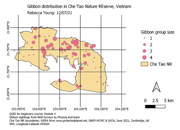
Hi @Mike ! I like how you made your map simple and clear. Same case for me, I had to go back to the previous module, turns out I forgot to specify the CRS when merging the layers. Hence, when I added the grid it was in meters instead of km. Agreed about QGIS. Mine crashes a lot especially when dealing with large datasets from the GPS.
I love how you used different symbols which made your map attractive to the eye.
I really enjoyed this week because it was just the right level of challenging with lots of hands on exposure to the tool and the data, and it answered all the major questions I had left, ie how to add a legend and split data based on attributes.
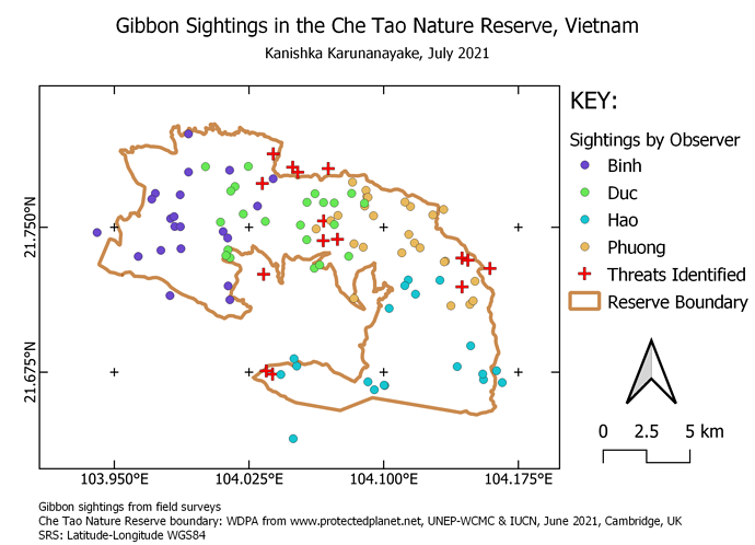
I chose to show sightings by observer because I wanted to mock up what I plan to do with my own surveys and split data by attributes, albeit I plan to show different species instead of observers.
The main problem I had this week was technical, because QGIS decided it wouldn’t let me save properly, so I lost 75% of the work I did, but actually turned out to be a blessing in disguise because having to redo everything made it sink in much better.
Hi @jemmy. Did you also create the map with the legend and titles etc? I think it would be good if you could show that as well.
Looks really good there @MariaELopez. I should have paid closer attention to the threats data, I didnt realise it had attributes for type of threat, thanks for showing that! I’ll look into that and try to include the zoomed out map as a bonus exercise.
Lovely map, @mandabee! I like all of it: layout, way you’ve decided to show the information provided and colour combination! Very well done!!!
Well done, @Deleece! Actually, I must say that I was glad to read that you found confusing the first part of the instructions in this module: I did work for a while on a blank document too before realising how I should have proceeded correctly!!!
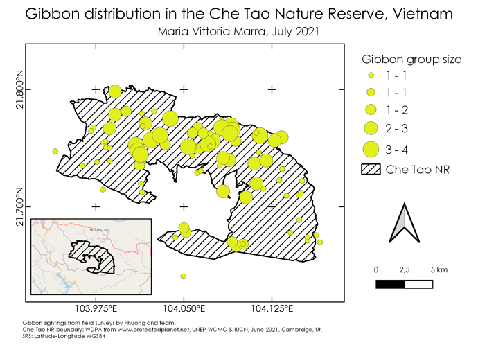
I had some issues myself with the grid, in particular with the intervals and the offsets for the x and y coordinates. I made the map several times and eventually I think I got everything to work fine just following step by step the instructions about the grid (I think in my first attempts I might have mixed up some instructions).
Great way to end this brilliant course!!! This module was really a journey for me: I’ve started from being completely lost (as said already, I was staring at a blank document at the beginning because I didn’t understand that I had to start from the project carried on in the previous modules to make the map), but then I finally got to the very satisfying step of exporting the final map as an image!
It’s been very interesting to learn how to make a map by trial and error and I think that once again I’ve learned a lot and gained much more confidence with QGIS (I found myself enjoying to explore all its settings in a similar way I did when I was self-learning how to use other softwares).
I’m aware my map might look too similar to the template offered by Lucy, but I find that really neat and I liked to reproduce it modifying just some bits here and there 
I just realized that I could have changed the cathegories in Gibbon Surveys and changed the name in the Reference.
I found this assigment challenging because my computer gets so slow that QGIS is about crash all the time
 , but also because I got very confused and a little bit frustrated. Since we had so so many options to show in the layer at the end I’ve got a big mess. I’m still trying to understand some things I did. But at the end I think I could managed to complete this work, but it was very hard for me to organize all the information shown on the map. For certainty I will have to improve my skills to organize and do a to do list with the most important information and why am I showing that.
Another great module,
I’ll miss this course and I’ll miss you Lucy 
Thanks so much! 
Hi!! Your map looks great! I like you chose to show both surveys and the map in the middle.
Just one comment about the reference, you can modify text and give us which survey is each different point colors. Also with the Che Tao Natural Reserve. Maybe also add a reference map to show someone who doesn’t know where this Reserve is, where in the country or even the world is.
Hi All
I had QGIS crash while making the map and then for a while I wasn’t able to find where the maps were stored in QGIS (Project → layout manager btw) but after I got that sorted I found the map making quite fun. Definitely another core skill towards my basic understanding of GIS.
My maps message is that it shows the distribution and size of gibbon groups within the CheTao Nature Reserve as well as the distribution of threats in the reserve.
Hi Kanishka
I like the simplicity of your map, it’s very easy to interpret while also showing all the important information. I don’t really have any recommendations other than that you could have tried an inset map.
Great job!
Thanks. I just used an online map legend tuorial
Great work !
To me your work looks great. Love your choice of colours. Good thing you manage to export. I did not succeed to export mine.
But. I can not see any scale bar. May be you just forgot to put or it was out of the print area.
Hi! Thank you! I think it just takes some playing around to get used to it (and having some spare time!)!
