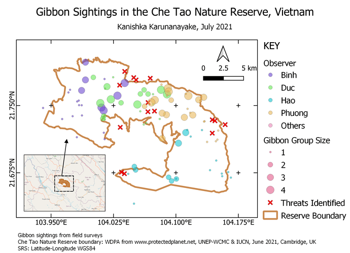
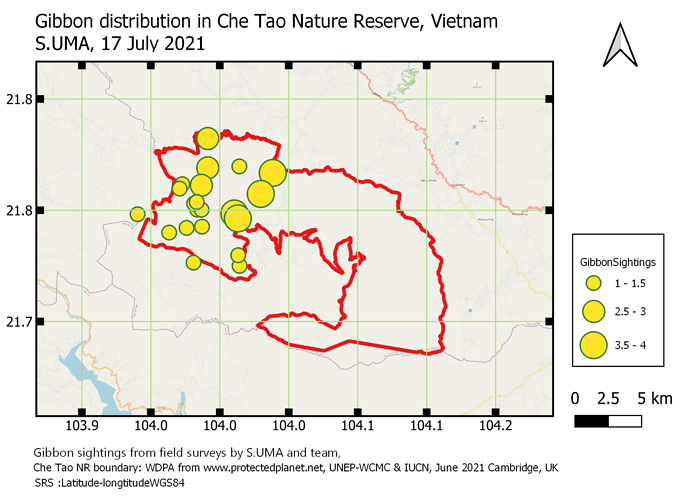
Good job, the map is beautiful and easy to understand
Good job, the map is beautiful and easy to understand
Hello Dani,
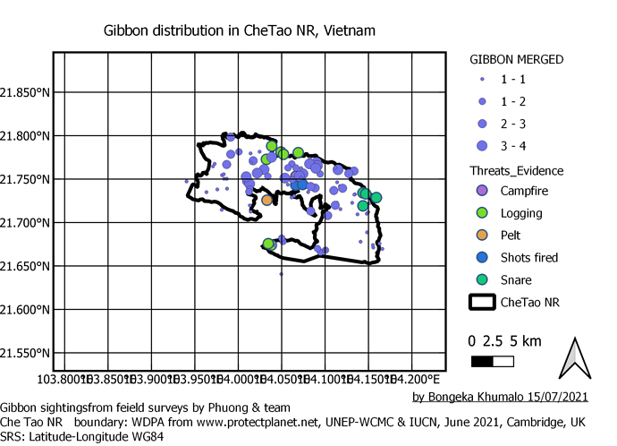
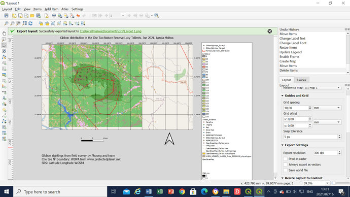
Congratulation. all the important elements are present in your map and you dicided to use the the option 'Categorized in the symbology function. Howerver you did not desactivate other layers in your project reason while map look a litle bit different. So you have two options
firstly you can desactivate unecessary layers and turn back in your map layout to actualize the map
secondly, you are free to just add those layer in the legend so that the readers will not be asking what they are.
Thanks for the feedback @Pye, much appreciated… here’s my attempt at an upgrade 
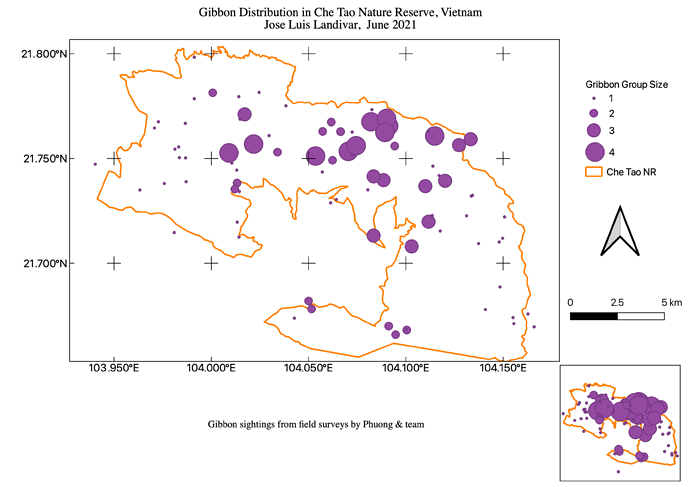
Beautiful map with unique filling. Also with a location map near.
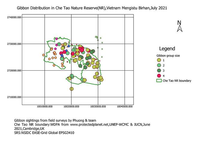
I could not display a single data from Gibbon groupsize. I think I am inspired by your Workdoing
Gracias Maria,
I think your map looks really good too and well done for getting the second inset map, I was too nervous to try this as I had it all crash on me the first time I tried to select the SRS in the print view, so I did it all again but this was also a good elarning opportunity. Now its done I will try adding a second map. thanks.
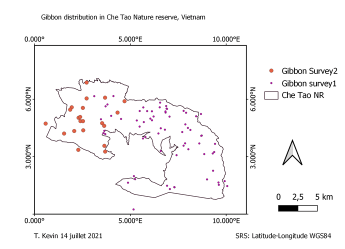
this is my final image. I found this module as the difficult one compared to others as I spent more than 8 hours trying to get it right and starting afresh a few times. as its seen on my map i failed to zoom for better and clear view. I would appreciate comments and input from the community. thank you
I think that this was a cool module! I enjoyed creating my map and trying to make it look professional by modifying the symbology based on attributes! I liked creating an inset map through QGIS as well.
I really enjoy working on this module. Learning how to create a map, editing the map, and exporting it will be very useful for future work presentations. I spend some time trying to match the example, but other than that the instructions were very straight forward. Really enjoyed this course!
I think your map looks professional! Way to go.
I appreciate it Halk!
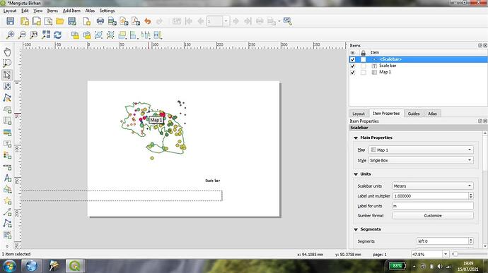
Hello everyone! Here is my final step in mapping to show the Gibbon group size . It is true that module 4 is an improved teaching method, but there are some problems with adding a scale bar to the map. I follow the step as follows,but it does not display on the map.
Click on the Add Scale Bar tool QGIS Add Scale Bar tool on the Project toolbar, and click on the map where you want your scale bar to be. Click OK. Anyone to help…?
here is the screenshot to show the failure of scalebar
Hi BioDeb,
I really like your map. It looks very neat and professional.
Congrats!
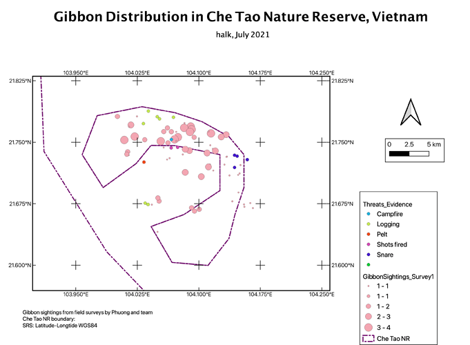
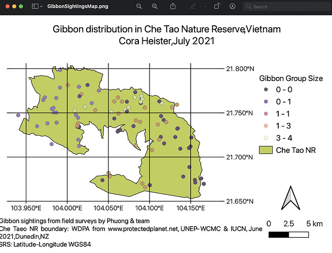
I’m not sure why the grid lines on my map look different to others but overall I am very happy with the result as I think it looks very clean and tidy and represents gibbon group size within Che Tao NR accurately and is easily interpreted as the coordinates are displayed nicely.
I had the most fun in this module as I was able to play around with my map and decide how I wanted to uniquely display the data to the reader.
I really enjoy the colours you have used within your map (: maybe next time try and have some fun with relabelling some of the items within the legend so it looks a bit cleaner to the reader but overall looks really great to me!
Cmheister mine also appear like that, different from others but I think they played around with different grid style .
This module have been the most difficult module of them all, but I have managed to compile up something as part of the activity. I hope I will be able to achieve more with practice.
This is great work indeed!
Keep up the good work.
