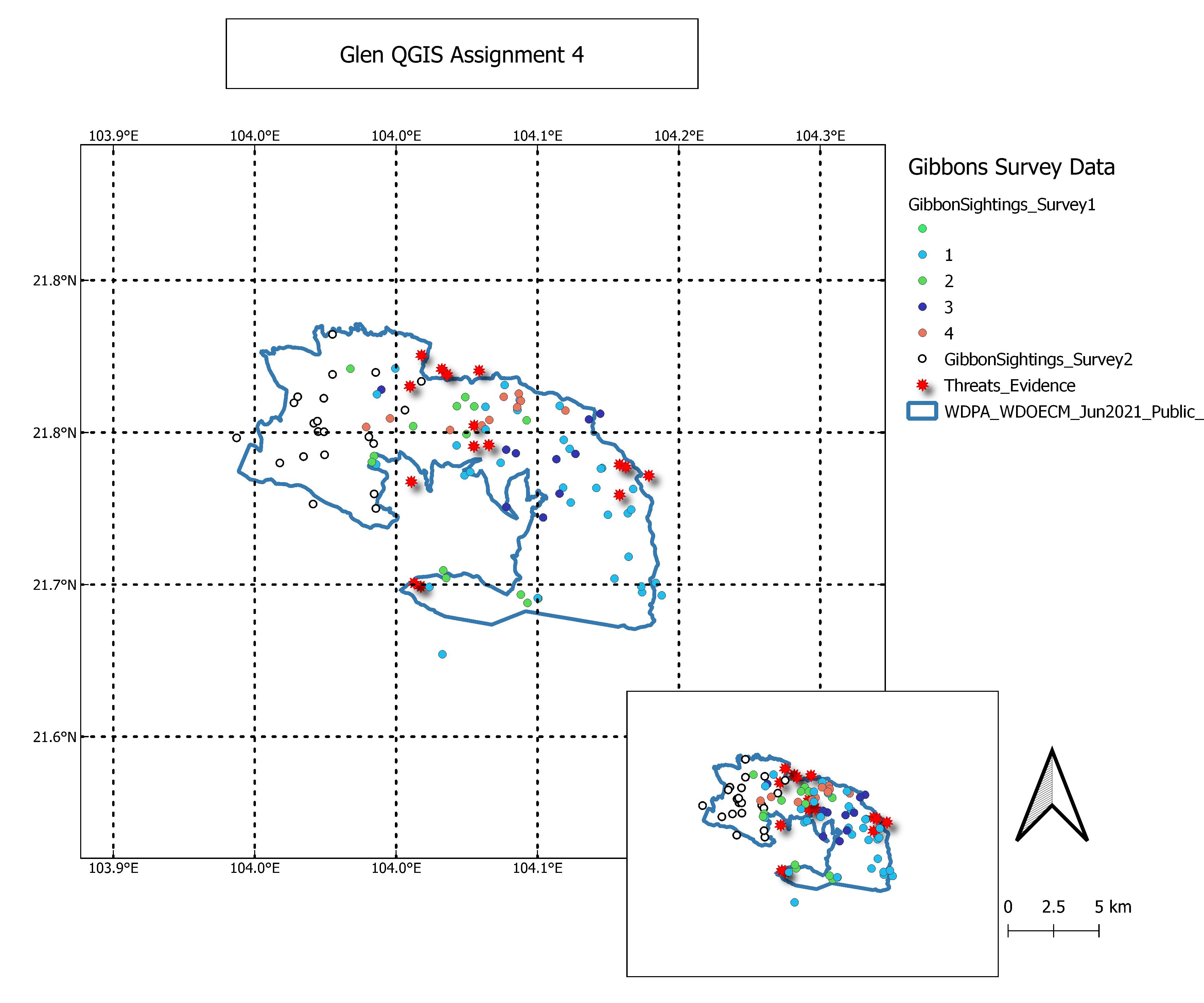
Hello @szabo.borbala nice map. very catchy to the eyes and neat. Good for you!!!
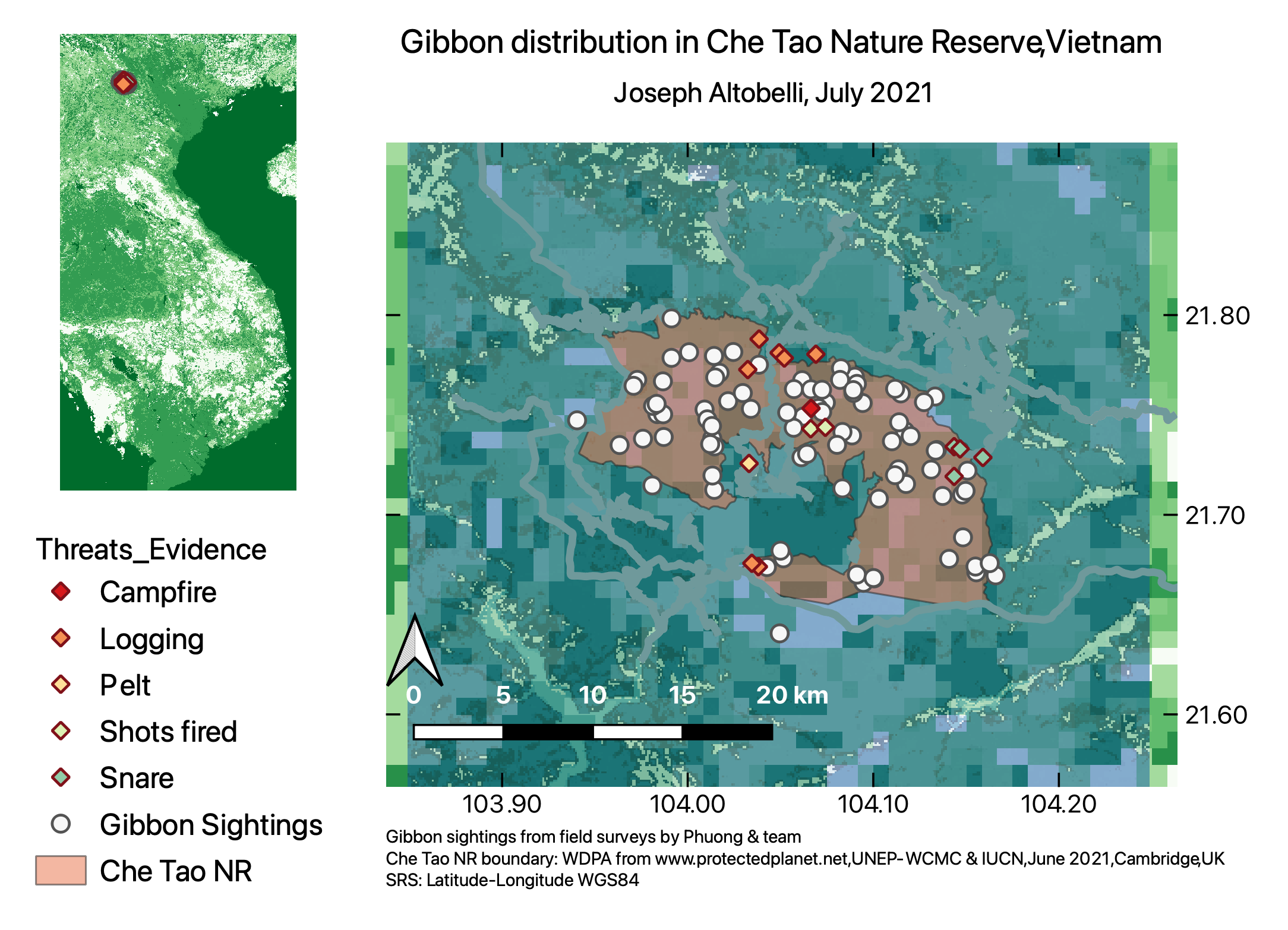
Just few points to suggest: 1) evidence of threats in the legend part should have sub labels as campfire, logging, pelt, shots fired, and snare. you might have chosen the " value" to be threat types from pop down column lists. 2) one gibbon Sightings Survey would have been enough to the map as both field surveys, as I guess, were taken from same location by same team of Che Tao, i.e., the survey data are similar except the time they were taken.
I kept mine pretty basic, but looking at other maps, I see I could’ve improved it alot. However, I really struggled with the legend (my screen kept on freezing, and took forever to update), so I’m just happy I managed to finally get it to work

Hi everyone!
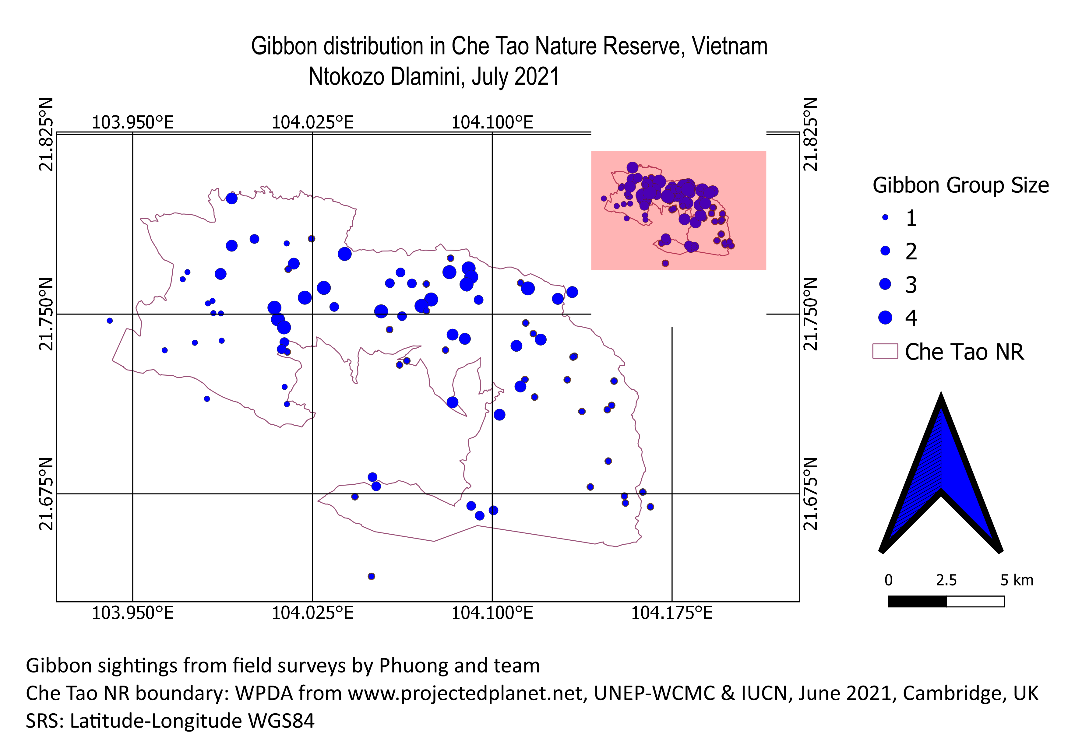
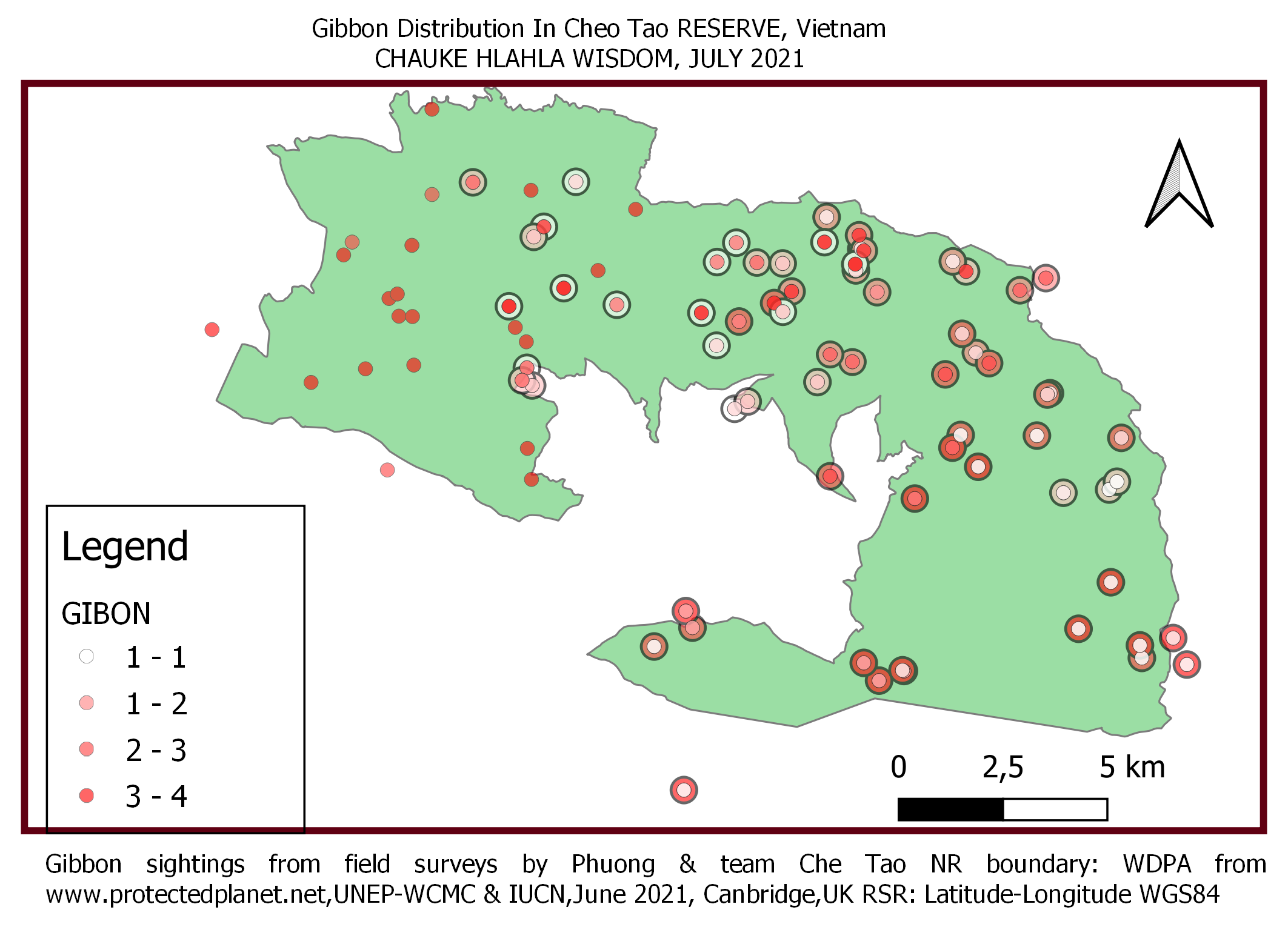
Here is my work. I quite enjoyed this module, very interesting. One of the things I learnt last year was to create maps using QGIS, so it was not was not something new to me but I learnt a lot of things despite having the background knowledge.
Thank you,
Ntokozo Dlamini
1 Like
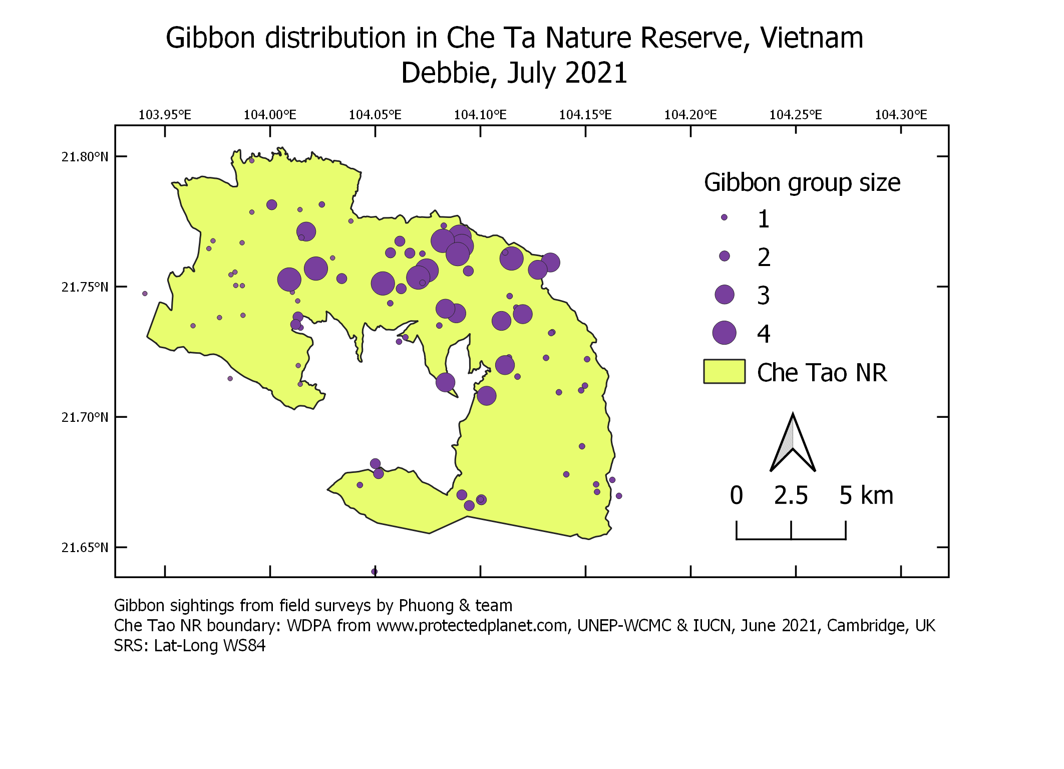
Hi BioDeb
Well done on completing your Module 4. I love your work, looks simple and neat. I don’t feel the need to recommend a lot, just only one thing. I would suggest to sort of modify the position of your longitude / x-axes. You can modify them to be vertically ascending or descending rather than horizontal.
Best regards,
Ntokozo
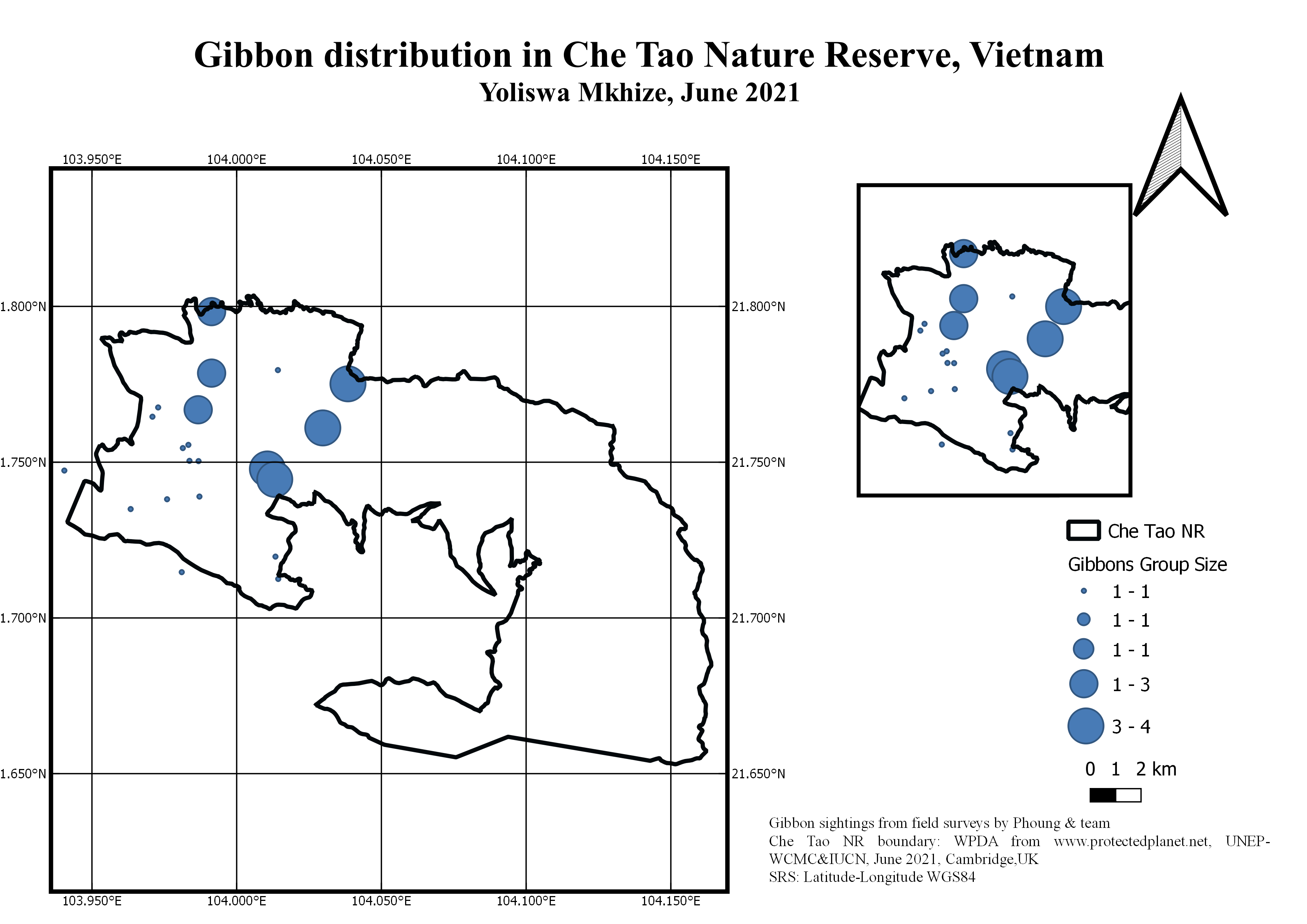
I am still struggling with the labels for the second map when designing. Overall I am happy I got to this point without much of a problem, and have learnt so much. I wish to be in the next advance lessons, so that I can learn more. Thank you for this opportunity, and please do not seize to help other like me, who are in need. I am ready to create my map now, just few details will need to be revised. Kindly receive my creation…

Thank you.
I mostly struggled with the layers to use for this exercise as I have been using different computers.
I also struggled with how when I change the main interface, the layout does not automatically change itself and I have to keep deleting with each mistake.
1 Like
Thanks Anna, I will try this now. 
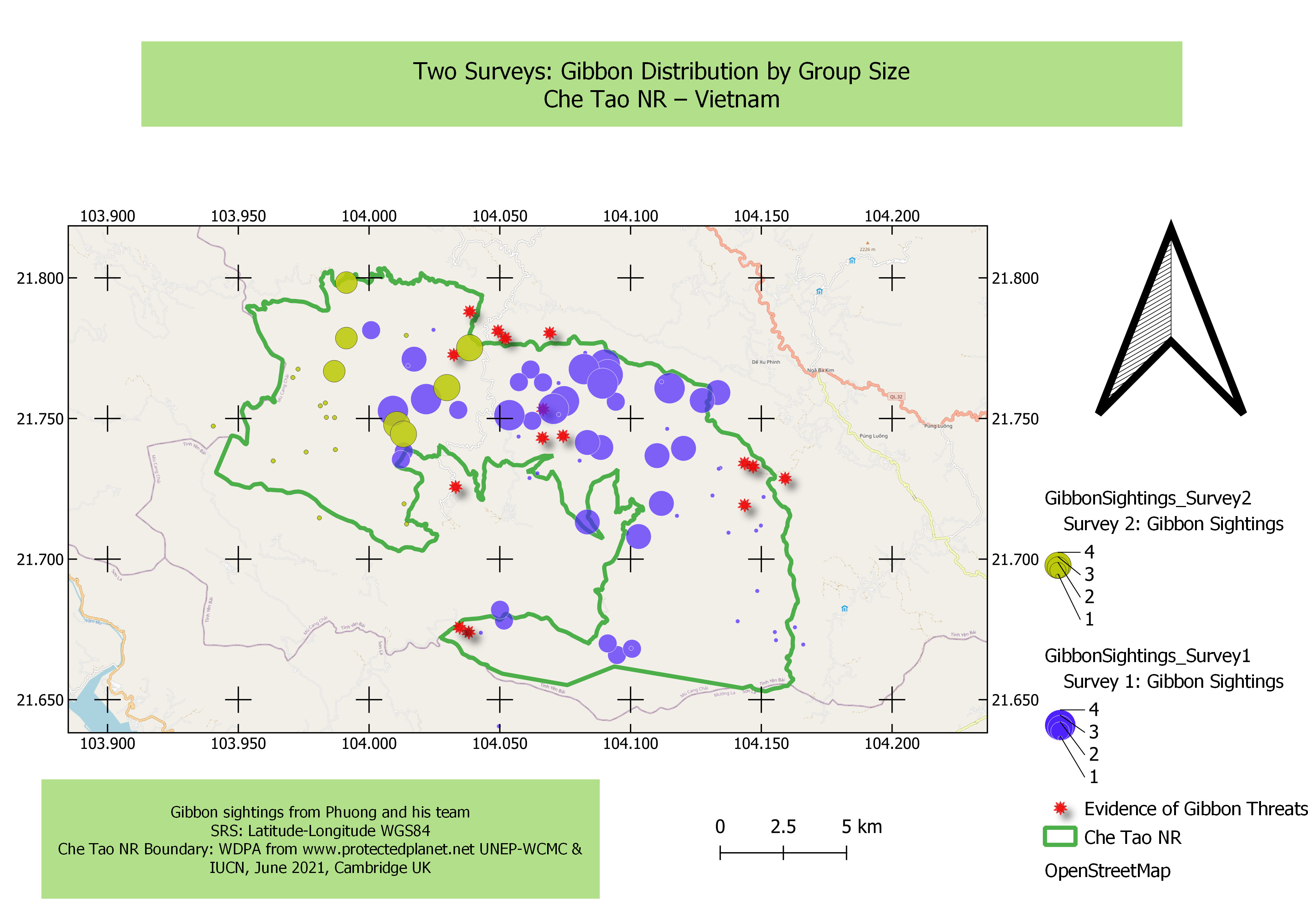
Thanks Jonathan, will try this ‘merging of dots’ function. Because I am not even 70% familiar with QGIS, I often ‘trial and error’ by clicking on different functions to learn on my own. I agree that the size of the inset is not much bigger - need to work on the clusters in order for a more detailed visualisation of the inset.
Thanks Borbala, will try this
This week’s module was fun and took me a bit longer than the previous modules, mainly because I was playing around with all of the symbology of my map! I still don’t think it looks great but it is wonderful to see everyone else’s creativity.
I really like your inset map showing the location! The clarity of your display is excellent.
1 Like
Thanks Ntokozo! I agree - that would look better changing position of the x-axes.
module 4 assignment: making maps
the module was great with clear instructions but i struggled a lot with trying to make sure the legend information shows everything inside the map. with map location i followed instructions but i could not get it. any help and input, welcome.

This final stage was both interesting and engaging. I have had fun playing with the legend and I feel that looking at the assignments of others has been a lesson in realising the importance in colour choices, legend styles and presentation clarity - a great lesson indeed.
I will comment on [annakarolinaborges] in a reply to her map
3 Likes
Hi Anna,
Despite not incuding the second inset map (I did not either) I feel that the map you did produce was clear in its simplicity (the more is less feel). I think you could have included a stroke around each ‘dot’. If you choose a stroke of a different colour it will help differentiate the blobs from each other - great if some are on top s each other - gives some definition and clarity to them too. Internal tick marks within the map may also have brough the scale more to life.
I realise that I did not remember to inclide a scale - a critical aspect so I have now gone back and done that. I remember at school the acronym was TAPS (Title, Axis, Points, Scale)!
1 Like
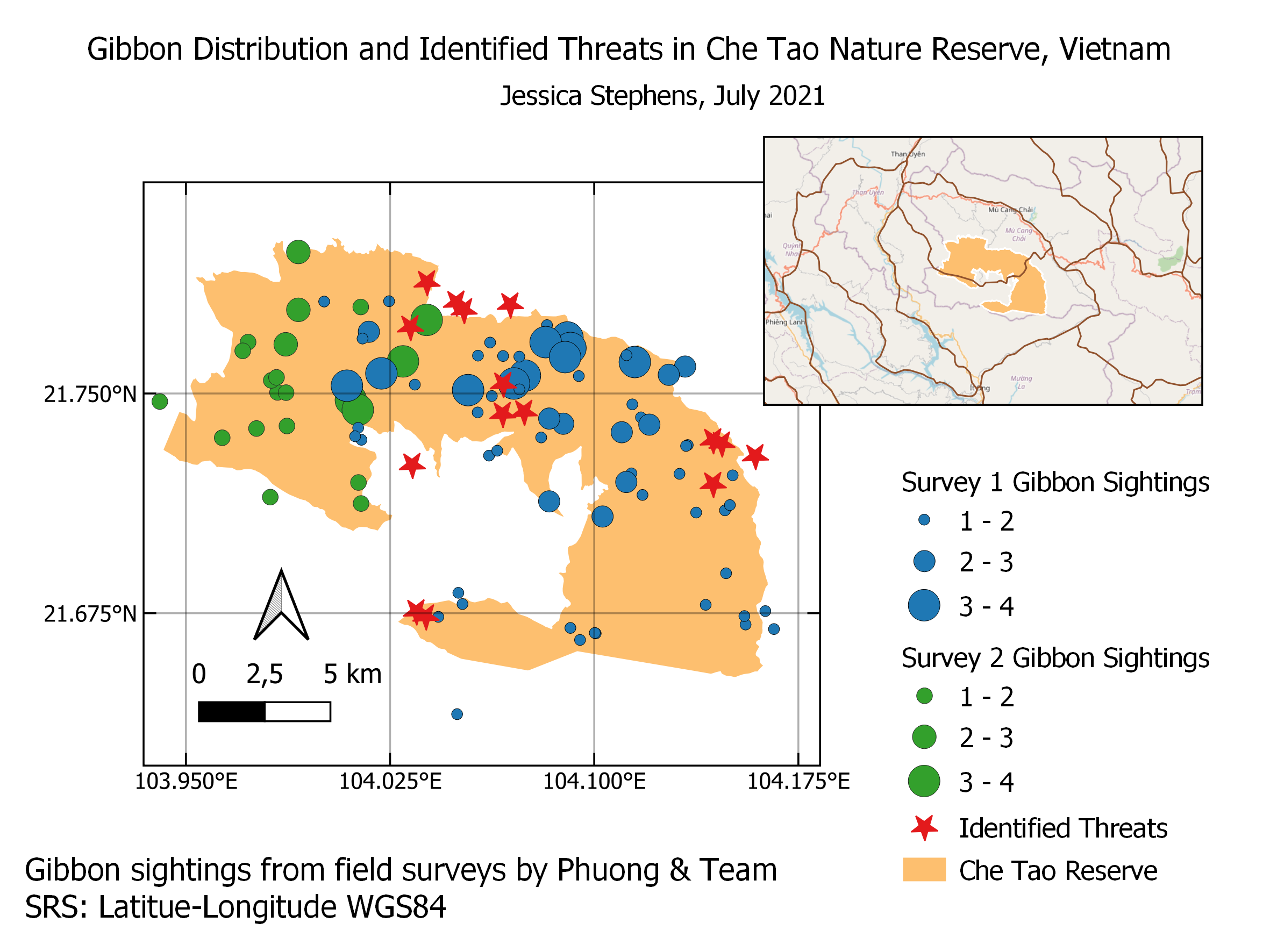
Nice use of the inset to give an idea of where abouts in Vietname the nature reserve is.
If using different computers, (and you may be doing this already), having the project (and all the associated GIS files and Layers) stored on a “shared” fileserver/folder allows you to access the same QGIS project which ever computer you are using - but how the interface looks will be dependant on the QGIS set up on that particular computer.
You can set QGIS up in exactly the same way on multiple computers by using a configuration file so that a “corporate install” is possible, allowing all users in the same organisation using different computers get to “see” QGIS in exactly the same way.
This does though open up an interesting discussion on file management in a shared working environment - perhaps a discussion for another day
1 Like
The CRS that the grid lines use can be set independantly of the CRS for the QGIS project, so sometimes if these are different, it can cause problems with the labelling - best bet is to make sure that the CRS for the gridlines is the same as the QGIS Project CRS.
This was the most difficult module yet. It took me extremely long to try and figure out the instructions but I’m really glad I eventually did via playing around with settings. I have now learnt how to create a map from the original layers and how to determine which layers to show in the map. I am still struggling with getting the right scale and extent on the map and am not certain how to change this. Do you have to zoom in on the original and then sync when the map panel is open or is there a way to change the zoom in the map panel itself?
I suspect that the lesson on symbology will also be very useful once I have obtained my own data.
3 Likes