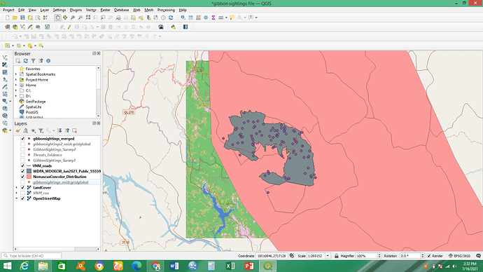
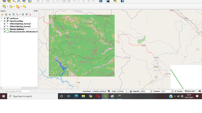
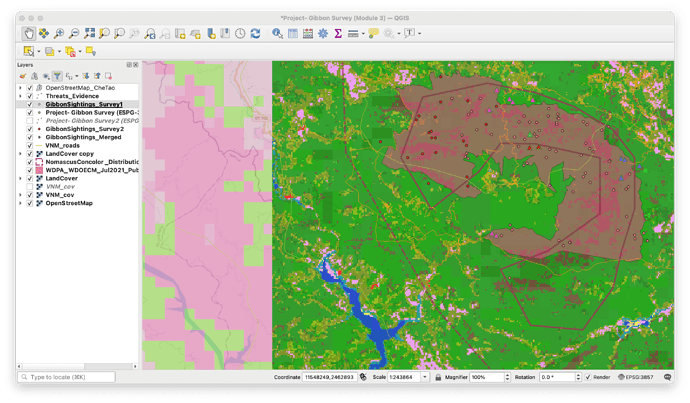
I have learnt that projections cause some distortions. I understood how re-projection allow for datasets combination and analysis. On my map l have decided to show the merged layer. This course is really an eye opener, have learnt new stuff indeed and am appreciating the importance of GIS more.
Your map looks more clearer, way clearer than mine. Good map. How did you map the point colours more clearer.
This module was a tough one, but I managed to merge my layers and that is what I’ve indicated on the map in the screenshot in addition to the threats layer.
I’m glad that you got to fix the issue! I like the fact that your map is clear and concise.
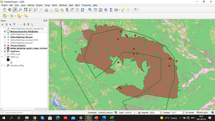
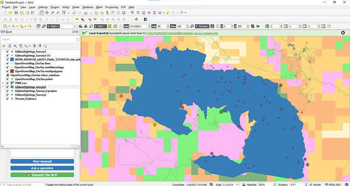
This module was completely new to me. Leaned importance of identifying SRS of the data you get and projecting all data into same SRS for ease in analysis. I had problem to find both the edited gibbon sighting file in the merge window. then I again went back and repeated the process of projecting.
Hi, I like that you decided to show only the merged sighting data on map. its more clean and easy to under stand.
I could suggest you to plot the landcover layer over the WDPA… layer to better understand the elements of the landscape.
I liked the use of color combination in your map it is clean and pleasing to eyes.
nicely done, i like how you present your map, simple and can see the point overlapping easily
I think this module is easy to follow and has a lots of information about different reference systems.
After this modules, I feel there are more to learn about these reference systems and need more reading from my side to get a thorough understanding this module.
Hello @Seneiya-2021 and Olanike
Thank you
I will do that.
A post was split to a new topic: Processing menu doesn’t appear
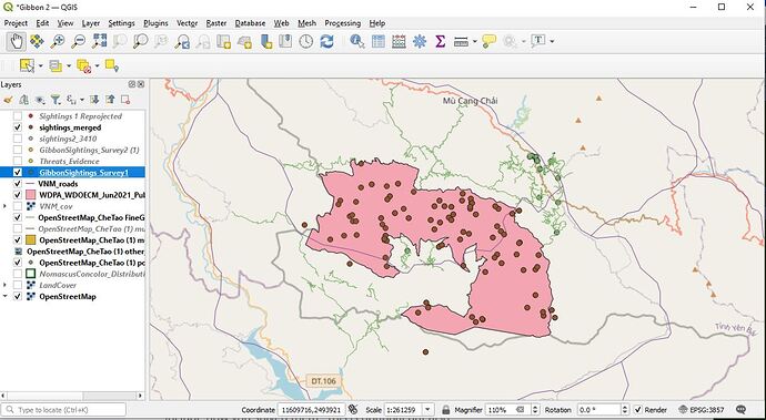
Wow I love how you adjusted the presentation to have such a different look!
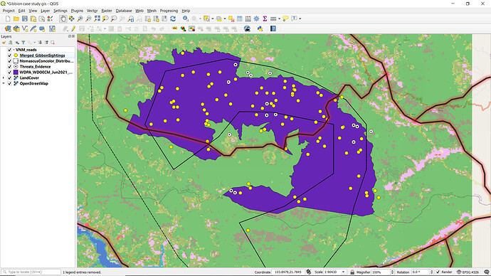
Here is my Module 3 map, with the layers I decided I wanted to focus on.
It was definitely helpful to get the overview on scaling and projection, I’m still not quite sure how to decide on the SRS but I’ll be reading back through the module and looking up some more resources to make sure I’m solid on it.
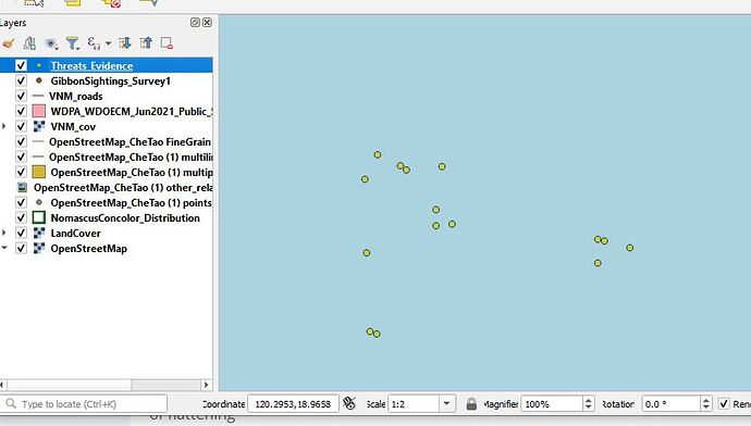
One thing I guess I had difficulty with was adding the Threats Evidence layer. There was no issue at all adding it to the map, the weird thing was that it didn’t appear next to my other layers, and when I zoomed to layer, the points were located in the middle of an ocean somewhere. I deleted and tried again, same thing- I deleted and tried again, this time switching the X and Y lat and long designation, in which case it just appeared in a different part of the ocean. Still not sure what’s going on there. I’ve uploaded an additional image of that.
Your maps look great!! the EPSG codes and GS 84 / Pseudo Mercator were also confused to me but we just need to practice more!!
Hi Elizabeth,
great works! Your map looks good.
About the threats evidence, I think it might be due to your layer’s crs projection.
I really enjoyed the module as it was so insightful. I learnt about the different map projection, how to transfer CSV files to QGIS environment and how to merge two field datas.
Thank you Lucy
Nice work @mandabee. I love the colours used for the map making it very visible.
@Lito_Bagona your map is good
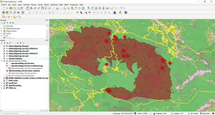
In this module, we were guided through which SRS to use but this is one area of GIS that I need to spend some considerable time with to gain a better understanding. I definitely do not feel confident with my current knowledge base to tackle determining the proper SRS on my own. I really liked how this module incorporated .csv files and showed us how field data (and different data file types) could be incorporated into our maps. I found the symbols to be a bit too confusing so I represented the threat data with triangles and then changed the color of them to differentiate the different types of threats. Without a legend, these changes only mean something to me but I am a bit more content with my map now.
Nice map, Scr21! I too changed my symbol and colors of my data points. However, I find my data points to be a bit hard to discern and noticed that some of our course mates changed the sizing of their data points. I think this is something that my map would benefit from.
