@Mehloti, please see this post for advice: Processing menu doesn't appear
Hello everyone, this is my assignment for module 3. I really enjoyed this module (I didn’t struggle nearly as much as I did with module 2) and I really liked seeing the differences between the datum and globe projections. I’ll definitely need to look over the topic of reprojection and merging again because I feel like some of it went over my head. I got the basics but I’d like to try another example.
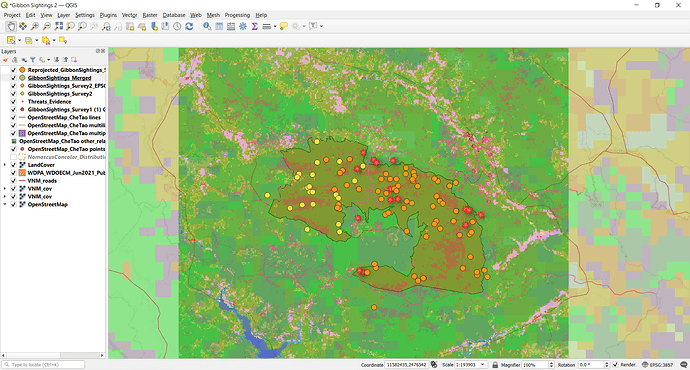
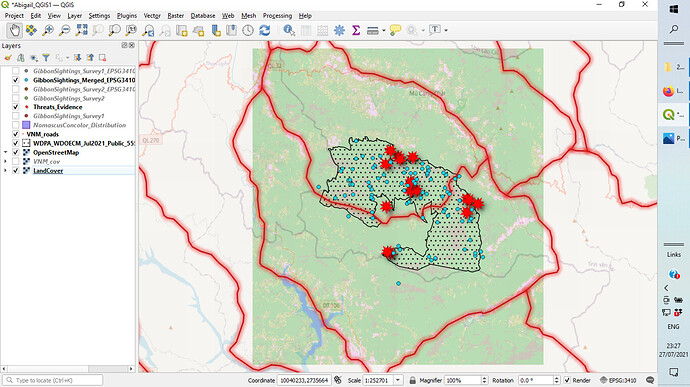
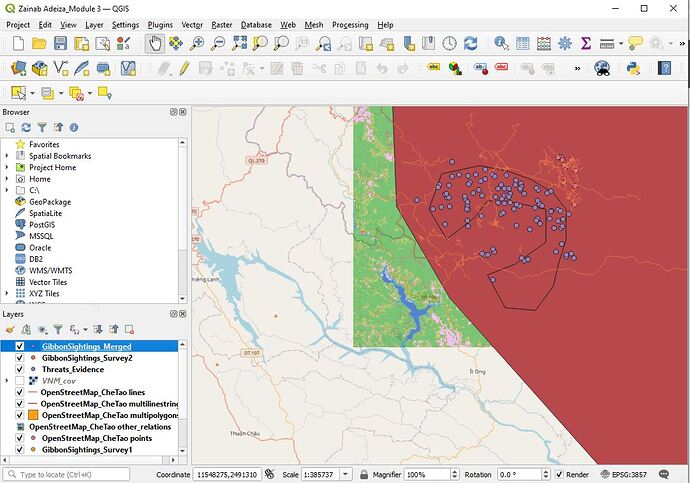
Lastly, I changed the Threat Evidence symbol from dots to little red explosions/star shapes to signify their urgency and distinguish them from gibbon sightings.
I used the same symbols for the Threat Evidence data! Glad to see many of us think along the same lines 
I really like how your map looks! If I could make one suggestion, I would suggest making the data points (dots) a little bigger as right now they are sort of difficult to see very well.
I like this one. Simple and effective. Kept the colours fit for purpose, think some of us enjoyed loud and bold colours ahaha, a cartographers nightmare i dare say 
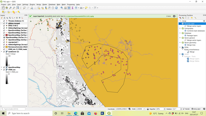
I like that you’ve chosen a different colour palate to experiement. I did a brief MOOC on cartography, and colour choice can play a part of telling a story. At first glimpse at this, if i didnt already know what or where this was, it would make me think that this is in relation to a water body of some description.
Following the steps was easy, but understanding what is actually going on is another ball game altogether! Definitely need to spend some time getting to know the method behind the steps, and why I’m doing what I’m doing. No problems thus far, but still not nearly as familiar with the programme as I aspire to be. Baby steps!
This looks great, very clear. You could always add more background layers if you wanted to, but you have what you need here 
I found it extremely time-consuming and very tiring on eyes and mouse-using hand to find the desired projection each time it was needed. I wish there was a way to type in part of it and get a small selection or even the desired one that way - a kind of search.
In contrast, the merging was so easy once that was done!
I realise there ares still so many functions I do not yet know how to use. But at least some basics are becoming clearer with practice.
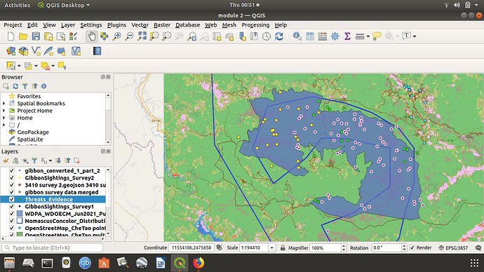
I found something to make the threats look threatening. Maybe later will find a way to differentiate between them with a legend, but right now I have so little time. More important for now to try and finish before the deadline for the course.
NIce map. I also found the red stars to use for threats. I think you have not yet merged your datasets in this shot, but I like the way you have done the layers.
There is a search option for the CRS selection - you can type in the CRS name or its EPSG number.
Message me direct if you want more help.
If you are using a laptop and its tiring on the eyes, I would highly recommend using a 24inch monitor plugged into the laptop and use it as an “extended monitor” to provide a much larger viewing area when using QGIS. I have a USB docking station so actually use 2 24inch monitors with my laptop (potential for using 3 screens !).
Thanks.
Am sure am learning a lot
I really enjoyed doing this task even though it felt a little challenging in the beggining. it has cleared a lot of concepts with regard to CRS and SRS and their co-relations. This module took a little bit of trial and error but i have understood these concepts better now. I also wanted to know if older unmerged data can be eliminated from the legend after merging datasets and if not, what is the significance of having both merged and unmerged data represented on the map
I was facing the same issues, but have now resolved it. I assume someone must’ve helped you with the same, but if you still haven’t figured it out let me know. Happy to help 
I uploaded this earlier but somehow it failed. Even though some of the files didn’t open… This is the best I could come up with… I am still learning so I intend to be better by practicing on my own and taking future courses. The experience I have gotten from this course is priceless.
Thank you very much! I will get in touch if I still can’t work it out - now I know there is a way…
Nice calm background colours - makes the sightings data stand out.
This magnification gives good context (surrounding land) - if it was important to have a focus on number/place of individual sighting data point then zooming in a bit might work too
I love the bright colors of your low res land data! But perhaps the sightings evidence could be seen better if it were done in a lighter color?
The markers for threats was a great idea! Really helps with the comprehension of what you’re trying to show.
