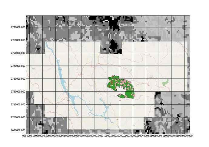
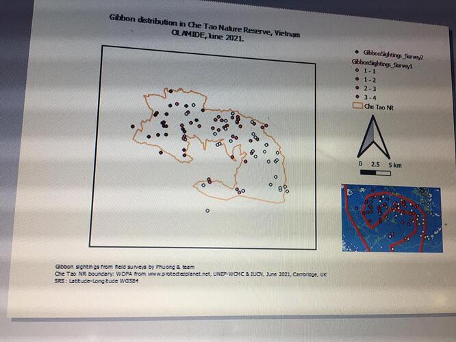
The only way I found to remove them completely, including from the legend, was to close them in the layers window, then refresh the map page. I also would like clarification on this! I like your map with the insert, Also interesting choice of features. It certainly does give a message.
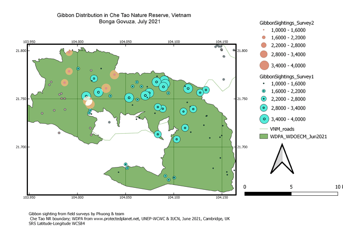
Great clear map, colour choice really differentiates sightings from different surveys.
I like the inset map as it gives good context for tthe sightng data
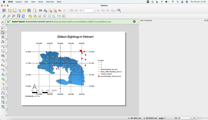
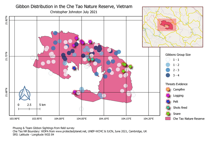
Yeah this was a challenging module. I like how your star points have the shadows, really adds to the depth of the map. It looks like you have green and blue points underneath? Weird that those didn’t automatically show up in the Legend
Your work looks great. I learnt so much in this course too though I had problem understanding the instructions too and it gave me a tough time and slow pace…all thanks to the organizers
Am really sorry for the late submission and that was because I had tough time while doing the assignment and that slowed down my pace…but at the end I was glad I was able to achieve a good outcome after many trials and errors…I particularly had trouble with the symbology and legend but I got it after going through other people assignments on this platform
And I really want to appreciate the organizers of this amazing online course for the great privilege… it’s really an insightful course that I will need now and for future projects
Nice map and grids.
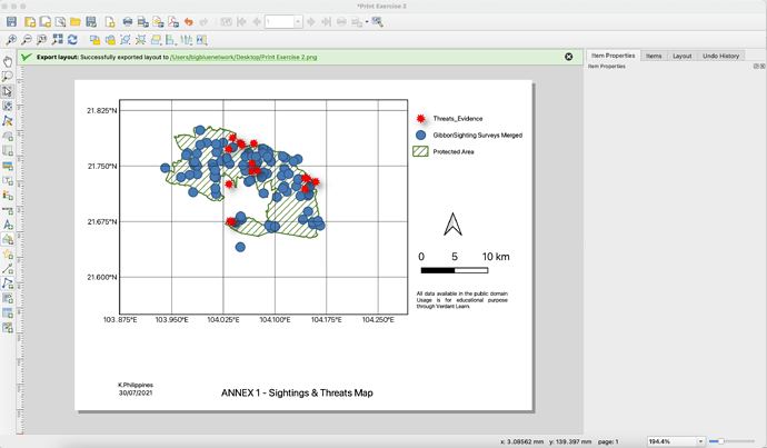
consider using different types of symbols for Threats, because this class is not well represented in the map
This is a neat map, great representation of data and all the map elements are evenly distributed in the course page. Well done
I didn’t so much struggle with this module but I think I only grasped the basics. I was able to complete the task and understand where everything was to edit my map accordingly. I have had a look at some other people’s maps and think they look amazing! The one task i struggled with was making the second layer map reflect something different with different layers to the first map. When i changed the map on the main screen it just changed both the maps. Would love some guidance there.
Your work is looking really great! I am loving the size grids you have used which are really suitable. My suggestion would be to maybe make your area size a bit smaller. This way you would be able to see your intended study area in closer detail and people may be able to see the difference between your sample points more easily. I’ve been able to take away from yours that the size of the map is important.
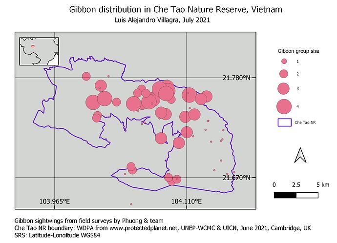
Hi there!
I am very satisfied with my results because I was able to learn to better represent the information contained in my maps!
Thanks a lot!
Hi there!
Your map is amazing! Although the color seems attractive to me, I recommend you not to use blue ranges because they could be misinterpreted as bodies of water
Greetings!
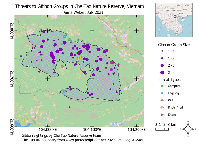
What a fun assignment! My map shows how gibbon groups are distributed with respect to the various threats present in the nature reserve. I chose to keep the land cover layer in my final map. While it’s a lot of information, I think it helps to provide context to interpret the map. It took me a while to figure out how to lock the layers of each map so that they each updated individually as I made changes in the main QGIS window, but I eventually was able to add an inset map to show where in the world this reserve is located. I should have spent a little bit more time on the legend, correcting the way the gibbon group sizes are displayed, but what can I say, by that time I was getting lazy!
This was a very valuable exercise though, I feel much more prepared to handle basic QGIS projects in the future!
Hi there! Great looking map, it looks very clean and tidy, and I like the gray background and overall color scheme!
A couple of minor suggestions: your large points indicating a group size of 3 or 4 might be a little bit too large as they are obstructing the view of some of the smaller points. I think you could make the size difference less dramatic and it would still be easy to tell the difference between the group sizes. Secondly, it might be worth trying to include a little more information in the inset map. Not knowing whether the black lines are roads, rivers, or borders, for example, makes it a little bit difficult to understand this “zoomed-out” view.
Awesome job!
This was the most frustrating of the modules for me. The symbols do not scale automatically, I could never get the map to size correctly inside the frame, etc. I never could get the group sighting data to appear by group but I did get the breakdown of threats - which disappeared when I changed the name of the layer so it would fit inside the legend - and I could not recover the data. And the panels caused endless problems. In the end, I deleted, closed the software, and restarted this exercise at least 6 times - so I got quite fast at the first bits but am throughly dissatisfied with the final result - and I don’t have time to go back and reload the layers to obtain the original data set.
Wow - Neat, clean, easy to read, and the choice of only 1 color makes it easy and less expensive to print.
If you have two map elements, then if they are still both synchronised then any changes in yoru main map window will be shown in both map elements.
If you want to show the same map with the same layers at different scales then you can specifiy the scale for each map element seperatley, or if you want to create two different maps showing different layers, then you need to “lock” one of the map elements to avoid changes being synchonised with it. This then allows you to alter what layers are shown in the map window which will then only be shown on the “Unlocked” synchornised map element.
Okay this module was challenging it took me sometime to figure some of the things out, however, it was great I have learnt a lot. I enjoyed playing around with the symbols and their properties, it help to better understand what I was doing. Due to my limited time I did not get to add a second map to this assignment, I will try it in my own time.
Hi your maps is amazing, and I like how you presented your map and you even showed your second map, this conveys a great message.
After some issues with the grid display I’ve managed to get it sorted. Apart from that one issue, getting the grid to display the correct latitude and longitude, I felt this went well and the instructions were very good. The problem I had was that the grid wasn’t showing the coordinates in latitude and longitude but I asked on Stack Exchange forum and got some advice there. I changed the CRS to EPSG:4326 - WGS 84 and it worked.
For the map, I have reduced the opacity for the Gibbons Group Size layer so that some of the threats are easier to see.
I was pleased that I was able to add an inset map too, learning how to lock layers and highlight the area etc. Overall, I feel I’ve learnt a lot and am keen to learn more in the future.
Thank you @LucyTallents for your help and advice too, much appreciated 
